Pie Charts Best Practices
🥧 The most controversial chart in dataviz
In my second year of university, I was told that you can’t use pie charts. It was simply not allowed, and that’s all. The reason given was that bar charts are much more readable and understandable. It’s hard to disagree with that one. But how can you not like multicolored rounded circles?
Then I fell in love with data visualization, and the choice between pie charts and bar charts became very important to me. Actually, pie charts are not that bad, but they are enormously misused. It’s like vanilla — very nice if used properly in baking, but have you tried something with too much of it? Awful!
Best Practices series:
So, can we use pie charts? Yes, just carefully and it depends on the purpose. And most of the time, they can be substituted by other more suitable charts. Here are the rules for how and when to use them. Same rules can be applied to donut charts.
TLDR
1. Pie charts are used to understand ‘part of the whole,’ not for direct comparison.
2. Pie chart categories should always sum to 100%.
3. Use reasonable number of categories: no more than 5 slices
4. Try to group small categories into ‘Other’
5. Apply sorting from biggest to smallest clockwise, but place ‘Other’ at the end.
6. If shares among categories are similar to each other, pie charts would be useless.
7. Label values directly; don’t create an additional legend.
8. Coloring is optional, but it helps distinguish slices.
9. No 3D, never!
10. Pies in Dashboards: consider skipping them
1. Pie charts are used to understand ‘part of the whole,’ not for direct comparison.
Comparison. If you want users to compare different categories, go with the bar chart. Also, if you are showing absolute numbers on pie charts, you most likely need a bar chart. Pies are for shares — show percentages.
Statement. If you’re conveying that 25% of people are doing X, consider using a big number instead of a pie chart. A pie chart can be added for visual interest, but it might not significantly impact the perception of the number.
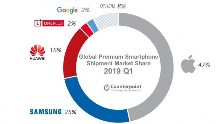
Part of the whole. If you want to show shares, such as market shares, pie charts can be a good way to do that.

But then again, pie charts can be used only with the following rules.
2. Pie chart categories should always sum to 100%.
This is a pretty simple rule but yet very common mistake. You simply can’t use pie charts for averages or ratios because they won’t sum to a total of 100%! Summarizing averages or ratios with a pie chart is not appropriate.
Here for Avg Sales it’s better to use bar chart.
3. Use reasonable number of categories: no more than 5 slices
4. Try to group small categories into ‘Other’
This hack is also applicable to other charts with many categories, like lines or tree maps.
5. Apply sorting from biggest to smallest clockwise, but place ‘Other’ at the end.
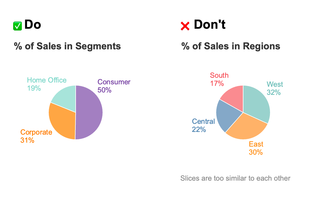
6. If shares among categories are similar to each other, pie charts would be useless.
We effectively read pie charts when slices are different from each other and resemble quarters on a clock. We can distinguish parts like 25/50/75 percent because it’s just like pizza slices. However, for something in between, it would be much harder to do so.
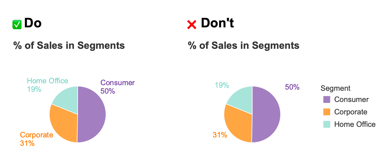
7. Label values directly; don’t create an additional legend.
8. Coloring is optional, but it helps distinguish slices.
9. No 3D, never!

Pie Charts in dashboards
In dashboards, pie charts usually attract too much focus due to the rules of contrast. Their round shape, relatively large proportions, and bright colors usually draw too much of the viewers’ attention. This can easily become an issue because they typically don’t contain this much important information. Therefore, in dashboard design:
Increase opacity to make pie charts less prominent.
Consider using donut charts because they remove the high-contrast center.
Explore other chart types. I honestly believe that for dashboards, where data might change significantly, there is a high possibility that pies won’t be a suitable choice after all.
Fun fact
French word for “pie chart” is “camembert”


The bar chart is a minor competitor of the pie chart. Any table is a real one.
You aren't adding anything using a bar chart. Our brains need to work better with sectors and their squares to make a pie chart useful
Camembert's butterflies! 🥰