Line Charts Best Practices
https://open.substack.com/pub/nastengraph/p/bar-charts-best-practices?r=1ndgkl&utm_campaign=post&utm_medium=web&showWelcomeOnShare=true
Line charts are one of the most popular charts in the world of data visualization. They have an ability to convey data without the need for extensive explanations. However, harnessing this power effectively requires an understanding of key principles and best practices. So what are the rules here?
Best Practices series:
TLDR
1. Line charts are for time data only.
2. Time goes from Left to Right.
3. Time Intervals and Scale Ticks should be aligned.
4. If you have missing data, make it clear from the chart — use dashed or unconnected lines.
5. The zero baseline can be eliminated, except when dealing with 2+ lines displaying flat trends.
6. Aspect Ratio matters, try 16:9 as a safe one.
7. Synchronize Dual Axis.
8. Utilize design and different layouts to avoid creating a spaghetti chart.
1. Line charts for time data only
Line charts are ideally suited for visualizing time-related data. The human mind instinctively connects data points in a line chart, following the gestalt principle of continuity. We perceive the lines as continuous, with a clear start and end, much like the passage of time. Attempting to create line charts from non-time dimensions may confuse users, as they naturally expect a dynamic sequence in these charts.
2. Time goes from Left to Right
In most cases, time should progress from left to right on a line chart. This left-to-right flow is intuitive for users, aligning with the reading direction in many countries. However, it’s important to consider exceptions for regions where people read in a different order.
3. Time Intervals and Scale Ticks should be aligned
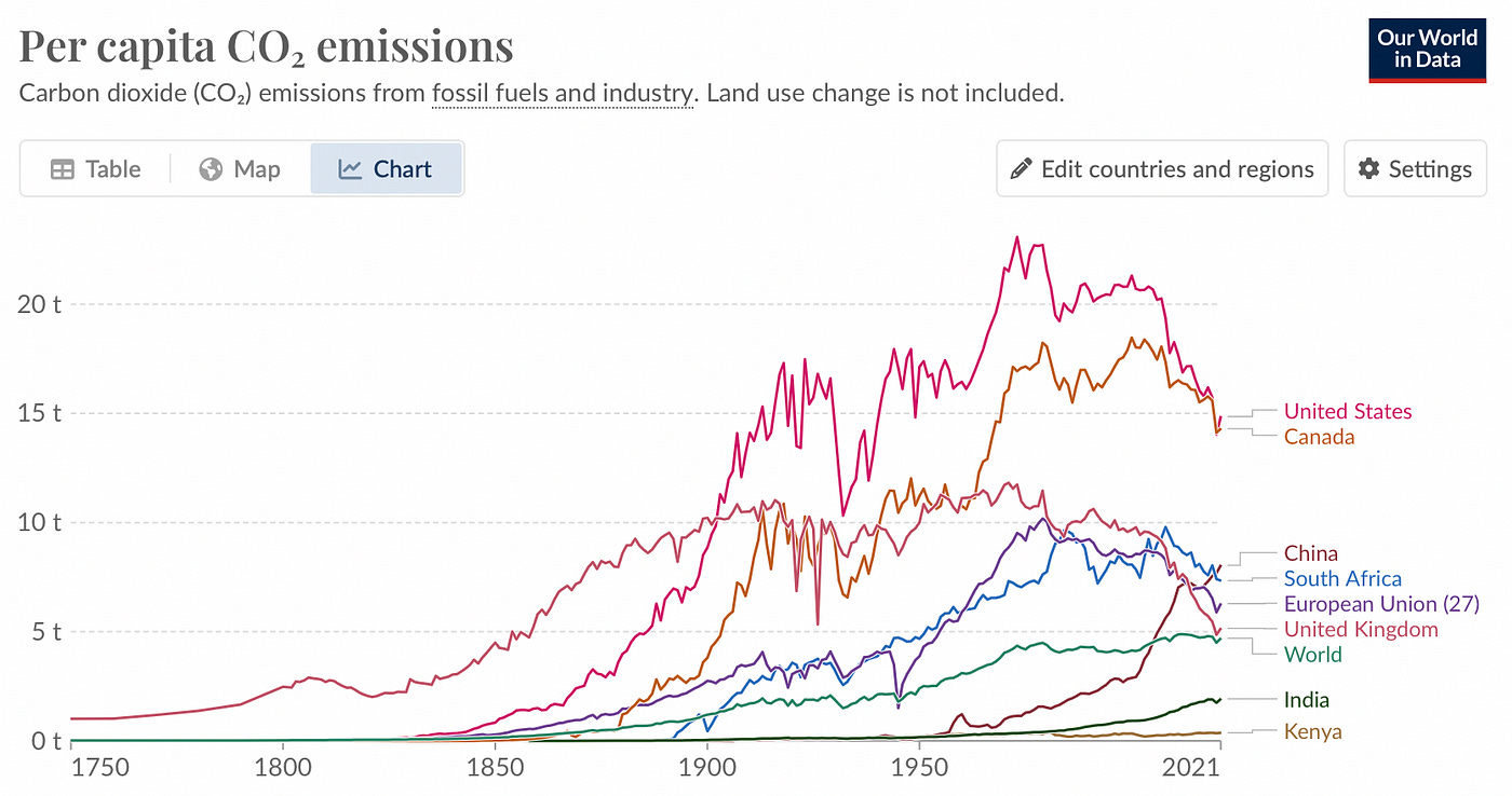
To ensure a line chart’s accuracy, the time intervals should correspond to the scale ticks on the chart. A well-designed chart maintains consistent spacing between intervals.
In the example below, the 2021 tick is further from previous intervals of 50 years, and that’s both correct and beneficial.

4. If you have missing data, make it clear from the chart
When dealing with missing data points in a line chart, it’s crucial to maintain clarity. Do not connect data points that have gaps between them. Consider using dashed lines or other visual cues to signal the absence of data for specific periods.

5. The zero baseline can be eliminated, except when dealing with 2+ lines displaying flat trends
Starting the vertical axis from a non-zero baseline can be acceptable, but exercise caution, especially when comparing multiple lines. Eliminating the zero baseline may lead to inaccurate conclusions, particularly when analyzing flat or subtle trends. In the example below, Germany and the UK appear larger in version B compared to version A

If the fluctuation in the trend is very small (like less than 10% between data points), consider eliminating the baseline for a clearer understanding of the trend.
6. Aspect Ratio matters, try 16:9 as a safe one
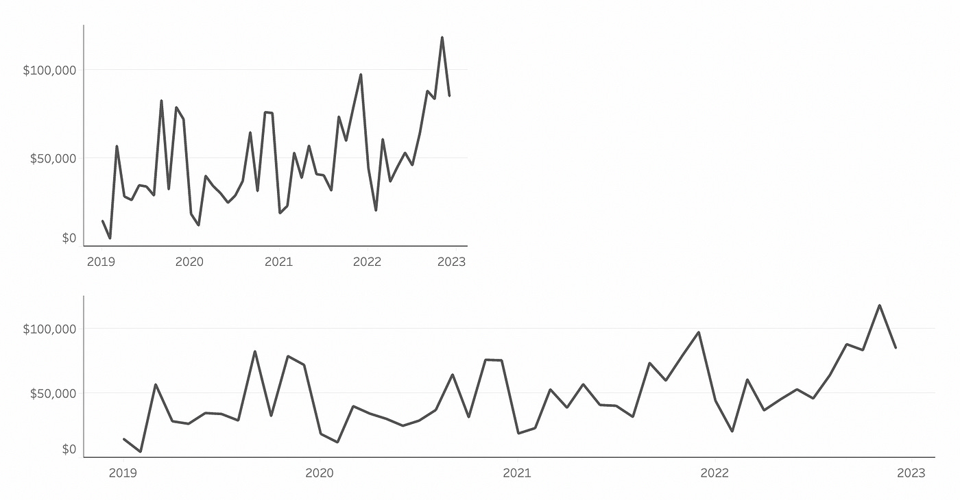
The aspect ratio, or the width-to-height ratio, plays a significant role in how trends are perceived in line charts. A wider chart can make trends appear flatter. In contrast, a narrower chart accentuates fluctuations in the data. While a 16:9 aspect ratio is a common choice, be mindful of your design decisions as aspect ratio can influence the chart’s interpretation.
7. Synchronize Dual Axis
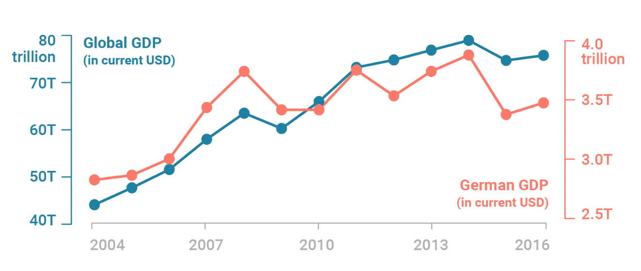
It’s better not to use dual-axis charts with line charts. However, if you choose to do so, always synchronize the axes to create a single shared axis for both lines. How to deal with dual axes read in Datawrapper

8. Managing the Number of Lines
There is no strict rule dictating the maximum number of lines you can include in a chart, but wise design choices are crucial. Ideally, limit your chart to a “golden” number of 4 to 5 lines. Beyond this threshold, the risk of creating a “spaghetti chart,” where lines overlap excessively, increases. To mitigate this, consider:
Coloring one category distinctly while using subtle colors for others, providing context for the selected data.
Comparing the selected line with relevant statistics, such as the average, percentile, median, or extreme values, to add context.
Exploring small multiples charts to display multiple line charts side by side, facilitating comparisons and maintaining consistent axis ranges.
Best practices series:
Bar Charts


