Bar Charts Best Practices
🍫 the only bars we're talking about — unfortunately, not the chocolate kind
Bar charts are one of the first types of charts that come to mind when you think about visual representations of data. Alongside line charts and tables, they form the foundation of most business visualizations.
The main purpose of bar charts is to provide comparisons between categories. To achieve this effectively, there are simple, strict, and useful rules that should be applied. Here, I’ll share all I know about bar charts.
Best Practices series:
TLDR
1. Always start axis from zero.
2. No 3D.
3. Don’t use rounded edges.
4. Apply logical sorting.
5. Horizontal orientation for typical dimensions, and vertical for date categories.
6. Label data directly.
7. Use color efficiently.
8. Don’t break the bar axis.
9. Don’t make radial bar charts
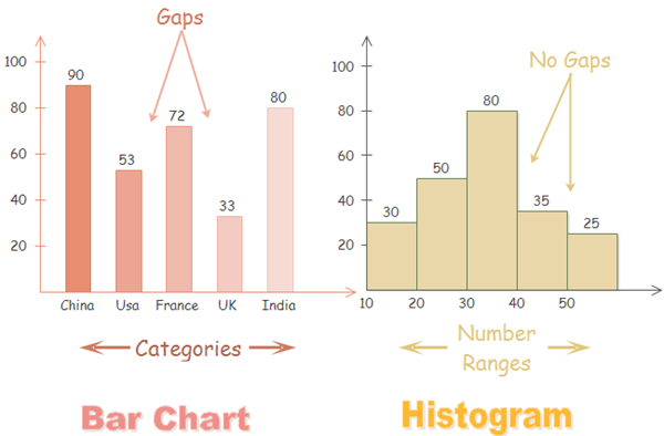
10. Bar Chart is not a Histogram!
1. Always start axis from zero
This is a basic and fundamental rule for bar charts. The purpose of a bar chart is to compare the areas of bars to one another and draw conclusions about their relative sizes. When we eliminate the axis zero, it appears that the differences are much larger than they actually are.
In the example below, the ‘Home Office’ category is only about 2.5 times smaller than ‘Consumer’, but if we eliminate the zero axis, it appears that the difference is x10 times or even more. The reason for this is that in bar charts, we compare the area taken up by each category’s bar and their positions.
2. No 3D
This rule applies not only to bar charts but also to pie and donut charts, and the reason is simple: 3D distorts proportions and leads to incorrect comparisons.
The only good example I know is this one, where 3D works as a metaphor for real buildings.
3. Don’t use rounded edges
While it may appear aesthetically pleasing from a design perspective, the issue lies in data distribution. It’s difficult to determine whether the actual data value is located at the top of this rounded part or on the side.

4. Apply logical sorting
Most of the time, sorting from highest to lowest can be helpful, but it all depends on the objective. If you want to emphasize:
which category is the largest — sort from highest to lowest to highlight the top first
which category is the smallest — sort from lowest to highest to emphasize the bottom first
If you have a logical order in your data, such as age intervals or dates, make sure to sort by them!
5. Horizontal orientation for typical dimensions, and vertical for date categories.
It’s not a rule, but it feels very logical to me to arrange it that way. It’s much easier to read category names from left to right and also to fit them horizontally rather than trying to incline them and fit them vertically.
However, if you’re comparing date categories, such as which weekday brings you the most sales, it would be easier to look at time data in a vertical orientation, like time flowing from left to right.
6. Label data directly
When possible, label your data directly on the bars. This allows you to hide axes and makes the data easier to read. Remember not to hide the axis if data labels are not shown and leave grid lines for better understanding.
7. Use color efficiently
There is no reason to color your bars with different colors if there is no logic behind it. Use color efficiently:
highlight categories you are focused on
alert on changes and important information
distinguish other dimensions
Be careful with:
Coloring bars by the same metrics as shown — this duplicates the data and doesn’t really aid understanding. It’s better to reserve color for something more useful.
Coloring with a metric different from what the bar represents; for example, showing sales but coloring by profit. This can be confusing for many users. It’s better to split it into two adjacent bars to allow for complex comparisons.
8. Don’t break the bar axis
Breaking the axis distort data values, just like with 0-axis case.

Instead, you can 1) split the charts into multiple ones to zoom in smaller ones, 2) group categories, 3) add annotations for big values.
9. Don’t make Radial Bar Chars!
10. Bar Chart is not a Histogram!
Even if they look alike, they serve totally different goals. The idea of the bar chart is to compare categories, while a histogram is used to analyze distribution.

Bar or Line for dates?
When working with date categories, you might start thinking: should you use a bar or line chart to show a metric over time? The question is: do you want to compare periods or show the trend of the metric?
If you want to analyze metric fluctuations in detail and show its trend, use line charts with continuous dates. If you want to compare which year is the most profitable, use bar charts.
From a Tableau perspective, use date values for line charts and date parts for bar charts.


Great post! I especially enjoyed the section about color and how to emphasize certain results. I generally agree that bar graphs should start from zero, but I don't think this is a hard and fast rule. For instance, if you have values that are quite far from zero and the difference in values between bars are small, but meaningful, then this difference could be washed out by starting from zero. Curious to hear your thoughts though on non-count data and the use of bar graphs (e.g., means, point estimates with error, etc.). Would you recommend? Thanks!