DataViz 101: Key Principles for Crafting Clear Dashboards
🎓 Lessons Learned from Analyzing Over 3,000 Student Dashboards
I've reviewed more than 3,000 students' dashboards over the past three years, and here are my tips if you're just starting your data visualization career.
💪 1. Master the Basics
It can be very tempting to start creating something complex. The desire to add everything and show that you can do anything is understandable, but first, master the basics.
1.1 Start with mastering the design of bar charts and line charts
Make them look clean, uncluttered, and easy to read. 90% percent of dashboards have these types of charts, and you can solve almost any problem with them. Especially focus on:
1.2 Create a simple but clean and easy-to-read dashboard first
It might consist only of bar charts, without any KPI cards or fancy visualizations, but with a clean design and layout. Master the way you organize elements when they are as simple and useful as bar charts before moving on to something different. I have one dashboard with mostly bar charts, and you know what? It might not be that visually appealing, but it's easy to read and understand the idea.
1.3 If you're using Tableau, start with a fixed layout
The desire to make adaptive dashboards is great, but get familiar with element sizes, how containers work, etc.
✨ 2. Keep It Simple
2.1 Don't overuse colors.
Start with grey; make all charts grey! If you don't like grey, most likely you haven't found the grey you like :) There are many tones of it, so find the one you like and use it first. This will help you understand when you really need to use color.
2.2 One sans-serif font
Use one sans-serif font, and combine bold and regular weights only. Serifs are great for long-read texts but not for charts. In charts, they create unnecessary noise and use additional ink (pixels). You don't need italics or underlined text. Underlined text can be used for hyperlinks, but again, don't overuse it. I personally like Arial, Roboto, Verdana, but check out Google Fonts also.
2.3 Remove clutter from your charts
Remove unnecessary elements from your chart that create noise and make it hard to read. If you are using Tableau, at least avoid adding new ones! The basic formatting is pretty good. Try to:
Remove borders
Remove gridlines (if they are needed, e.g., for large line charts, make them light grey)
Remove additional markers and unnecessary labels
Remove backgrounds
Also, take a look at a couple of makeovers on the Storytelling with Data blog. Most of the time, they focus on decluttering charts. Highly recommend!
📚 3. Learn About Basic Chart Types for Each Purpose
I've seen pie charts or stacked area charts misused many times. Or gauge charts or polar bar charts, which are actually bad data visualization practices. All you need in dashboards:
Bar chart - for comparison
Line chart - for dynamics
Stacked charts (like area or bar) - for parts of a whole
KPI card with sparklines - for a quick overview
Table (especially those with visuals, like heatmaps and bar chart tables) - for analyzing exact values
Additionally, use something for distribution (like histograms or jitters) and relations (scatter plots). These will most likely solve all your problems.
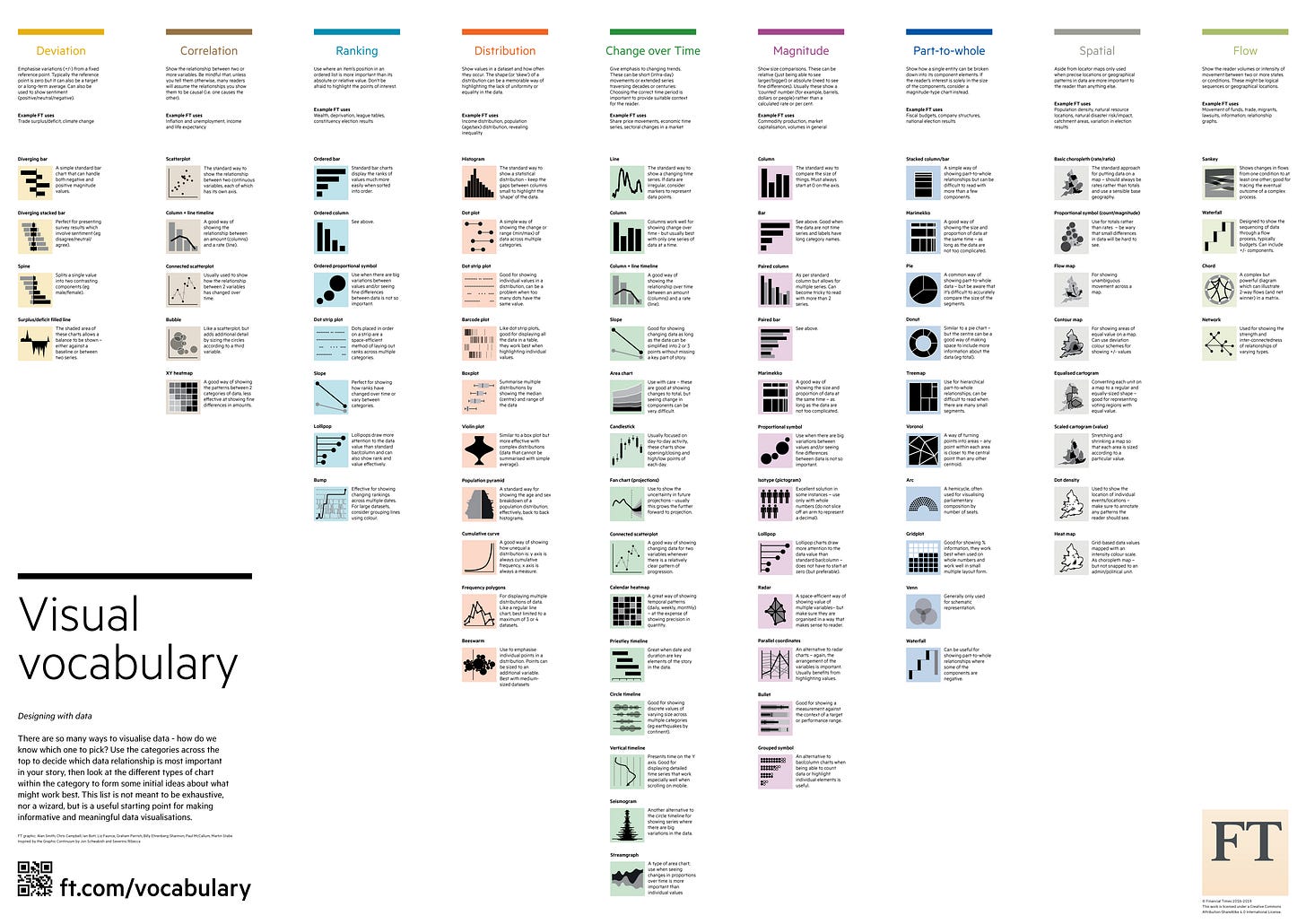
One of my favorite chart choosers – Visual Vocabulary by Financial Times.
⏸ 4. Utilize White Space
It's like pauses for your visualizations. There should be enough space between visualizations to take a breath and look at the next one 🌱
In Tableau, utilize paddings. Don't forget about inner padding; it helps make charts stand out from the background and creates the needed space.
Paddings (in px)
for charts: outer – 4, inner - 0;
for charts blocks: outer – 4–10, inner 8-16
between charts inside one block: 16-40
📐5. Learn Proximity and Similarity Rules
Pretty much all you need from Gestalt principles are the proximity and similarity rules. Use
Proximity to:
Place elements related to the same things together
Place filters and legends closer to the elements they are related to
Similarity for:
Effective color use
Consistent design of similar elements
More about Gestalt Principles
Hope you've enjoyed reading this article. If you found it useful, please share it with your friends and don't forget to subscribe 👇


Great tips. Thank you🙏
Super! 🤩