Gestalt Principles in Data Visualization
A bit of history: the Gestalt Principles, developed by German psychologists in the 1920s, aimed to unravel the complexities of human perception and how individuals visually interpret the world around them. These principles explore the ways in which our minds organize visual information and play important role in various disciplines, particularly design and data visualization.
Here I will try to explain how they work and uncover their practical applications in creating data visualizations.
Proximity
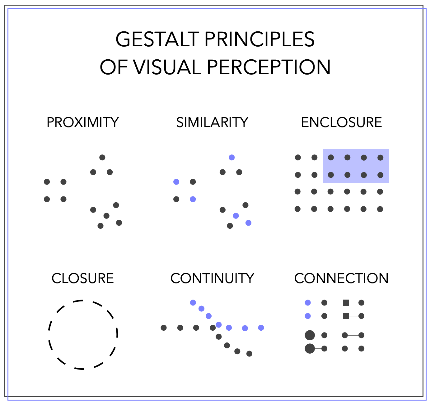
When objects are in close proximity, our minds naturally infer a connection between them. In the context of visual perception, this phenomenon is crucial to understanding how we interpret images. Take, for instance, a collection of points in a picture — our immediate perception might lead us to believe there are distinct groups based on their proximity.
Arrange elements of your visualizations closer to each other if they are related:
Titles should be placed near the charts they are related to.
Color keys (legends) need to be located close to the charts they are used in.
Filters/parameters (and other settings) should be positioned closer to the charts they influence.
Charts related to each other, such as those representing the same metrics, should be placed close to each other rather than to other charts.

Similarity
Objects sharing the same color, shape, or size are perceived as related or part of the same group. In the image, even though three distinct groups are apparent, the blue dots appear similar to each other, suggesting a common characteristic.
Use color efficiently to enhance navigation and perception of your visualizations. If the chart is merely colored without carrying any semantic meaning, it may be harder to interpret than if left without color altogether.
Use color for
Grouping to highlight similar characteristics. For instance, assigning color to a scatterplot can convey additional characteristics of the elements.
Directing the audience’s attention to elements you consider significant, serving as a focus mechanism within your visualization.

Enclosure
This principle, akin to proximity, suggests that objects ‘enclosed’ within a defined area belong to a group. Instead of ares you can also use borders.
Common applications include:
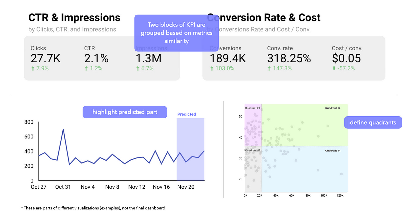
Grouping connected charts with the same background, such as KPI cards.
Highlighting specific parts of the chart, such as predicted values or quadrants in the scatterplot.
It is very popular nowadays to use backgrounds or borders for different elements. Remember to group similar objects, not just create separate backgrounds/borders for each chart and element.Otherwise you’ll make the dashboard less connected and broken, highlighting each element separately and not forming a cohesive picture. Again, this should help navigation not make it harder.
Closure
We prefer a group of objects to be drawn into something whole, simple, and clear. In a picture, it may appear as just a set of lines, but our mind distinctly perceives a circle.
In visualization, this principle aids in eliminating unnecessary elements from charts, ensuring clarity and simplicity. For instance, if you draw a bar chart and remove the y-axis with the values, it remains recognizable as a bar chart. This principle becomes particularly evident when unnecessary frames, extra grid lines, separators, and similar elements are removed from charts.
Continuity
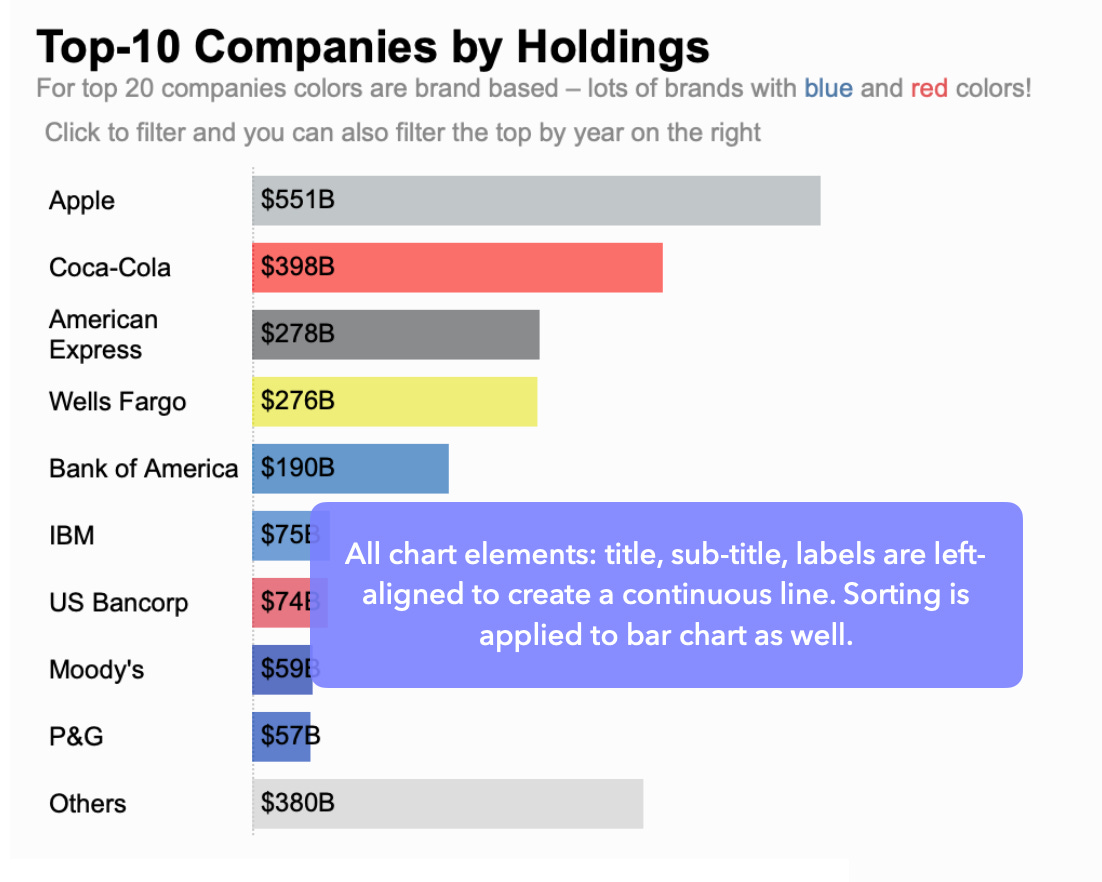
It is similar to closure: when we look at a group of objects, we naturally attempt to organize them. If they lie flat on a line, it is easier for us to align them and comprehend their arrangement.
In charts, this principle primarily involves sorting and order. Bar charts are more comprehensible when arranged from larger to smaller, time charts from past to future, and so forth. This organization allows us to perceive them as one continuous whole.
Additionally, captions, legends, and other visual elements should be organized in conjunction with the chart — consider alignment, indentation, etc

Connection
If objects are connected, we perceive them as a unified entity. This principle holds more influence than common colors and shapes. When looking at an image, even if the dots share the same color and possess other similar characteristics, our initial perception connects them through the principle of connection.
This principle is especially evident in networks and line graphs — thanks to the lines, we understand that the dots are interconnected, leading us to infer that they relate to the same thing or share similar characteristics.
Of course, all the principles overlap quite a lot with each other and should be used together frequently to enhance your visualizations and create their optimal versions. They guide us in understanding how people perceive our charts — indicating what can be removed and what should be emphasized. Ultimately, they contribute to making data visualization clearer and more efficient :)
Let’s stay connected on LinkedIn


This was so helpful when I was teaching my class! Great analysis!!
Another great one Anastasiya. I am getting into data analytics and this was an eye opener. It is always great to learn the concepts that drive our perception when we encounter visuals.