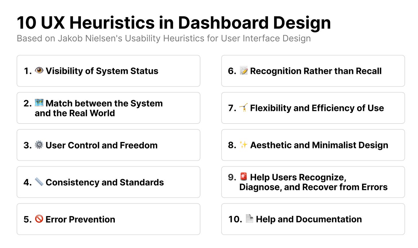
Jacob Nielson's 10 UX Usability Heuristics are broad rules of thumb for designing better interfaces. They can be easily applied to dashboard design, so here I’ll explain what they are and how you can use them in dashboards.
1. Visibility of System Status
The design should always keep users informed about what is going on, through appropriate feedback within a reasonable amount of time.
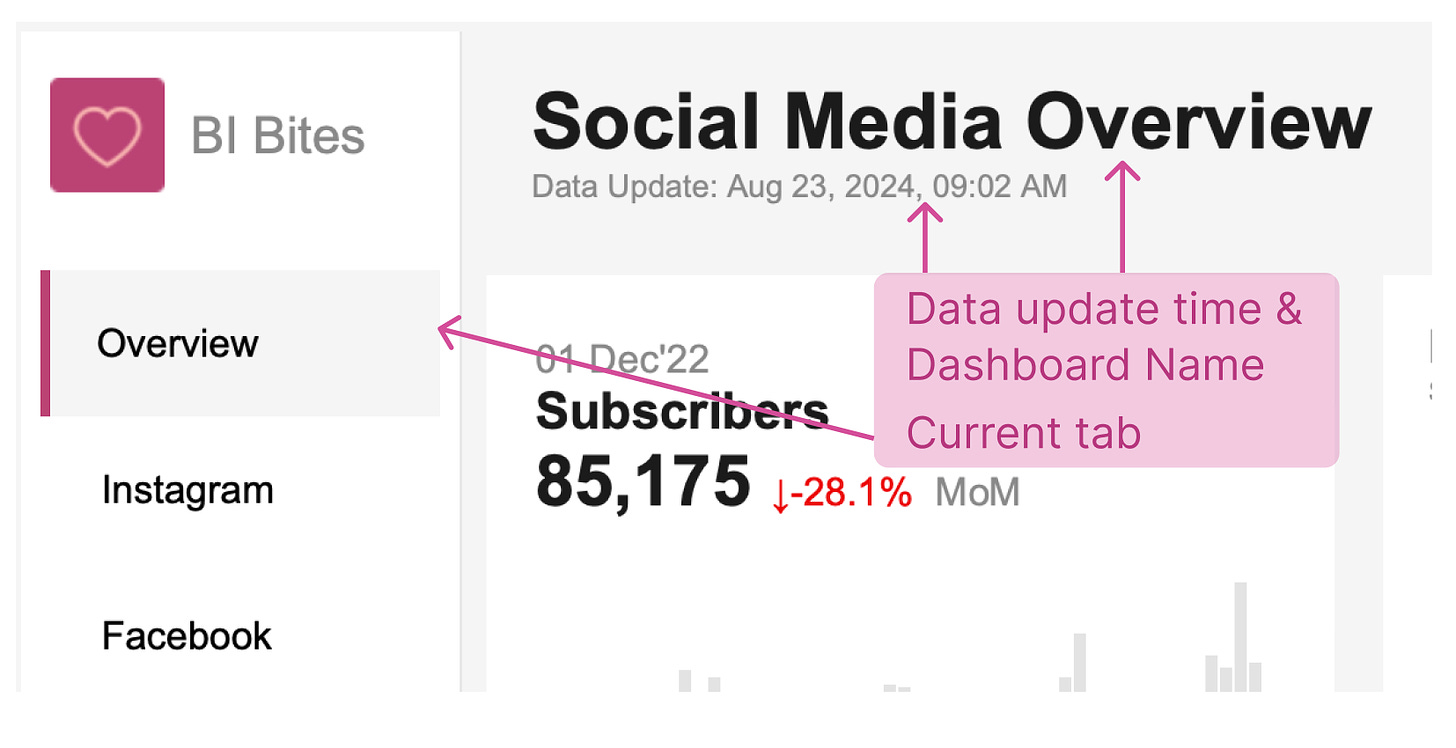
As an example, consider the page loading circle. In dashboards, aside from displaying the most important data in the upper left corner and including a dashboard name, you should also add the date of the last data update. This is a crucial feature that helps users understand the current state of affairs and the relevance of the data. If your dashboard has multiple pages, be sure to highlight the page the user is on.
2. Match between the System and the Real World
The design should speak the users' language. Use words, phrases, and concepts familiar to the user, rather than internal jargon. Follow real-world conventions, making information appear in a natural and logical order.
In dashboard design, we should ensure:
Consistent design across dashboards and charts (such as the same location of buttons, navigation tabs, and similar structure for KPIs within a dashboard).
Utilization of well-known color associations (e.g., green for good, brand colors like red for Coca-Cola).
Easy-to-understand icons (e.g., if your table is downloadable, add an Excel image near it).
3. User Control and Freedom
Users often perform actions by mistake. They need a clearly marked "emergency exit" to leave the unwanted action without having to go through an extended process.
In addition to using filters and parameters, it can be helpful to add a 'clear' button for filters (and to reset affected charts) so that the user can easily roll back if something goes wrong. How to create a reset button on Tableau.
4. Consistency and Standards
Users should not have to wonder whether different words, situations, or actions mean the same thing. Follow platform and industry conventions.
Dashboard styleguides are important! Messengers are similar to each other for a reason – we find it easier to use familiar things. If a person’s icon means 'your profile' everywhere, it’s unwise to go against that standard. Similarly, a dashboard styleguide, where filters are in a consistent location, chart layouts are standardized, colors are coordinated, etc., would greatly help users master new dashboards.
Additionally, naming conventions and other rules that ensure consistency are crucial in building a better BI platform within your organization.
5. Error Prevention
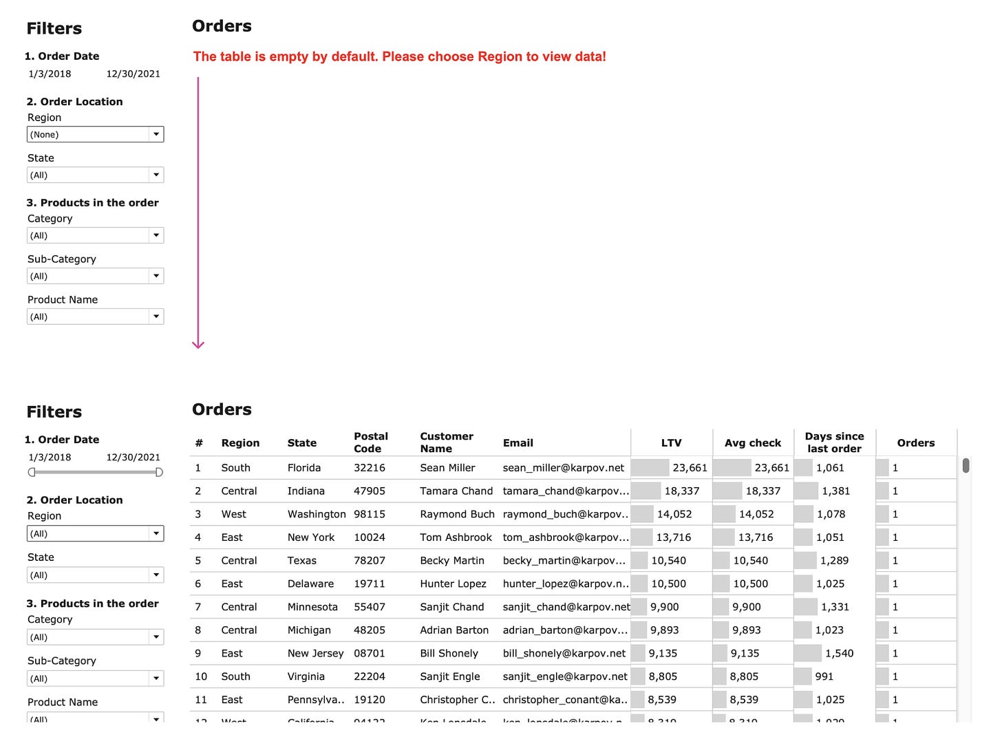
Good error messages are important, but the best designs carefully prevent problems from occurring in the first place. Either eliminate error-prone conditions, or check for them and present users with a confirmation option before they commit to the action.
If you use any actions or hidden triggers that may cause the existing visualization to change, explicitly state that clicking on something will alter the entire visualization. You can include this information in tooltips or subheaders.
6. Recognition Rather than Recall
Minimize the user's memory load by making elements, actions, and options visible. The user should not have to remember information from one part of the interface to another. Information required to use the design (e.g. field labels or menu items) should be visible or easily retrievable when needed.
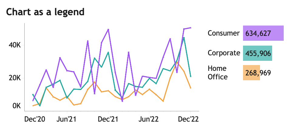
The main necessary information for using dashboards should be visible, so users don’t have to search for it or remember it. Elements like chart titles and labels, filter names, and legends are important parts of charts and the overall dashboard, helping users navigate through it.
7. Flexibility and Efficiency of Use
Shortcuts — hidden from novice users — may speed up the interaction for the expert user so that the design can cater to both inexperienced and experienced users. Allow users to tailor frequent actions.
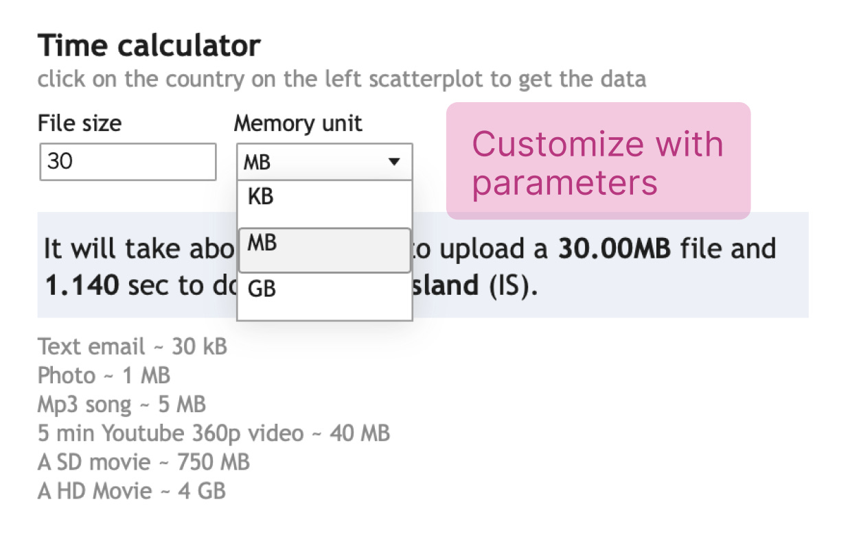
Give users the ability to customize, such as by offering the option to present data in different types of charts. For dashboards in Tableau, you can also mention the possibility of creating custom views.
8. Aesthetic and Minimalist Design
Interfaces should not contain information that is irrelevant or rarely needed. Every extra unit of information in an interface competes with the relevant units of information and diminishes their relative visibility.
Again, emphasizing the need for a dashboard styleguide, along with considerations like the data-ink ratio and Gestalt principles.
9. Help Users Recognize, Diagnose, and Recover from Errors
Error messages should be expressed in plain language (no error codes), precisely indicate the problem, and constructively suggest a solution.
Add easy-to-read and understandable error messages or error prevention messages. If there are limitations on filtering, such as when parameter X and filter A cannot be used together, create a text message highlighting this when they are used together. Or, when selecting a small number of dates or when the number of observations on the dashboard falls below a certain threshold, you can display a message indicating that there is not enough data to make a decision.
You can also include a link to bug tracking forms and don’t forget to mention the dashboard owner so users know whom to contact in case of unresolved issues.
10. Help and Documentation
It’s best if the system doesn’t need any additional explanation. However, it may be necessary to provide documentation to help users understand how to complete their tasks.
Don’t be lazy—write documentation. While only a few people may read it, those who do will benefit greatly in understanding the dashboard. Add cross-links to the documentation from dashboards, and provide support chats for users in need. Documentation will also be incredibly helpful when transferring dashboard ownership or working with legacy dashboards.
Also some short info in tooltips might help more about tooltips.






That was a great read Anastasiya!
I love anything related to making visualisations more intuitive and practical.
The biggest mistake I’ve seen a lot of data professionals make is not setting format standards to help them keep things consistent across dashboards.
Nice dashboard 😤👌✨