Tooltips in Dashboard Design
💬 the little pop-ups that make big data less confusing
Tooltips — are small boxes that appear when you hover over an element. Tooltips are always attached to specific items, such as a dot on a scatter chart or a bar on a bar chart.
I used to add all the information I could to the tooltip. Tableau provides all the resources for that: all your Marks details usually appear in the tooltip automatically. However, well-designed dashboards include well-designed tooltips as well. Tooltips can be a great way of providing additional information or adding context to data. So, how can you use them in dashboard design, and how can they elevate your dashboard?
How we can utilize tooltips?
Provide Additional Information
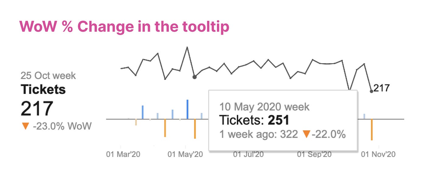
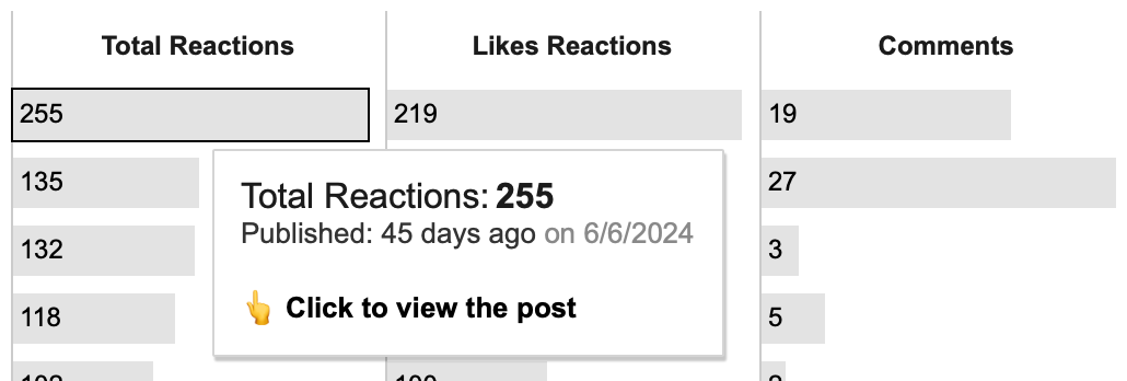
Tooltips offer supplementary details that are not immediately visible on the chart. For example, they might include additional metrics related to those displayed on the chart.
Add Context
They provide context-specific information relevant to the element being interacted with, helping users interpret the data accurately. For example, they can include averages or even data related to specific events.
Explain
Tooltipcs can be sued to add descriptions or calculations of some metrics, some inportant highlights why.
Maintain Clean Design
Tooltips allow for a cleaner and less crowded visualization by keeping additional details hidden until needed. For example, we don’t usually label all data points on line charts. Most of the time, it’s unnecessary because we want to see the trend first. However, adding details on hover can help a lot in case the user wants to look at exact numbers.
Guide Users through Tooltips
Tooltips can be utilized to show how users can interact wiht visualization. Like filtering, url actions.
What are the rules for better tooltip design?
Tooltips should be helpful.
Avoid duplicating information already present in the visualization with tooltips. Tooltips that contain obvious or redundant text are not beneficial to users. If all the necessary information is already displayed on the visualization, do not repeat it in the tooltip, especially in KPI/BAN cards.Choose tooltip information wisely.
You don’t need to include all the additional details you could add. Consider the user’s needs and think about what information will be helpful while they are viewing the visualization. Avoid trying to add everything at once.Don’t rely on tooltips alone. Avoid using tooltips for information essential to understand the viz. For example, don’t try to add color legend inside the tooltip only, always provide a clear one.
Be consistent with tooltip positioning. If 2 out of 3 sparklines in your dashboard have tooltips, the 3rd should have them as well. Users will expect tooltips to be present, so maintain consistency across the dashboard and on which charts you add tooltips.
Visual hierarchy is important. Just like in any other typography, the elements of tooltips affect how the tooltip is understood. Use a slightly larger font size for more important information and a smaller font size and/or gray color for additional information.
Tooltips should be consistent with the overall dashboard design. One problem with dark-themed dashboards is that tooltips are often still bright. Use the same font, size hierarchy, and color logic as the rest of the design.
Tooltips should not overlap other content. They shouldn’t be large enough to block other elements, as the rest of the visualization is usually more important. This is a common issue with visualizations in tooltips. Once again, keep it simple and minimalistic; don’t try to include everything.


