
Why Text Skills Matter More Than You Think in BI
Clear writing builds clarity, trust, and impact — on dashboards, in documentation, and across every insight you deliver

When you look at a typical BI skillset, it's mostly about working with data and business requirements. There's one thing that hiring managers usually don't ask for, but something that can elevate your BI communication skills enormously: writing.
To be honest, we have text everywhere in dashboards — starting from column naming to chart titles, annotations, dashboard documentation, and onboarding guides. The ability to write nice, structured, and easy-to-understand text is crucial.
Why Should I Care? I Make Top-Notch Visuals and Text Is Just Part of It
Yep, but an important part! If the chart isn't named clearly, people won't understand what they're looking at. If your metric definitions are vague, stakeholders will interpret numbers differently. If your dashboard has no context, users will draw wrong conclusions.
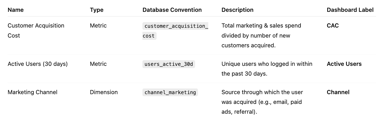
Think about naming conventions — when you have consistent, clear names for dashboards, metrics, and dimensions, new team members can navigate your work instantly. When you don't, they spend weeks asking "What's the difference between 'Customer_Final' and 'Customer_Clean'?" A proper data dictionary with well-written definitions becomes the single source of truth that prevents those endless definition debates.
Poor writing doesn't just confuse — it costs time, credibility, and insight. When stakeholders can't understand what you've built, your work becomes decoration rather than decision support.
Signs Your BI Team Needs Better Writing
Dashboards full of cryptic chart titles like "Table 1" or "Revenue (v3)"
No explanation for why metrics moved up or down
Comments in dbt models like
-- temp fix 4 nowStakeholders asking, "What's the difference between 'Activated User' and 'Active User'?"
Charts that require tribal knowledge to interpret
🖋 Making Writing Your BI Superpower
1. Naming Conventions and Data Dictionaries
Before you even build a chart, you're writing — in your column names, table names, and metric definitions. Good naming conventions are writing rules that scale across your entire BI platform.
Establish clear standards:
Use consistent patterns:
metric_type_timeframe(e.g.,revenue_monthly_current,users_daily_active)Avoid abbreviations that only you understand:
cust_acq_costvs.customer_acquisition_costCreate a data dictionary with plain-English definitions for every metric and dimension
Document business rules directly in field descriptions: "Active User = logged in within past 30 days"
When everyone follows the same naming logic, new team members can navigate your work without constant translation.
More about naming conventions
2. Dashboard Text and Labels
Your visuals might be the star, but text makes them usable. Think of your dashboard as a product — your text is the user experience.
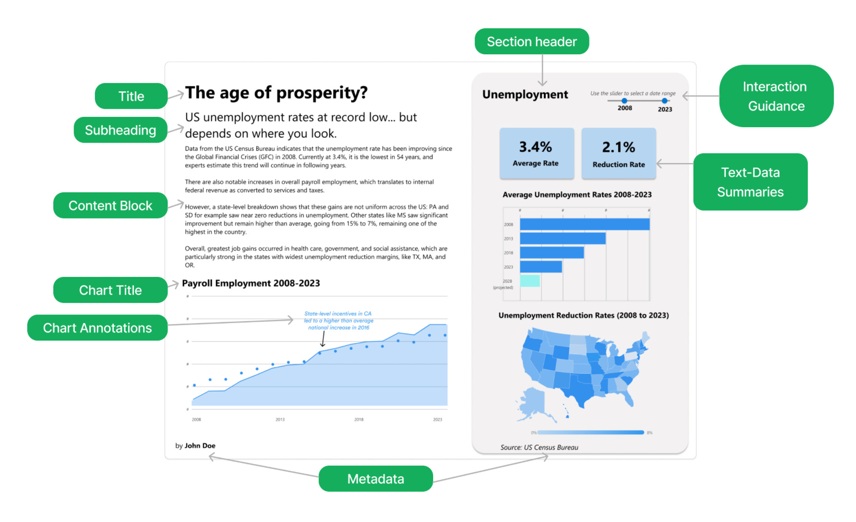
Key areas to focus on:
Titles: Clear, specific, human-readable
Bad: "Table 3"
Better: "Weekly Signups by Source (Last 30 Days)"
Delete unnecessary words. Remove "number of" "quantity of”.
Subtitles: One-line interpretation of what's shown, applied filters, or detailed description of the chart
"Filtered to Q4 2024 data, excluding trial accounts"
"Daily active users measured as unique logins per day"
Tooltips: Define terms, clarify logic, show units
"Net revenue = Total revenue – Discounts – Refunds"
More about Tooltips in Dashboard Design
Empty states and error messages: Tell users what to do or what's broken
"No data available: Select a different date range or check filters"

I highly recommend referring to the dashboard naming convention by Aurélien Vautier. The dashboard title is the first text your user will see.

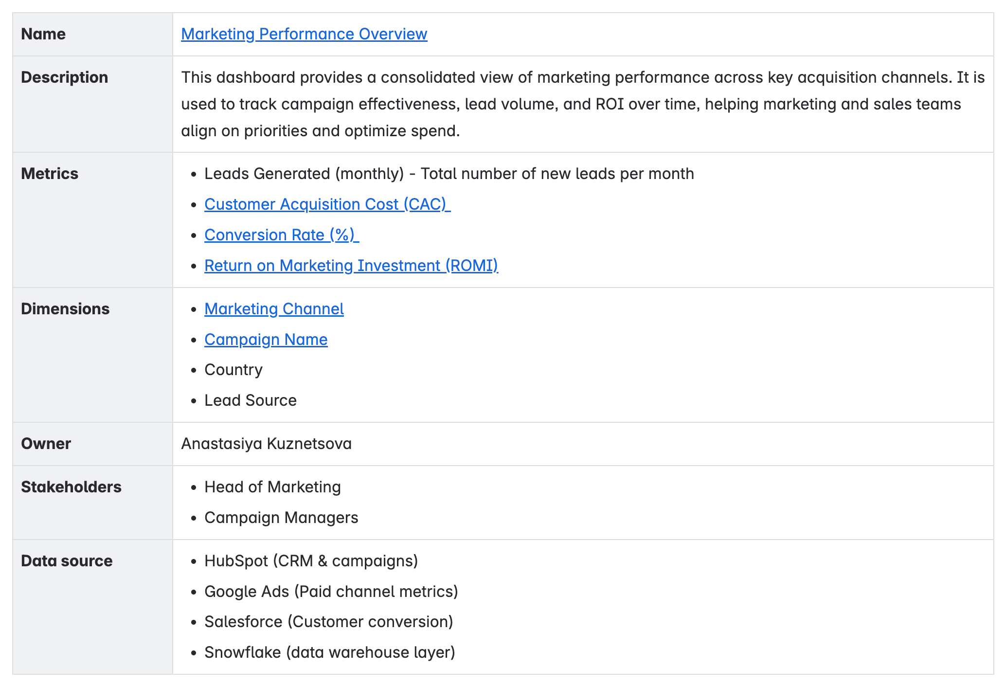
3. Documentation and Comments
Documentation isn't just "BI hygiene" — it's infrastructure for scaling your team. If your documentation is unclear or incomplete, it won't help anyone.
More about Dashboard Documentation Structure
What to document clearly:
Metric definitions: What it means, how it's calculated, when to use it. Make cross-links to your data catalogue or metrics & dimensions dictionary.
Model comments: Explain why, not just what
"This filter limits to active subscriptions as per Finance's Q2 reporting logic"
Dashboard "About" sections: Who it's for, what it covers, where data comes from
4. Insight Summaries and Analysis
When stakeholders open a dashboard, they're asking: "What's happening, and what should I do about it?" Answer that up front. Write your insights like you're delivering a brief:
Start with the headline insight: "Revenue is down 8% MoM due to a drop in signups"
Add the why: "The drop is isolated to the EU region, likely tied to the April launch delay"
Finish with next steps: "Monitor daily signups post-relaunch to confirm recovery"
A two-line summary at the top of a dashboard can multiply its usefulness.

One-sentence Tips
Standardize language across the team (e.g., "user" vs. "customer")
Make titles, subtitles, and other text in the dashboard easy to read and understand.
Use short sentences. One idea per line. Also titles should fit into one line.
Avoid jargon. Write like you're explaining to a smart new hire.
Read your writing out loud. If it's hard to say, it's hard to read.
Be specific over clever. Say what it is, not what sounds impressive.
To Conclude
You don't need to become a novelist — you just need to be intentional. Start with better titles. Add one clear comment per model. Write a one-liner that explains what your dashboard shows.
Better writing makes your BI work more effective. Your future self, and your team, will thank you for it.
Thank you so so much, this is so underrated, in the analysis space, but it is very essential