
How to write Dashboard Documentation?
📄 the structure, where to write it, and how to encourage users to read it

What is Dashboard Documentation and Why Do We Need It?
Dashboard documentation is a structured record that explains the purpose, functionality, and data sources of a dashboard. It’s a reference guide for users and developers to understand the dashboard’s design and use cases. While dashboards are designed to be intuitive, documentation ensures that:
Users know how to interpret the data and leverage it effectively. Understand the assumptions, limitations, and methodologies behind the visualizations.
Developers can update or troubleshoot the dashboard without guesswork.
Documentation is a love letter that you write to your future self.
Damian Conway (2005). “Perl Best Practices”
First of all, we create documentation for ourselves, the dashboard creators, to make sure we won’t forget what all that stuff means.
📄 Documentation Structure: Essentials vs. Secondary Elements
A clear documentation structure makes it easier to navigate and use. Here’s a recommended outline with parts that I consider essential and others that are secondary – only if you have time or if you’re going to hand over this dashboard to someone else.
📍Essential Components
1. General Information
Providing a clear overview of the dashboard's purpose and ownership ensures that users understand its context and scope.
Name and Purpose: Clearly state what the dashboard is about and what objectives it serves.
Dashboard Owner: Identify the person or team responsible for the dashboard. It's better to include your preferred way of contact, such as Slack, for quick communication.
Main Customer: Define who primarily uses the dashboard (e.g., a specific team or department). Specifying the customers is important for two reasons: first, to analyze the supply and demand matrix of analytical information within the organization and determine which roles would benefit from the dashboard; second, to know who to contact in case of any changes to the dashboard.
Key Metrics and Dimensions: List the primary KPIs and measurements tracked. This information can also be reused in your data catalogues to ensure consistency and alignment across documentation.
Frequency of Updates: Specify how often the dashboard data is refreshed.
2. Accesses (If Applicable)
This section details who can access the dashboard and how new users can obtain permissions.
Who Can See/Edit: Outline the roles and permissions.
How to Request Access: Provide steps or contact details for requesting access.
3. Data Sources and Technical Details
Understanding where the data comes from and how it is processed is crucial for accuracy and troubleshooting.
Name of Sources: Specify the data sources used (e.g., CRM, ERP).
Type of Connection: Clarify how data is connected (e.g., direct connection, manual upload).
Specifics of Calculations: Document any critical formulas or transformations applied. This should be described at a high level or with examples, such as schemas. It does not replace the need to comment on your calculations while creating them.
4. Frequently Asked Questions (FAQ)
FAQs help users quickly resolve common issues without requiring additional support.
Example:
Question: Why isn't my region listed?
Answer: It means that there have been no sales in that region this month.
")
Secondary Components
While not always necessary, the following sections can enhance documentation, especially when handing over the dashboard to someone else.
5. Dashboard Structure
A visual or descriptive guide explaining the layout and key sections. This is considered secondary because a well-structured dashboard should be intuitive. If omitted, users can rely on exploratory learning or internal training sessions.
6. Filters and How They Work
Detailed explanations of available filters and their impact on the displayed data. This is secondary as intuitive filter placement and tooltips often suffice. In the absence of documentation, users can explore filters through trial and error or seek support from dashboard creators.
7. Detailed Calculations
Comprehensive breakdowns of complex formulas and logic used in the dashboard. This section is secondary since calculations should ideally be self-explanatory through naming conventions and inline comments within the tool. If needed, users can review calculation logic directly in the dashboard tool.
8. Dashboard Illustrations
Annotated screenshots or diagrams to visually represent dashboard components. This is secondary as a well-designed dashboard should not require additional visual aids. If omitted, users can familiarize themselves through onboarding sessions or tool walkthroughs.
Note: These secondary components are often unnecessary if the dashboard has been well-designed with good UX principles and quality development practices.
✏️ Where to Write Dashboard Documentation
1. Inside the Dashboard
It can be done in the format of Tooltips, help buttons, or a dedicated documentation tab within the dashboard.
Pluses:
Easy access for users.
Contextual explanations (e.g., metric descriptions available when hovering over).
Minuses:
Limited space.
Lack of searchability.
Hard to maintain detailed technical information.
Potential performance issues with loading time.

2. External Tools (Confluence, Notion, SharePoint)
Pluses:
Centralized location for all project documentation.
Easy collaboration and version control.
Supports detailed content, images, and links.
Minuses:
Requires users to navigate away from the dashboard.
This is an example of the documentation structure in Confluence that I use in my projects. The top part is essential, while the items that go below are secondary. Confluence also allows you to integrate it into the dashboard catalog, which can be very handy. My personal preference is to write documentation in Confluence and add a navigation button to it from the dashboard.

3. Git Repositories
Pluses:
Ideal for technical teams familiar with Git.
Enables version control and tracking changes.
Can be tied directly to data pipeline or dashboard code.
Minuses:
Less user-friendly for non-technical stakeholders.

📢 How to Encourage Users to Read Dashboard Documentation?
Make It Accessible and Easy to Find
Place a visible link or button (e.g., “Help” or “Documentation”) within the dashboard. Offer contextual help or tooltips that appear when users hover over specific elements.
Offer Bite-Sized, Scannable Information
Organize documentation into short, digestible sections. Use bullet points, headings, and visuals like screenshots to make it easy to scan.Encourage Exploration
During onboarding or first use, encourage users to explore documentation for basic understanding. Use a pop-up like: “For more details on this feature, check the documentation!”.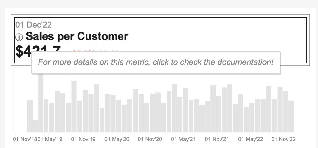
Provide Friendly Reminders
If a user asks a question you know is in the documentation, gently refer them there.
For example, say: “That’s a great question! You can find more details in the documentation – it's linked in the top right corner.”
This encourages users to refer to the doc first next time.Keep Documentation Updated and User-Friendly
Regularly update the documentation and make it relevant to different user needs (e.g., analysts vs. managers). This makes it more likely that users will refer to it.

Best Practices for Dashboard Documentation
Keep it concise but comprehensive – Avoid overwhelming users with unnecessary details, but ensure all key information is covered.
Make it accessible – Choose a documentation method that fits your audience’s technical skills and habits.
Update regularly – Ensure documentation stays current with dashboard changes. This is about the process of maintaining documentation. For example, each dashboard creator can review their documentation once a quarter.
Get feedback – Ask users and stakeholders if the documentation meets their needs.
Check usage – Don’t just analyze dashboard usage, but also the documentation for it.