
Nested Model for Visualization
Understanding Tamara Munzner’s Nested Model for Visualization Design and Validation

Tamara Munzner is one of my favorite authors on data visualization. Her Nested Model for Visualization Design and Validation provides a structured approach to analyzing what data visualization should show and how to evaluate it. This model helps identify potential design issues early in the process and ensures that visualizations are effective for their intended purpose. In this post, I want to give more details on what it is and how all BI practitioners, analysts, and data visualization specialists should use it.
Or you can just watch the video from her educational course or read the original article.
What Is the Nested Model?
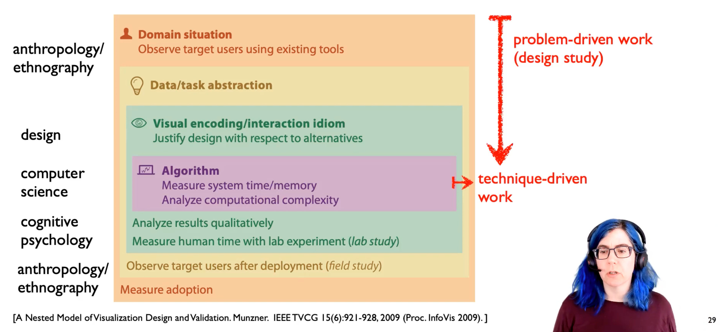
Munzner’s model divides the visualization design and validation process into four interconnected levels:

Domain Situation – who are the target users, and what do they do?
Understanding the real-world problem and the context in which the visualization will be used.
The main problem here is to misunderstand the needs of the end-users.
Data & Task Abstraction – what data are we showing, and why are users looking at it?
Defining the key analytical questions and transforming raw data into an appropriate structure for visualization.Visual Encoding & Interaction Idiom – how is it shown?
Selecting the right visual metaphors, encodings, and user interactions to represent the data effectively.Algorithm Design – can we show that?
Ensuring that computational techniques can efficiently generate and render the chosen visualizations.
Each level is nested, meaning that errors or poor decisions at higher levels (e.g., misunderstanding the domain needs) can cascade down and affect all subsequent design choices.
How Can the Nested Model Be Applied?
The model serves as a framework for diagnosing and addressing design flaws at different stages. Here are some real-life examples of its application:
Analyzing E-commerce Sales Performance
Domain Situation: An online retailer wants to understand customer purchasing trends.
Data & Task Abstraction: Define key questions (e.g., how do seasonal trends affect sales?) and structure the data into categories like time series, product categories, and customer segments.
Visual Encoding & Interaction Idiom: Choose a line chart for trends, bar charts for category comparisons, and interactive filters for exploring customer segments.
Algorithm Design: Optimize data processing for real-time dashboard updates.
Validation Issues
What can go wrong and how to prevent it?
1. Domain Situation
❗️ Threat: Misunderstanding user needs, business context, or the real-world problem.
Users may struggle to articulate their needs, or requirements might change over time.
✅ Solution: Conduct user interviews, stakeholder workshops, and iterative feedback loops to refine problem understanding. After that, measure adoption and track usage.
To understand user needs, try
To track adoption
For web tools try to GA4, HubSpot, Hotjar and others.
2. Task & Data Abstraction
❗️ Threat: Selecting the wrong data or incorrect analytical questions.
Raw data might not directly map to user questions, or key variables may be missing.
✅ Solution: Work closely with domain experts, test multiple hypotheses, and validate data quality before designing visualizations.
For better data questions
Data Quality
3. Visual Encoding & Interaction Design
❗️ Threat: Poor chart selection, misleading visuals, or inaccessible design.
Cognitive biases, perceptual limitations, and differing user expectations can affect interpretation.
✅ Solution: Conduct usability testing and heuristic evaluations to ensure clarity and effectiveness.
4. Algorithm Design Validation
❗️ Threat: Computational inefficiencies, rendering issues, or misrepresentation due to data smoothing or aggregation.
Large datasets, real-time requirements, or algorithmic biases can distort results.
✅ Solution: Optimize performance, test algorithms on diverse datasets, and implement transparency measures for data processing.
By applying this structured approach, data visualization professionals can create solutions that are both insightful and user-friendly, leading to better decision-making and communication. Remember to always start with the domain and understand who your users are and what they need from this visualization.