How to Choose the Right Chart?
🔎 Intro to Chart Choosers, Visual Attributes, and Finding the Best Visual for your Data
The chart you choose to display your data will fully define the way your audience perceives this data and draws conclusions based on it. All of us use the information we see to reinforce our beliefs and ideas. So, let's go step by step!
1. Research Your Data
I would even call this step 0. Most of the problems with charts come from the data itself.
“A chart shows only what it shows, and nothing else.” – “How Charts Lie”, Alberto Cairo
If you don't research the data you're going to use, the rest is useless. The most important things to do are:
Research the subject your data is about. For example, if you’re creating charts about spaceship launches, start by Googling to understand what that entails, potential problems, etc. In business, try to understand how this kind of data is generated. For example, learn how everyday user payments transform into profit in your data.
Understand your data sample’s limitations. Maybe some countries are missing, certain user types were excluded, etc. This information should be noted in your future chart and/or dashboard.
2. Understand your data
Understand your data types. Essentially, we can categorize data into:
Categorical: Data that can be divided into groups (e.g., types of products, regions).
Nominal: Unordered categories, such as gender (male/female) or country names.
Ordinal: Ordered categories that are mutually exclusive, such as age groups, happiness scores, or difference indices.
Numerical: Data that can be measured and counted (e.g., number of users, sales).
Discrete: Numeric values that can be counted and aggregated, like sales, number of users, or visits.
Continuous: Numerical values that can be divided into any possible value and further subdivided, measured with high precision.
Other important types:
Time series. They can be tricky because they can be ordinal, such as years, quarters, or seasons, or continuous, like time. Try not to categorize date columns into these types and consider them as a separate flow of temporal data.
Geo spatial data. Having a geo variable doesn’t always justify using a map, but it definitely provides the possibility to use one.
Also, don’t forget to check:
What columns can be appropriately aggregated and how
Which might produce duplicates
Which columns contain unique values
If any important derived attributes can be created based on the data. Sometimes, raw data is not enough, and additional calculations may be necessary, such as finding the number of days between dates or calculating age from a date of birth.
3. Finding Your Visual
In this part let’s consider ways to find the best chart for your data.
3.1 Based on the Data
One of the easiest ways to find the right visual is to start with the data. I personally love the "from Data to Viz" website because you can choose chart types based on the kind of data you have. It might not be the most advanced approach, but it’s definitely an easy way to research which kinds of charts you can actually apply to your data. For example, there’s no way to create a map without geospatial data. So it will definitely narrow the list of possible charts for you.
3.2 Based on the Goal
Once you've narrowed down the possible visuals, it’s time to understand what you want to show and what questions the chart should answer. You can definitely start with this step while skipping the previous one.
In general, most cases can be solved with these charts:
Comparison: Bar chart – “Which category has the most sales?”
Dynamics: Line chart – “Is our sales growth increasing over time?”
Part of the Whole: Stacked charts (like area or bar) – “What share of sales goes to this category?”
Relationship: Scatter plot –
“What is the relationship between sales and profit?”
Distribution: Histogram and jitter plot – “How is our customers’ LTV distributed?”
Quick Overview: KPI card with sparklines – “What are our current sales?”
Exact Values: Table (especially those with visuals like heatmaps and bar chart tables) – “What is the exact number of sales for this region in that category?”
Flow: Sankey plot – “Which pages did the user visit during their session?”
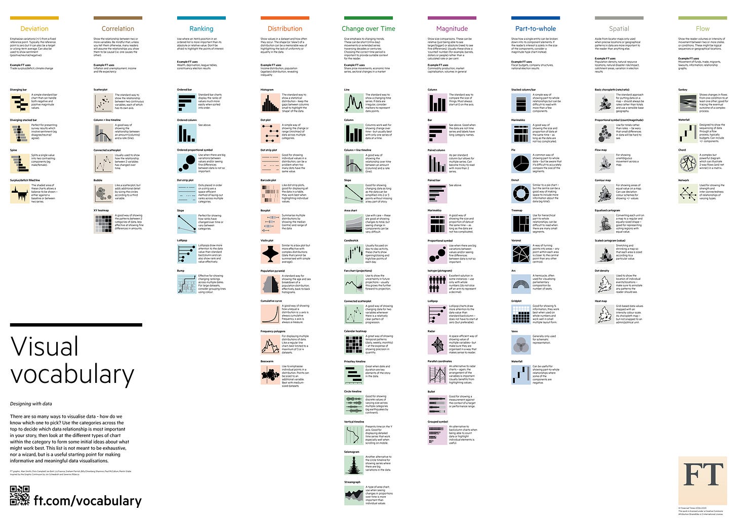
You can also use chart choosers here. One of my favorite chart choosers – Visual Vocabulary by Financial Times and it’s version in Tableau by Andy Kriebel.
Once again, this is a basic way to find the right chart. It’s an easy way to avoid mistakes and choose a good chart, but there are more advanced methods. If you’ve mastered this approach, let’s move on to the next step.
3.3 Combining Data, Goal and Visual Attributes
This approach definitely takes more time than the previous ones, but it's the only way to truly find the best way to present your data and master dataviz skills. It essentially combines some of the earlier methods by remapping the data and dissecting basic chart types.
I absolutely love Tamara Munzner's approach with visual encoding through marks and channels. I highly recommend her book “Visualization Analysis and Design" and video lectures.
Marks: Represent items or links, usually as geometric elements in the chart, such as points, lines, bars, circles, etc.
Channels: Ways to change the appearance of marks, something that can be controlled by the data, such as length, area, and color. These can also be referred to as visual channels, variables, or dimensions.
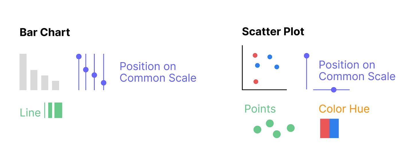
Channels for numerical variables also vary in their effectiveness for analyzing and estimating data. The best option is the position on a common scale—when values are aligned on the same scale, we can easily compare them and determine which is larger and by how much. However, it’s much harder to determine which value is larger when using area size or color. We can provide general estimates, like identifying the larger one, but it’s difficult to say exactly by how much.
So, whenever you create a chart, you apply certain channels and marks. For bar charts, we use position on a common scale as a channel and bars as marks. For scatter plots, we use position as a channel and points as marks.
How to Start Creating Your Own Charts with Channels and Marks:
Identify Data Types: Determine which aspects of your data need to be visualized and what variables represent them.
Understand the Goal: Clarify the message you want to convey and the relationships you want to highlight, such as comparisons, trends, distributions, or correlations.
Choose Marks: Decide which marks will represent your data points.
Choose Channels: Select the visual properties that will modify the marks to represent the data.
Map Data to Marks and Channels: Determine how your data will be visually encoded using the selected marks and channels.
For example, in a bar chart, bars (marks) represent categories, and their height (a positional channel) represents the value.
This approach allows you to think outside the box and create visuals that may not exist on the usual list of charts.
For the same process also read about grammar of graphics.
4 Consider Your Audience
There’s always a basic rule: know your audience when creating visuals. If your audience consists of experts with a high level of visual literacy, you can easily use more advanced visuals, like Box Plots. However, a general audience may prefer simpler visuals like Bar or Line Charts.
That said, I recommend focusing on the goal and selecting the best visual while considering how well the visual should be explained to the audience. You might not need to add specific instructions on how to read a Box Plot for an expert audience. But if a Box Plot is the best chart for your data, try to make it accessible—add a descriptive legend with examples to ensure it’s easy to read, utilize tooltips, so no one has to wonder what type of chart they’re looking at.
I’ve had a hard time adding Bar Code Plots and Jitter Charts to business dashboards, but once you explain them, you get the needed “aha” effect, even if these types of charts rarely make it onto dashboards.
DataViz Catalogues
Catalogues with explanations and how to choose the best one
Language specific
https://www.r-graph-gallery.com – for R
https://python-graph-gallery.com – for Python
What type of charts you can create in what tools


