
Dashboards That Deliver
got it delivered to my doorstep!

Finally finished Dashboards That Deliver and I love it. I wish this book existed 5 years ago – it would’ve saved me so many problems. Yet it’s finally here! There are many books on data visualization but not so many on dashboards. And yes, I’m a fan of The Big Book of Dashboards, so I was eager to read this one.
In this small post I’ll share a couple of things I found most interesting. It doesn’t cover the whole book and I recommend reading the full version, but it might get you interested.
Framework
One of the most essential parts is the framework. I love that the authors start not from design and not even from requirements gathering, but from the spark – an important reminder that many dashboards start from an idea and understanding that we have a problem we might need to solve through the dashboard.
Then there’s a big part about user discovery techniques. This thing is missed way too often in dashboard design, and thanks to Amanda and Andy you can go through many discovery techniques like:
Interviews
User stories
User personas
Journey maps
Continuum maps
They all utilize the main techniques used in product development and I’m a big fan of this approach. One of my personal favorites is the JTBD approach for dashboards – thinking about what jobs they perform for users.
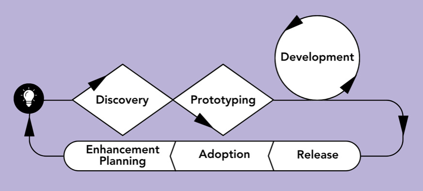
After discovery it comes to prototyping. My favorite part is that prototypes should be connected to the data exploration. I’ve seen so many fancy looking prototypes that fail when put onto real data.
Then it comes to the dashboard development itself, release cycles, adoption and planning future adjustments. The last three are so important to talk about.
An important piece of wisdom I take from this framework is trying not to get stuck in any of the phases:
But don’t get stuck in one phase waiting for three levels of sign-off just to check a box stating you got the requirements “right”: you need just enough discovery to avoid going off in the wrong direction, just enough prototyping to get something real into the users’ hands, and continuous ways to get feedback from your users.
At the ned of the books there s also a lot of icussion about AI and data quality in general. This quote is my fav
“It takes years of work as a data team to build trust with your consumers. It takes one wrong answer for someone to lose trust in a data set.”
—Tim Ngwena, consultant at Aimpoint Digital, and data visualization YouTuber.
Visual ideas to steal
A big part of the book is about dashboards and the ways they are designed with connections to real use cases. Again, would recommend reading it, but here are some things I found so interesting that I want to steal now:
Breadcrumbs to show which filters/parameters are applied
In the Children’s Hospital Association Dashboard you can see what filters/parameters were included and excluded. Absolutely brilliant. Lindsay Betzendahl design.
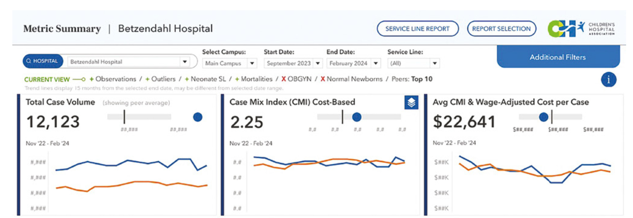
I’m not gonna lie, this dashboard example is one of my favorites and there are so many things to look at and learn.
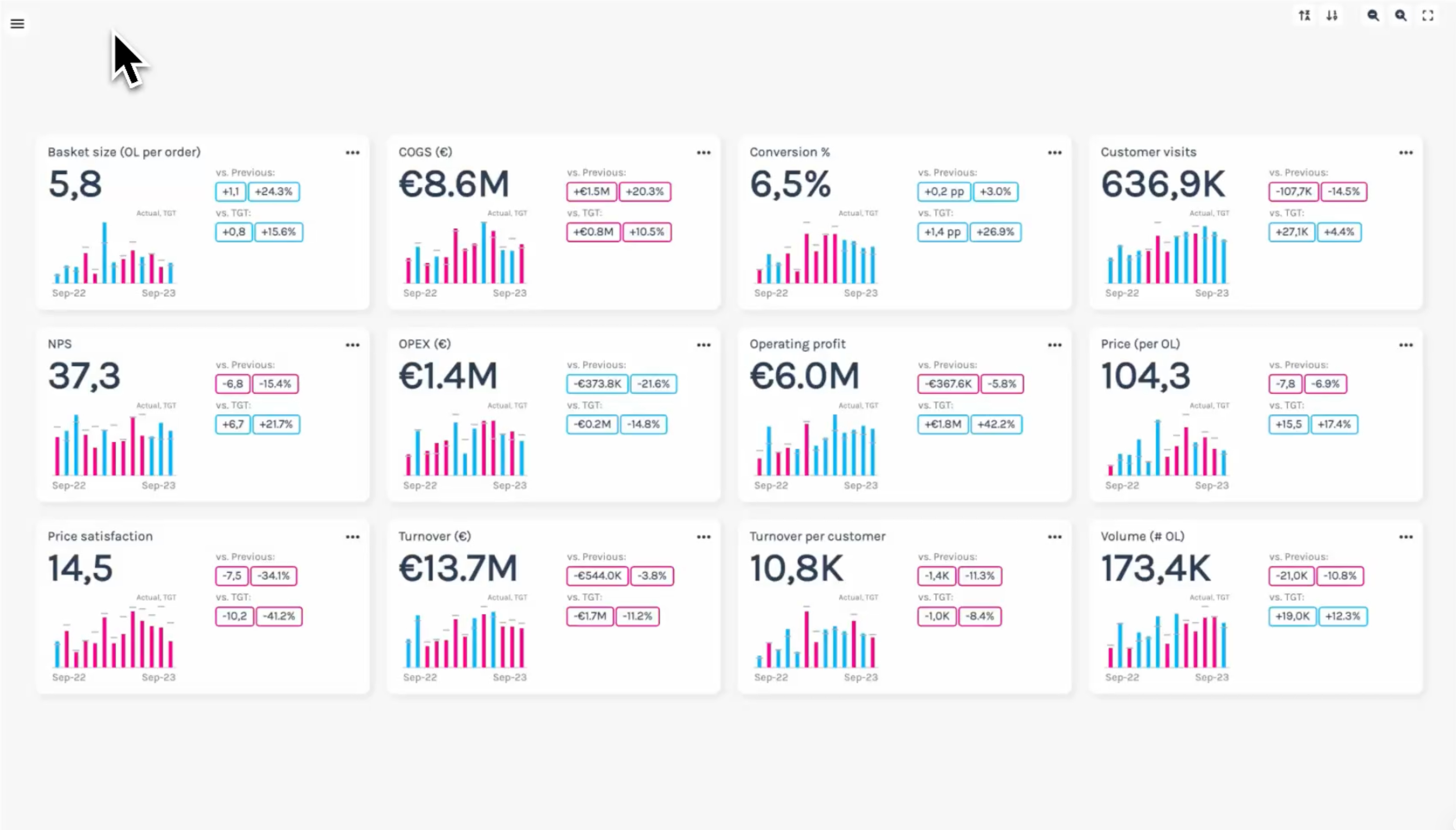
Packed KPI cards
I saw this Metric Tree by Klaus Schulte a long time ago and I’m still in awe. Its packed yet clear design is wonderful.
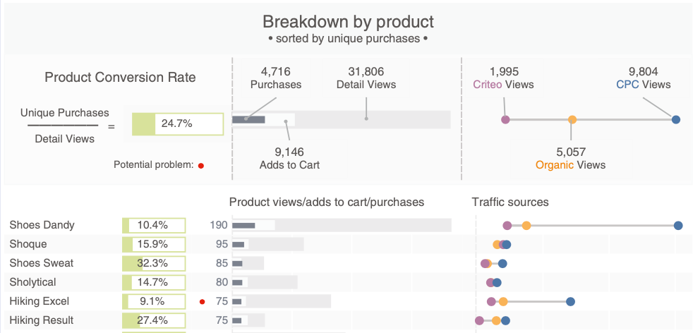
Legends in the dashboard
In this dashboard by Dorian Banutoiu the visual is kind of complex yet the legend above explaining each element is a wonderful idea.
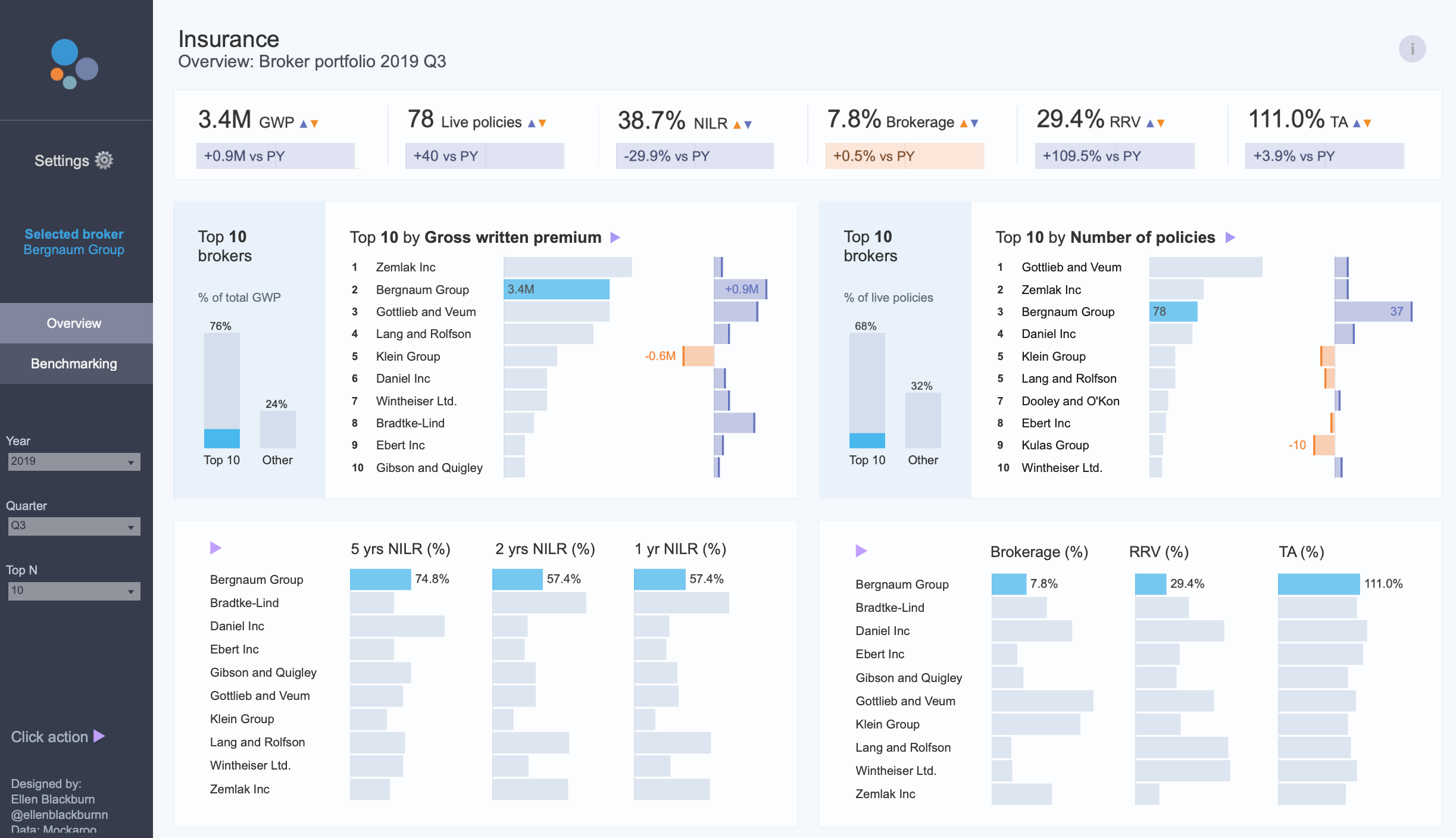
TOP-10 highlight
Ellen Blackburn is one of my favorite dashboard designers. I always recommend checking her profile for inspiration. What I really like in this dashboard is the highlight of top-10 by default. The dashboard doesn’t give you all the information at once, it gives a good storytelling experience focusing your attention on the most important parts.
Metaphors visualization for climate data
Not something we can use a lot in dashboards yet this is a fantastic idea making data more understandable. Here the sea level rise was visualized through a porthole – fascinating yet a bit scary.

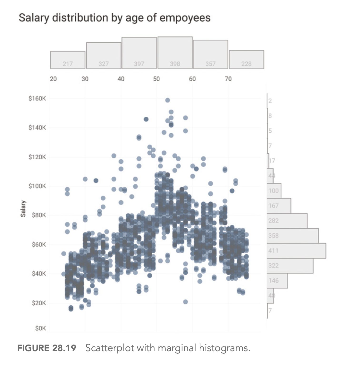
Scatter + Histogram
Steve made a whole chapter about dynamic duos in dataviz. I also believe that sometimes one chart is not enough and there are well-designed combos that are better utilized together. One of them is scatterplot + histogram.
This is definitely not it. I’ve bookmarked way more but it’s better if you read the whole book.
Dashboards That Deliver is packed with practical examples, real-world case studies, and actionable frameworks that you can apply immediately. Whether you’re just starting with dashboards or looking to level up your existing designs, this book has something valuable for you.
Andy, Amanda, Jeffrey, Steve did an amazing job covering everything from the initial spark of an idea to post-launch adoption strategies. It’s rare to find a book that handles both the strategic and tactical sides of dashboard design so well.
If you’re serious about creating dashboards that people actually use and find valuable, grab a copy. You won’t regret it.