
Jobs-to-be-Done: A User-Centered Approach to Dashboard Design
Design dashboards around what users need to achieve — not just what they can see

What is Jobs-to-be-Done (JTBD)?
Jobs-to-be-Done is a framework that fundamentally shifts how we think about product development and design. Rather than focusing on what products or features to build, JTBD centers on understanding what users are actually trying to accomplish. The core principle is simple yet powerful: people don’t buy products or use dashboards — they “hire” them to solve specific problems and complete particular tasks.
This approach has gained traction across various industries, from software development to product management, because it reveals the true motivations behind user behavior. Instead of asking “What features does our dashboard need?” JTBD prompts us to ask “What job is the user trying to get done?”
The JTBD Framework: Four Key Dimensions
When applying JTBD methodology, you need to examine four critical aspects:
1. JOB (The Task) — What is the user trying to accomplish? This is the core activity or decision the user needs to make. It’s not about clicking buttons or viewing charts—it’s about the actual work outcome they’re pursuing.
2. SITUATION (The Context) — In what circumstances does this need arise? Understanding when, where, and why the job needs to be done is crucial. The same job might require different solutions depending on whether it’s performed daily or monthly, alone or in a team meeting.
3. OUTCOME (The Desired Result) — What does success look like? This goes beyond completing a task. It’s about the measurable improvement or change the user wants to achieve in their work or decision-making process.
4. OBSTACLES (The Barriers) — What’s preventing successful completion right now? These are the pain points, inefficiencies, and frustrations in the current workflow that your dashboard needs to address.
Why JTBD Matters for Dashboard Design
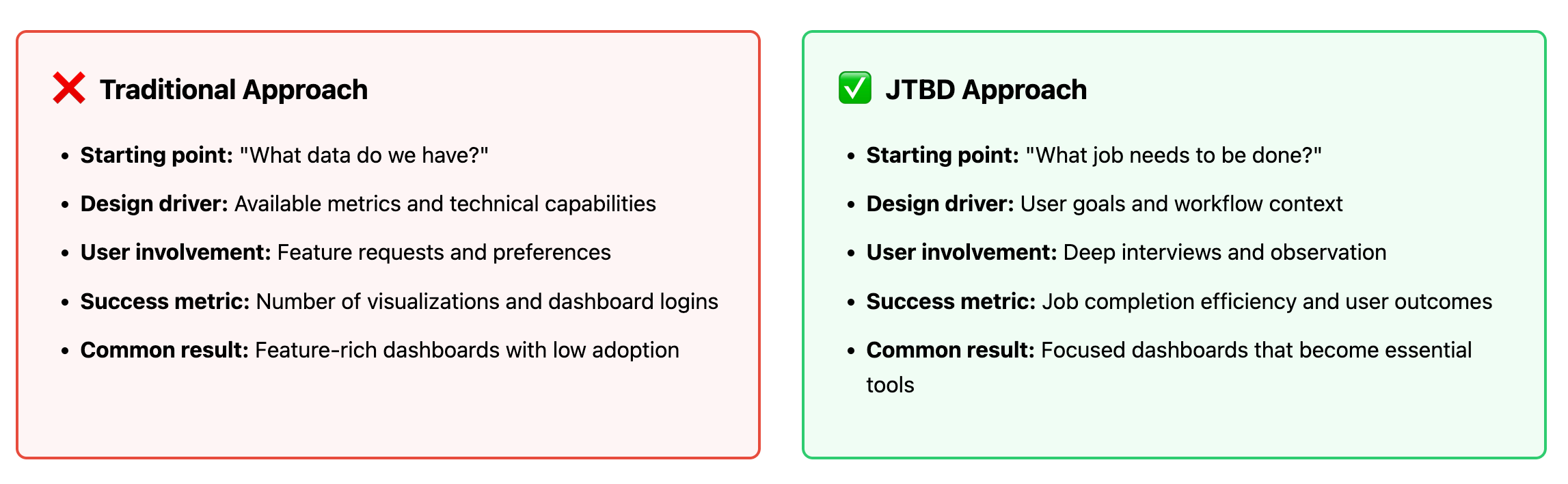
Dashboards often fail not because they lack data or visual appeal, but because they don’t align with how users actually work. Traditional dashboard design frequently starts with available data or technical capabilities — ”We have this data, let’s visualize it.” This inside-out approach leads to dashboards that are technically impressive but practically useless.
JTBD flips this paradigm. It starts with the user’s reality and works backward to the solution. This matters because:
It prevents feature bloat. By focusing on actual jobs, you avoid adding metrics and visualizations that nobody needs. Every element on your dashboard should serve a specific job.
It reveals hidden requirements. Users often can’t articulate what they need in technical terms, but they can describe what they’re trying to accomplish. JTBD helps translate job descriptions into design requirements.
It improves adoption rates. When dashboards actually help users complete their jobs more efficiently, they become indispensable tools rather than ignored browser tabs.
It guides prioritization. Not all jobs are equally important. JTBD research helps you identify which jobs are most critical, most frequent, or most painful —allowing you to focus your design efforts where they matter most.
Applying JTBD as a Dashboard Developer
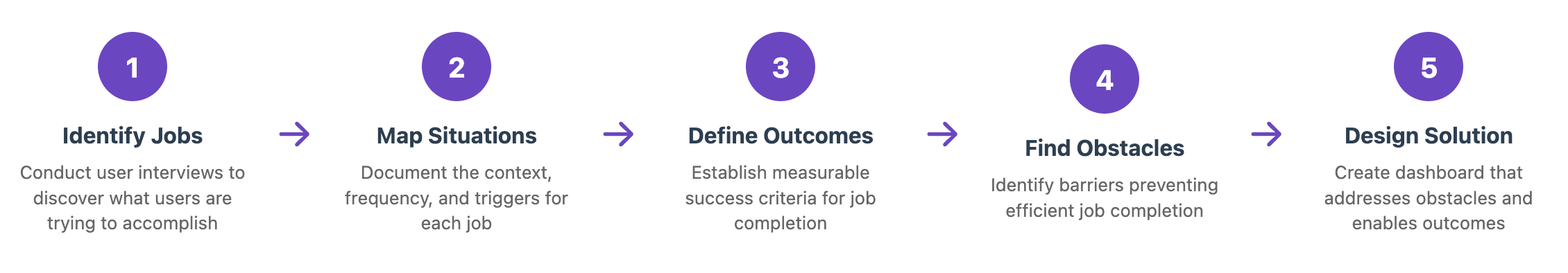
Step 1: Identify the Jobs
The primary tool for uncovering jobs is in-depth user interviews. Don’t ask users what features they want — ask them about their work:
Walk me through your typical Monday morning
What decisions did you make yesterday that required data?
Tell me about the last time you struggled to find information
What reports do you create for others, and why?
Look for patterns in their responses. A regional sales manager might have jobs like “Identify underperforming team members before the weekly meeting” or “Spot emerging sales trends to adjust strategy.”
Step 2: Map the Current Situation
For each identified job, document the current workflow in detail. Observe users in their natural environment when possible. Statistical analysis and usage data can supplement interviews, but don’t rely on them exclusively — they show what users do, not why they do it.
Key questions to explore:
How often does this job need to be done?
Who else is involved in completing this job?
What tools and data sources are currently used?
How much time does it take?
What triggers the need to do this job?
Step 3: Define Success Metrics
Translate vague desires into concrete, measurable outcomes. Instead of “better visibility into sales performance,” aim for specific goals like “identify conversion rate drops within 2 hours of occurrence” or “reduce time spent preparing weekly reports from 3 hours to 30 minutes.”
These outcome metrics become your design success criteria. If your dashboard doesn’t measurably improve the user’s ability to achieve these outcomes, it’s not doing its job.
Step 4: Catalog the Obstacles
This is where you identify what your dashboard must overcome. Common obstacles in dashboard contexts include:
Data fragmentation: Information scattered across multiple systems
Delayed updates: Data that arrives too late to act on
Lack of context: Numbers without comparison points or benchmarks
Poor drill-down capabilities: Can’t investigate anomalies
Unclear data provenance: Users don’t trust the numbers because they don’t know where they come from
Each obstacle represents a design requirement. If data fragmentation is preventing job completion, your dashboard needs to aggregate information from multiple sources.
Step 5: Design the “To-Be” Solution
Now you can design the dashboard with clear purpose. For each job, create views and interactions that:
Present the right data at the right time: Don’t show everything—show what’s needed for this specific job
Match the user’s mental model: Organize information the way users think about their work, not how the database is structured
Enable efficient action: Make it easy to go from insight to decision to action
Reduce cognitive load: Highlight what’s important, provide context automatically, and minimize the need to remember information
A Practical Example: Regional Sales Manager Dashboard
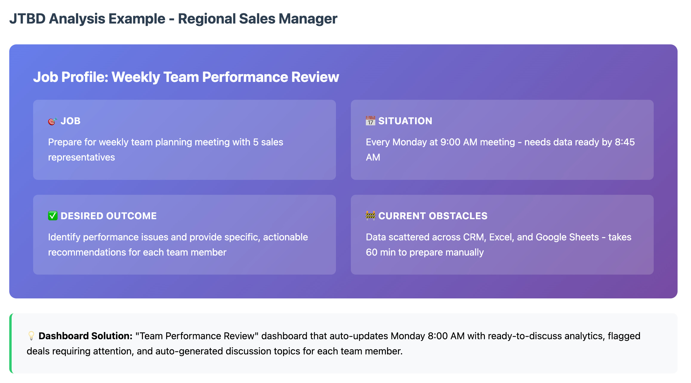
Let’s apply this framework to a real scenario:
Job: “Prepare for weekly team planning meeting”
Situation: Every Monday at 9:00 AM, meeting with 5 sales representatives to discuss the week ahead
Desired Outcome: Identify team performance issues and provide specific, actionable recommendations for each team member
Current Process (AS-IS):
30 minutes collecting data from CRM, Excel reports, and Google Sheets
20 minutes analyzing each team member’s results
10 minutes preparing discussion questions
Obstacles:
Data about different team members exists in different formats and systems
No comparison with previous periods or benchmarks
Unclear which deals are at risk and need attention
JTBD Solution (TO-BE): Create a “Team Performance Review” dashboard that auto-updates every Monday at 8:00 AM, containing ready-to-discuss analytics for each team member with specific talking points and recommendations.
The dashboard would include:
Individual performance cards showing key metrics vs. targets
Week-over-week and month-over-month trend indicators
Automatically flagged deals requiring attention (based on age, size, or stalled progress)
Suggested discussion topics based on performance patterns
Quick comparison view across all team members
This specific solution emerged not from asking “What sales metrics should we show?” but from understanding the manager’s actual job and the obstacles preventing efficient completion.
Conclusion
Start with observation, not assumptions. Even if you think you understand your users, invest time in proper JTBD research. Users often have workarounds and workflows that aren’t documented anywhere.
Focus on job frequency and importance. Prioritize dashboards that address jobs that are performed frequently or are critically important. A job that happens daily with moderate impact might deserve more attention than a quarterly strategic review.
Design for the situation, not just the job. The same job might require different dashboard designs depending on whether it’s done on mobile during a client visit or on desktop during deep analysis sessions.
Measure job completion, not dashboard usage. Success isn’t about how many people log in — it’s about how effectively they complete their jobs. Track metrics like time-to-insight, decision confidence, or reduction in manual data preparation.
Iterate based on job evolution. Jobs change as businesses evolve. Regularly revisit your JTBD research to ensure your dashboards remain aligned with current user needs.
The Jobs-to-be-Done framework transforms dashboard design from a data visualization exercise into a problem-solving discipline. By understanding what users are actually trying to accomplish, the context in which they work, and the obstacles they face, you can create dashboards that become indispensable tools rather than underutilized projects.
For dashboard developers, adopting JTBD means committing to deep user research, resisting the temptation to build features without clear job-based justification, and measuring success by how well users can complete their work — not by how impressive your visualizations look.
The next time you start a dashboard project, don’t begin with data models or wireframes. Begin with questions: What job needs to be done? Who’s trying to do it? What’s stopping them right now? Your answers will guide you toward dashboards that users don’t just use — they depend on.