We see KPI cards every day (also known as BANs or factoids); they’ve become a widely popular way to visualize data. However, a good KPI card doesn't just show the numbers—it also tells a story. In this post, I’ll explore the essential elements that make up a great KPI card for your dashboard.
🧩 Essential Components of a KPI Card
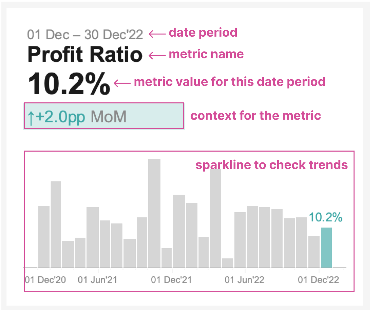
Each KPI card should focus on one key metric. Every KPI card should always include:
Date period for which the metric is shown – This ensures users won’t have to guess the timeframe.
Metric name – A basic but essential element. Consider adding a metric description in the tooltip for additional context. Also, make it simple and easy-to-read,
Total Number of Orders → Orders.Metric value for the stated period – A KPI card wouldn't be meaningful without it.
Context for the metric – This helps users understand if the current metric value is positive or negative, such as period-over-period changes, comparisons with averages, or target values.
Sparkline – Provides a quick overview of the trend.
🔢 Visual Hierarchy
KPI cards provide a quick overview for users, helping them easily understand the numbers and determine whether they are good or bad.
Use a clear, easy-to-read sans-serif font, ensuring that numbers are distinguishable (e.g., it's easy to tell 0 from o).
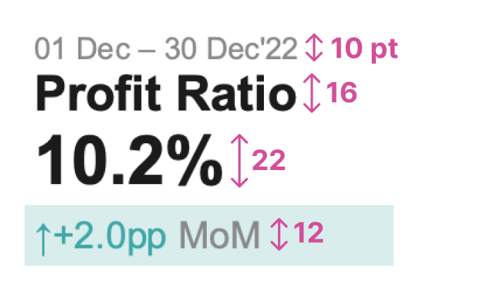
Apply visual hierarchy to font sizes—use a larger font size for the metric value, slightly smaller for the metric name, and even smaller for contextual information. This hierarchy is important for understanding the current metric value and guiding users through the dashboard.
🔍 Add Context
Users should easily understand if the current metric value is good or bad. The choice of what contextual information to add depends on the metric and its nature. Consider using:
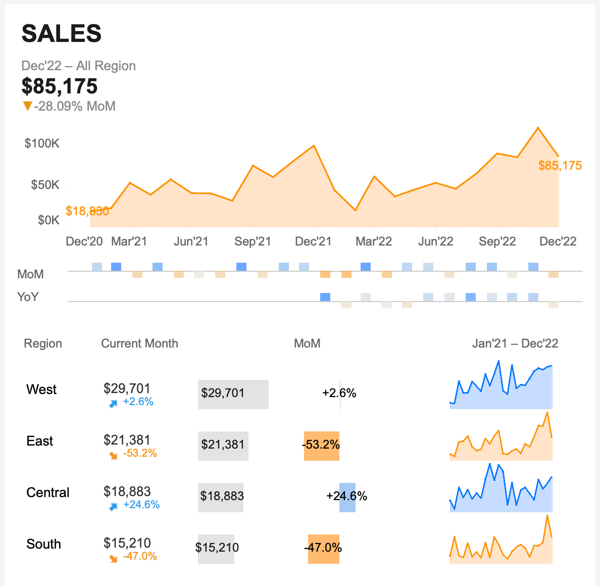
Seasonal comparisons like MoM, YoY, or QoQ if you're interested in the overall growth and trend of the metric over time. For example, Sales or Revenue.
Comparison with average if you're interested in stability checks and understanding whether a metric is performing above or below a typical level. For example, Performance Metrics like Open Rate or Bounce Rate. You might also consider other statistical comparisons, like with the median or percentiles.
Target progress makes sense only if you have a plan. If you do, it's easier to track it on a KPI card.
Another thing to consider when adding context to the dashboard is incorporating dimensions that might affect the overall trend of the metric.
🖍️ Use Color and Icons Efficiently
Make it clear from the KPI whether everything is good or bad. Based on the context provided, ensure consistency. It would be very confusing to have a green KPI card when there's a decrease in the latest data points.
Apply associative colors for KPI elements like text, background, icons, or sparklines. Use 🟢 green for positive changes and 🔴 red for negative ones. If you're unsure whether the change is good or bad, opt for a more neutral palette like 🔵🟠 blue-orange.
Include indicators like arrows or even emojis to enhance quick recognition. Utilize UTF symbols for that, like ↑↓ ▲▼
🔄 Consistent Design
Ensure consistent alignment of elements across all KPI cards. Better to use left-alignment for overall symmetry.
Maintain even spacing between elements within each card and across multiple cards to ensure readability and visual balance.
KPI cards on a dashboard should be consistent in design so users won’t have to “learn” how to interpret each one. If different KPI cards provide various types of contextual information, you can apply different visual coding. However, this visual coding should still align with the overall design to maintain consistency.
Also, don’t forget about the hierarchy of elements on the dashboard. The main metric should be the first element the viewer notices, followed by any supporting information. But that’s a topic for another article. 😉


Great content! Very useful!
Thank you!