
7 Steps to Elevate Your Chart
my process for turning charts into clear, insightful visuals

Good visualization is a process. However, even the worst viz can have a good makeover and start sending the right and clear message. Here I'll share the 7 steps I usually apply to any charts while refactoring them. If you find them useful, consider subscribing!
1. Choose the Right Chart Type
The foundation of effective data visualization lies in selecting the appropriate chart type for your data and message. This single decision can make or break your visualization, regardless of how polished the final design appears.
Choosing the right chart can be a complex process and in the post How to Choose the Right Chart? you can dive into this topic in detail. However, there are 3 chart types which I usually remake:
Common chart type mistakes and their fixes:
Pie Charts → Bar Charts
Pie charts are notoriously difficult to read, especially when comparing similar values or dealing with more than 3-4 categories. Our brains struggle to accurately compare angles and areas. Bar charts, on the other hand, leverage our natural ability to compare lengths.
I'm not against pie charts, however, they are often very misused and hard to design correctly. In many cases, a bar chart is a better solution. However, pie charts can be used, and here in the Pie Charts Best Practices I describe the do's and don'ts for them.
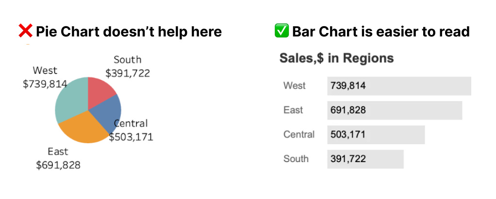
When to make this switch: Almost always. The only exception might be when you specifically want to show parts of a whole with just 2-3 very distinct segments.
Column Charts for Time Series with Several Categories → Line Charts
If your data shows changes over time, line charts are almost always more effective than column charts. Lines emphasize trends and patterns, while columns can create visual clutter that obscures the underlying story. Bar charts for dynamics can be used but they work better in cases when we need to compare date periods like years or quarters and only if we have one category inside.
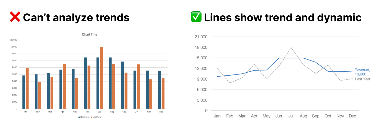
When to make this switch: Whenever your x-axis represents time (days, months, years) and you want to show trends rather than discrete comparisons.
Line Charts with Categories → Bar Charts
Line charts are designed for continuous data, particularly time series. Using lines to connect discrete categories (like product names, regions, or survey responses) creates misleading connections between unrelated data points. Bar charts are the correct choice for categorical data comparisons.

When to make this switch: When your x-axis shows categories rather than continuous variables. If there's no meaningful progression or relationship between your data points, don't connect them with lines.
Dual Axis Chart → Two Separate Charts
Dual axis charts with different scales can be misleading and difficult to interpret correctly. They often create false correlations or make comparisons impossible due to different scaling. Two separate charts placed side by side provide clearer, more honest data representation.
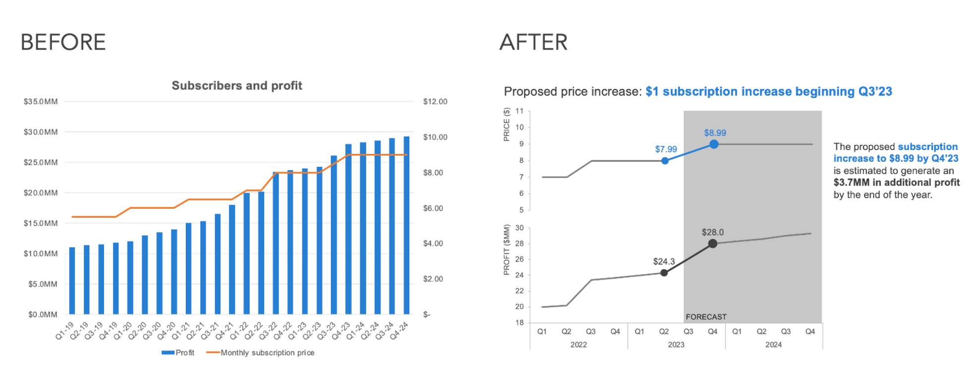
Dual axis charts can exist if we synchronize the axes or if the axes are the same value but in different metric systems (like cm and inches).
When to make this switch: Almost always. If you feel you need a dual axis chart, consider whether the two metrics actually need to be compared directly. You can also transform such charts into index charts showing the percent change of the metric. More about dual axises.
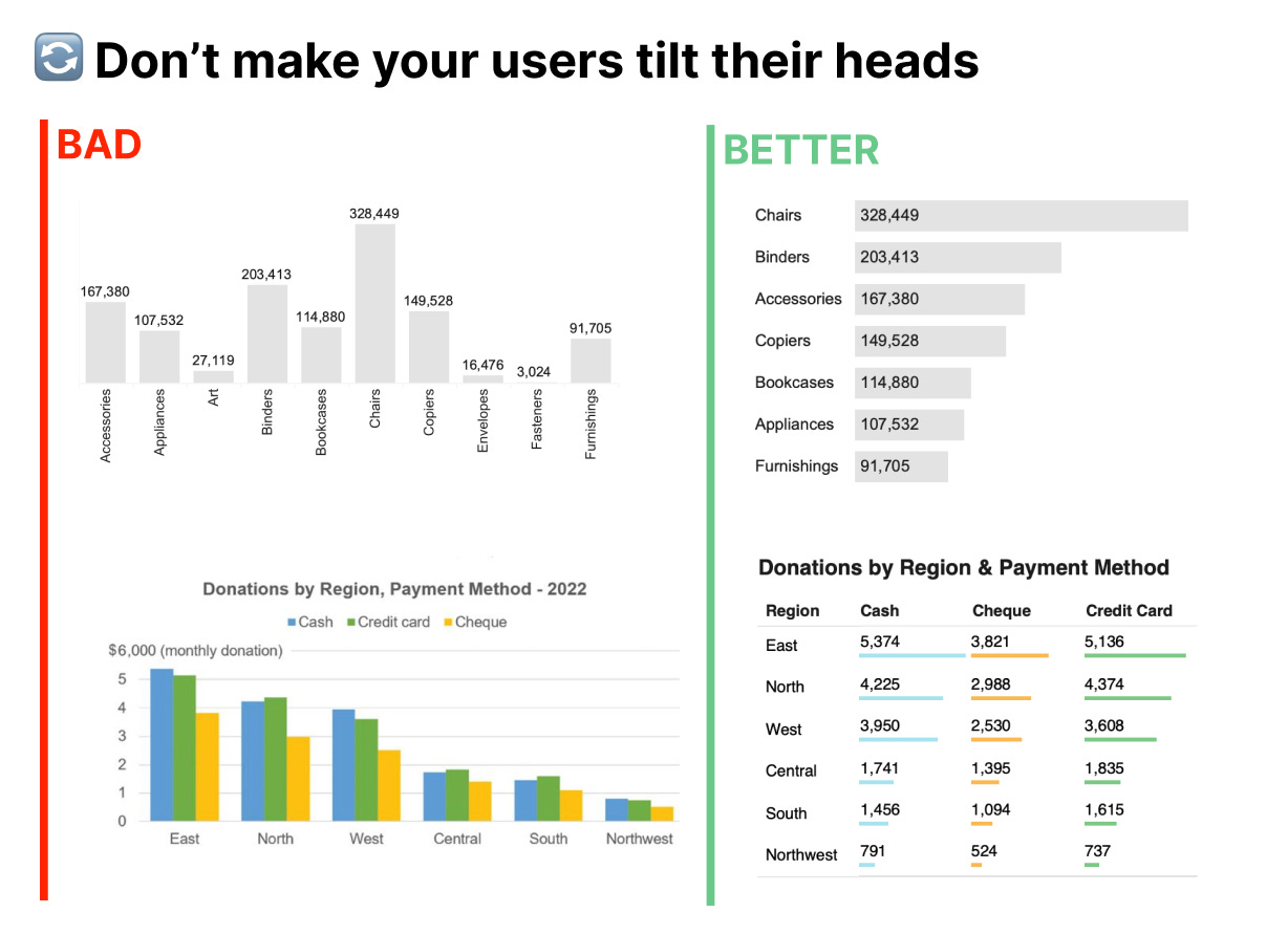
Tables → Visual Charts
While tables are excellent for precise lookup of specific values, they're terrible for pattern recognition. If your goal is to communicate insights rather than provide a reference tool, convert that table into an appropriate chart. If not, try to add some visual inside the table like highlighting cells or sparklines.
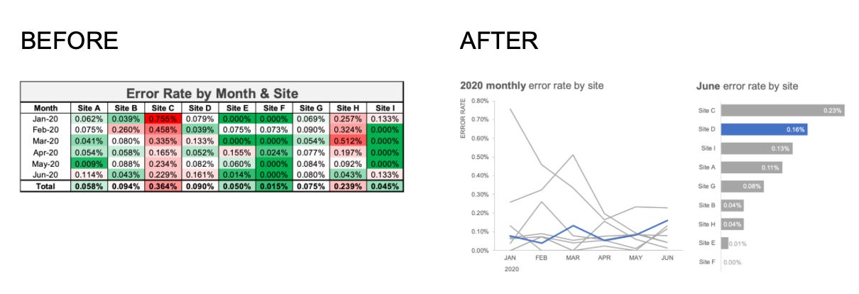
When to make this switch: When your audience needs to understand trends, comparisons, or relationships rather than look up specific values.
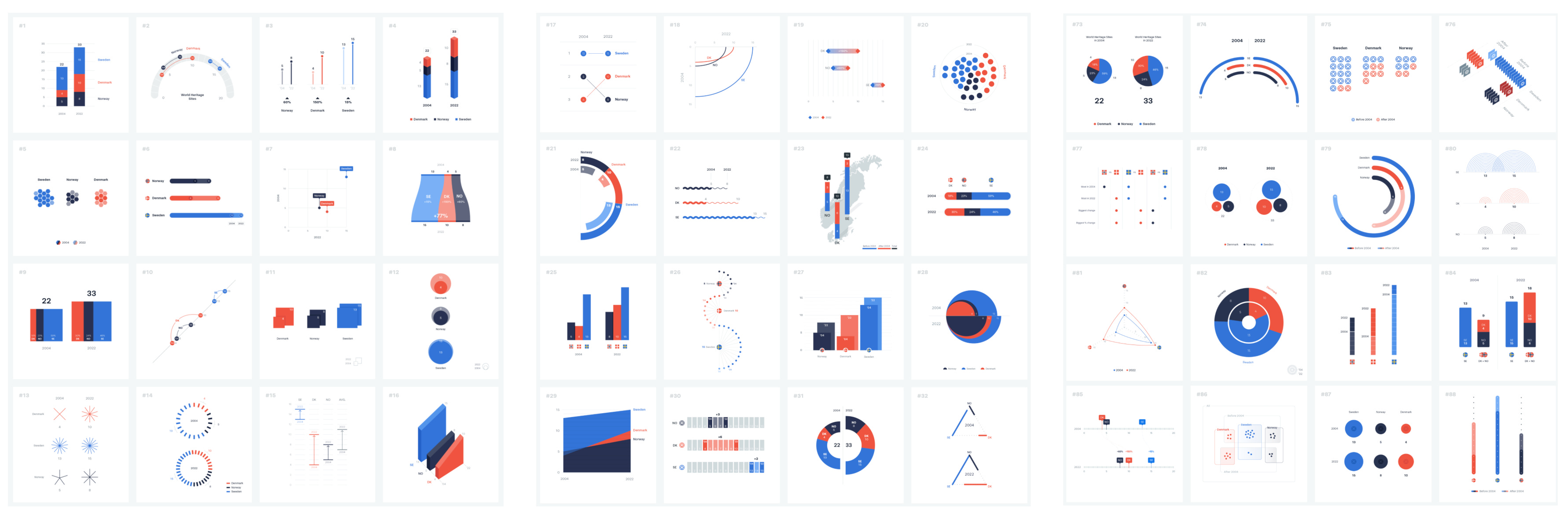
Remember, any data can be visualized in many different ways. To support this idea, there is a beautiful project showing how the same dataset can be visualized in 100 ways. Just by looking at it you'll see some charts being more effective for different use cases while some are not readable at all and are shown mostly for beauty purposes. Think carefully about what you want to show and choose the chart based on that.
2. Rotate Your Perspective
Sometimes the most impactful improvement requires the simplest change: flipping your chart's orientation. This is particularly powerful for bar charts with long category names.
If your bar chart is for comparing categories, always show them in a horizontal orientation. Vertical bars are for time periods comparison. Horizontal orientation makes text more readable (we read left to right).
This simple rotation can transform a cramped, hard-to-read chart into one that feels spacious and professional.
3. Master Text Alignment
Typography in data visualization follows the same principles as good graphic design. Proper alignment creates visual order and guides the reader's eye naturally through your chart.
The golden rule: Left-align everything
Chart titles
Axis labels
Legend items
Annotations
More about left alignment in my post Why Left Align in DataViz and Dashboard Design?
Left alignment creates a clean vertical line that anchors your design. It's how we naturally read, so it feels comfortable and professional.

The only exception is alignment in tables. There we left align our row names but right align numbers for better comparison and to distinguish categories from numbers.

4. Leverage White Space and Proximity
White space isn't empty space – it's your biggest friend and a powerful design tool that creates relationships and hierarchy in your visualization.
The Gestalt Proximity Principle: Elements that are related should be close together. Elements that are unrelated should be separated by white space. This helps viewers naturally group information and understand relationships. More about Gestalt Principles in Data Visualization.

Practical applications:
Group related legend items together
Use white space to separate different sections of a dashboard
Keep chart titles close to their corresponding charts
Separate different data series with space, not just color
Don't forget about paddings, especially inner ones – ensure there's adequate breathing room between your chart elements and their containers. Cramped charts feel unprofessional and are harder to read, even if all other design principles are applied correctly.

Avoid the border trap: Many people try to create separation using borders, boxes, or lines. White space is almost always more elegant and effective. Borders create visual clutter and can make your charts feel cramped.
5. Establish Typography Hierarchy
Consistent typography creates professional-looking visualizations and guides your audience through the information hierarchy.
The font formula:
One sans-serif font family. Arial, Helvetica, Inter, or similar. Serif fonts add non-data ink and can make visualizations visually heavy.
Two weights maximum. Regular and bold – italics can usually be skipped; use regular fonts with the combination of black and grey colors instead. Underlined text usually looks like hyperlinks, and if there aren't any, it can be misleading.
Font size progression with rhythm. Use a 2x scale (e.g., 16-14-10 or 20-16-12). Don't make text sizes random, like title is 17 and text is 12, subheader 14. Make it visually rhythmic and you can also use the 8pt design rule - where all your sizes are multiples of 8 (8pt, 16pt, 24pt, 32pt). This creates visual harmony and makes your design feel more intentional and professional.
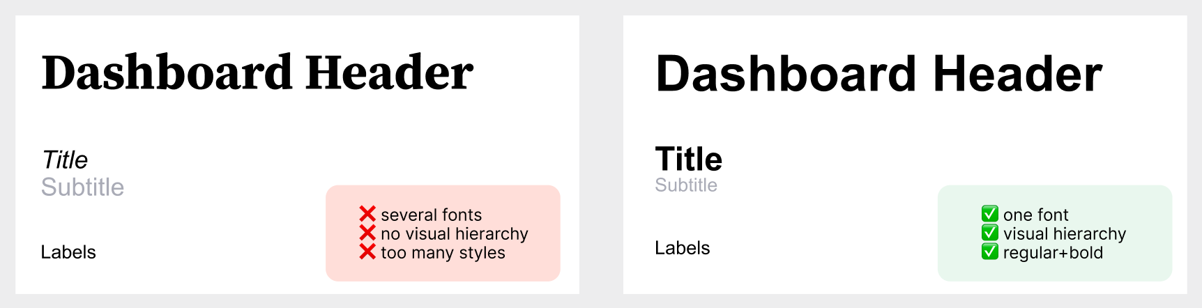
Hierarchy in practice:
Bold, largest size: Main chart title
Bold, medium size: Axis titles and section headers
Regular, medium size: Axis labels and legend
Regular, smallest size: Annotations and source citations
6. Use Color Strategically
Color is one of the most powerful tools in data visualization, but it's also the most misused. Effective color use enhances understanding; poor color choices create confusion. It's important to remember that color is a way to communicate data – it should not be used just for visual appearance and beauty, it's a powerful way to send a message to your audience.
Color principles for better charts:
Use color to highlight what's important: alert, highlight, distinguish categories or color code data values
Always start with grey, it'll help you to understand what is important to color code
Reserve bright colors for data you want to emphasize
Use neutral colors (grays) for context or comparison data
Ensure sufficient contrast for accessibility (aim for WCAG AA standards)
Avoid rainbow charts. Using different colors for every category might seem appealing, but it creates visual chaos. Instead, use one main color with variations in saturation or complementary neutral tones.
Apply semantic color use:
Red for negative/bad/stop
Green for positive/good/go
Blue for neutral information
Orange/yellow for warnings or attention
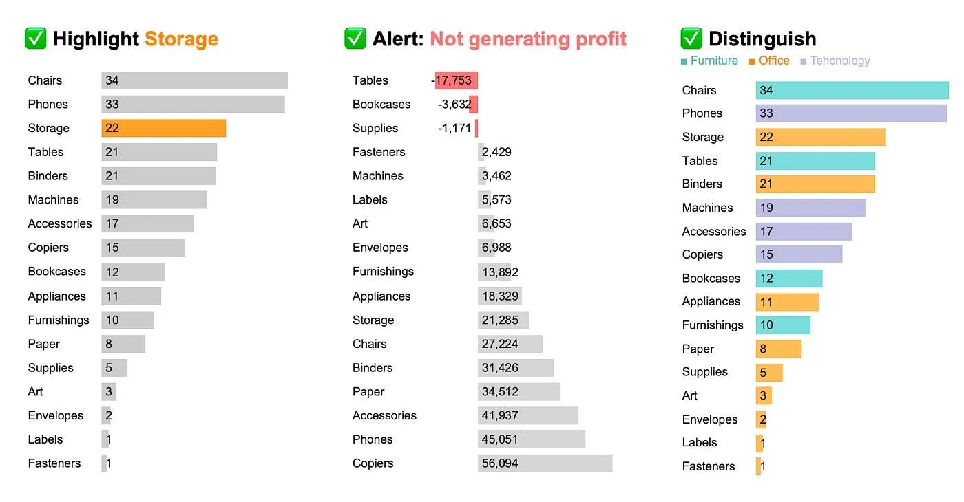
Test your colors: Always check how your charts look in grayscale. If the information isn't clear without color, your color strategy needs work. Guide to Color Tools.
7. Eliminate Chart Junk
The final step involves ruthlessly removing anything that doesn't directly support your data story. Every element in your chart should either display data, support data comprehension, or provide essential context. Yep, we are all about maximizing data ink ratio here.
Common elements to remove:
3D effects: They add no information and often distort data perception. We usually work with two-dimensional data and there is no need for 3D. Flat is better.
Chart borders: The data itself defines the chart's boundaries. Borders just add clutter.
Heavy gridlines: Light, minimal gridlines can help with value estimation, but heavy ones compete with your data. Often, you can remove them entirely.
Excessive markers and outlines: Every line, dot, and border should serve a purpose. If it's decorative, it's probably distracting.
Background fills: Let your data breathe against a clean, white (or very light) background.
Redundant colors: If you can tell the story with fewer colors, do it.
Someone should be able to understand your chart's main message within 5 seconds of looking at it. If they can't, you probably need to remove some elements.

These seven steps work best when applied systematically. Start with step 1 (chart type) since it's foundational, then work through each subsequent step. You'll often find that fixing one issue reveals others – that's normal and part of the improvement process.
Remember, the goal isn't to create the most beautiful chart possible – it's to create the most effective one. Sometimes that means making choices that feel plain or simple. In data visualization, simple usually wins.
Before you publish any chart, ask yourself:
Can a first-time viewer understand the main message within seconds?
Does every element serve a clear purpose?
Would this chart work in black and white?
Are the most important insights visually prominent?
Great data visualization isn't about following rules blindly – it's about understanding principles and applying them thoughtfully to serve your audience and your data. Master these seven steps, and you'll create charts that don't just display information –they communicate insights.
I specifically like tip #5. In some recent work I used the golden rule ratio 1.618 as my multiplier. Your thinking is way easier- love it!
Great tips!