Why You Should Always Visualize Your Data First?
🦖 Explained with dinosaurs why charts are better than just stats
“Graphics reveal data. Indeed graphics can be more precise and revealing than conventional statistical computations.”
- Tufte, Edward (1983). The Visual Display of Quantitative Information
One of the most important aspects of working with data is its visualization. You can be a fantastic statistician, but to truly reveal insights and understand the data, you should always visualize it first rather than relying solely on statistical results.
4️⃣ Anscombe’s Quartet
Anscombe’s Quartet, created by statistician Francis Anscombe in 1973, consists of four datasets that share nearly identical statistical properties: mean, variance, correlation, and regression line. Despite these similarities, each dataset, when plotted, tells a completely different story. The striking visual disparity serves as a cautionary tale that numbers alone can be misleading.
“…make both calculations and graphs. Both sorts of output should be studied; each will contribute to understanding.”
F.J. Anscombe, 1973
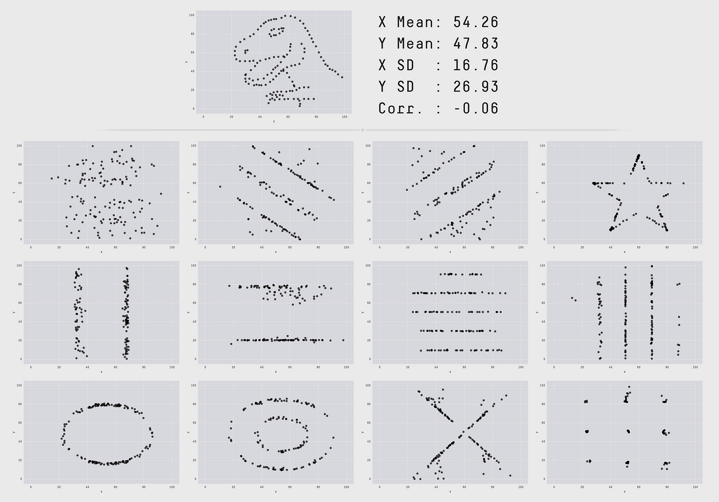
🦖 Datasaurus Dozen,
Fast forward to today, we have the Datasaurus Dozen, a modern tribute to Anscombe’s work, further developed by Alberto Cairo with the creation of the Datasaurus to demonstrate the same idea. Justin Matejka and George Fitzmaurice created a broader collection of datasets that show how data can produce strikingly different visuals while maintaining similar summary statistics. Each dataset looks unique—whether it's a dinosaur shape or more conventional scatter plots—once graphed. This reinforces that statistics alone aren’t enough to fully understand data. I highly recommend download.csv and trying it out yourself. Interactive version on Tableau Public.
Both datasets were developed to remind analysts that statistical analysis without visualization can miss critical nuances, patterns, or outliers. Visuals offer the opportunity to catch errors and unlock insights that numbers alone may obscure.
“Never trust summary statistics alone; always visualize your data”
Alberto Cairo
Charts are Better than Just Stats
I had a very interesting case long time ago where just relying on statistics wasn’t enough, and visualizing the data with a single chart wasn’t sufficient either. We were trying to analyze the results of different blog posts, and one of the metrics was the number of likes. While this use case is fabricated, it’s quite close to reality. As you can see, the average number of likes is higher for Web Design, and the median is higher for Data Science. However, there are two outlier posts in Web Design, which means most posts weren’t performing well, but these two were exceptionally popular. They turned out to be review posts that were indeed very popular. The takeaway is that if we had only relied on averages or medians, we would never have discovered these outliers.
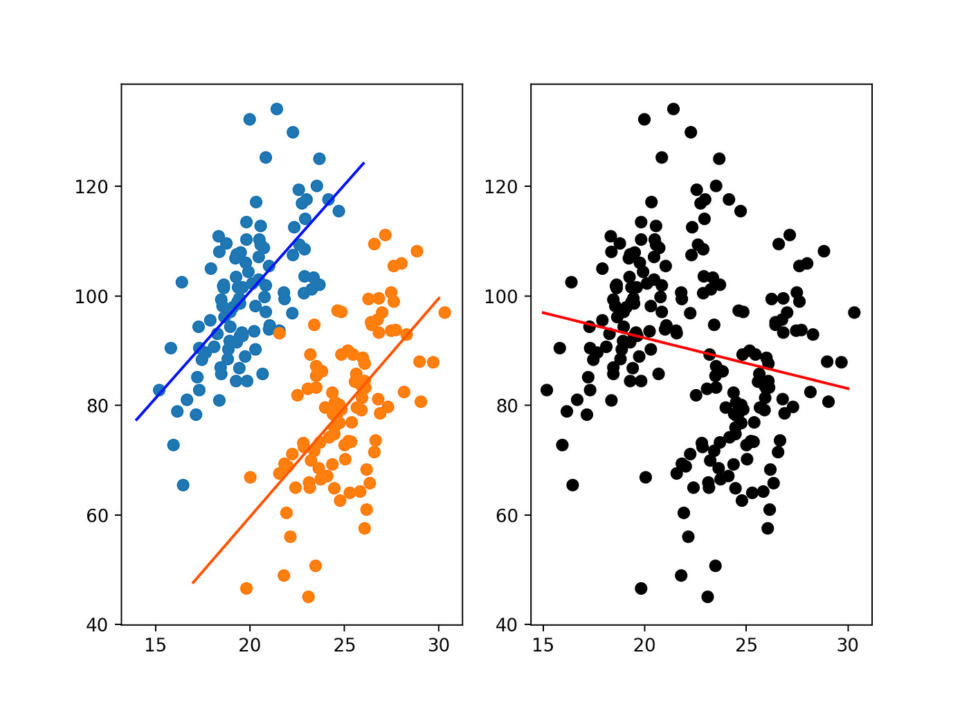
Another area where data visualization can be helpful is in addressing Simpson's Paradox. Simpson's Paradox is a phenomenon where a trend that is present within individual groups of data either disappears or reverses when the groups are combined.
Imagine a study comparing two treatments, A and B, for a particular illness. The data is broken down by two groups of patients: those with mild symptoms and those with severe symptoms.
Mild Symptoms:
Treatment A: 45 out of 50 patients recovered (90% recovery rate)
Treatment B: 280 out of 350 patients recovered (80% recovery rate)
Severe Symptoms:
Treatment A: 90 out of 150 patients recovered (60% recovery rate)
Treatment B: 20 out of 50 patients recovered (40% recovery rate)
If you look at each group separately, Treatment A has a higher recovery rate for both mild and severe cases.
However, when you combine the data:
Overall:
Treatment A: 135 out of 200 patients recovered (68% recovery rate)
Treatment B: 300 out of 400 patients recovered (75% recovery rate)
In this combined data, Treatment B appears to have a better overall recovery rate, despite Treatment A being more effective in both individual groups. This reversal of the trend when the data is combined is an example of Simpson’s Paradox.
The Key Takeaway – Always Start with a Visual
Data visualization is not just an afterthought – it’s a vital first step in any data analysis process. By visualizing your data, you not only reveal hidden patterns and outliers but also ensure that your analysis is grounded in reality. Try to visualize the smallest units of your datasets and always experiment with different chart types and visual marks.


