
Why Left Align in DataViz and Dashboard Design?
How natural reading patterns define text alignment in data visualizations.

When designing dashboards and data visualizations, even the smallest layout choices can have a big effect. One of the most important — and easiest to apply — is left alignment. Whether it’s text in charts, KPI cards, or dashboard panels, aligning text and labels to the left improves the speed and comfort of reading, while making the overall design feel cleaner and more professional.
But why is left alignment so powerful?
It’s rooted in how we naturally read. Studies in usability, including work by Jakob Nielsen, show that people in left-to-right reading cultures scan content following an "F-pattern" — first moving horizontally across the top, then down the left side, occasionally scanning across again. Left-aligned text fits perfectly into this natural behavior, making it easier for users to process information quickly without extra effort.
It’s important to remember that reading direction is not universal. In cultures where people read right-to-left (like Arabic or Hebrew), right alignment may be more appropriate. Always design with your audience in mind.
Left Alignment in Charts
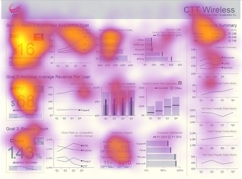
In charts, labels and annotations need to be easy to find and read. Left-aligning text — like axis labels and legends — provides a predictable starting point for the eye, reducing the time users spend scanning. When labels are centered or right-aligned, readers lose time trying to find where each label starts, breaking the flow of understanding.

When you display values inside bars (especially horizontal bar charts), it’s best to left-align the text at the start of the bar, rather than centering it inside the bar or floating it at the end. It helps visual integrity: If you right-align numbers at the end of bars, it can artificially extend the visual length of the bars. This makes some bars seem longer than they actually are, misleading the viewer about the real differences in data values.
Left Alignment in KPI Cards
KPI cards are designed to deliver quick, critical insights. If the text inside these cards — such as metric names or descriptions — is centered or scattered, users waste precious seconds reading them. Left-aligned text creates a strong visual anchor, improving legibility and keeping attention where it belongs: on the numbers.

Alignment in Tables
Tables and lists often hold a lot of important information in dashboards. Left-aligning text columns — like names, categories, and descriptions — makes scanning rows much easier.
However, numbers (like prices, percentages, and counts) should usually be right-aligned. This allows users to compare magnitudes quickly, as decimal points line up neatly.

Left Alignment in Text Across Dashboards
Dashboards often include various text elements: headers, section titles, filter names, descriptions, and notes. Consistent left alignment across these parts creates a smooth visual rhythm, making the entire dashboard feel more intuitive and reliable.
In your design, set up a column grid and keep alignment consistent across your different pages and elements. Any alignment inconsistencies should be purposeful — define clear rules to guide you.
From NN Group
Centered or right-aligned longer blocks of text disrupt the user’s reading flow and increase cognitive effort.

Left alignment isn’t just a style choice — it’s about designing for how people naturally read and think. By respecting reading patterns and creating visual consistency, left alignment makes dashboards and data visualizations faster, easier, and smarter to use.
When in doubt, align left!
Great post! It articulates very well points that I have tried to make to stakeholders. Will refer back to this in the future.