
Uncharted Territory from a Dataviz Perspective
what we can learn from the charts in Chris Dalla Riva's new book


There are not many authors who write truly unique content, where every post is proper research. And is one of them.
I don't even remember how I found his Substack, but I immediately got interested. I'm not even that into music! I mean, I do like listening to it, but I'm definitely not the kind of person who can distinguish all kinds of rock or know who won the Grammy last year. However, I do enjoy every post Chris writes, and I was very excited when he also wrote a book on it!
"Uncharted Territory: What Numbers Tell Us about the Biggest Hit Songs and Ourselves, can be pre-ordered, and you know what? It's full of charts! Thanks to the beautiful designs by Caileigh Nerney! Here I'll share some of the most exciting examples I found and what we can learn from them.
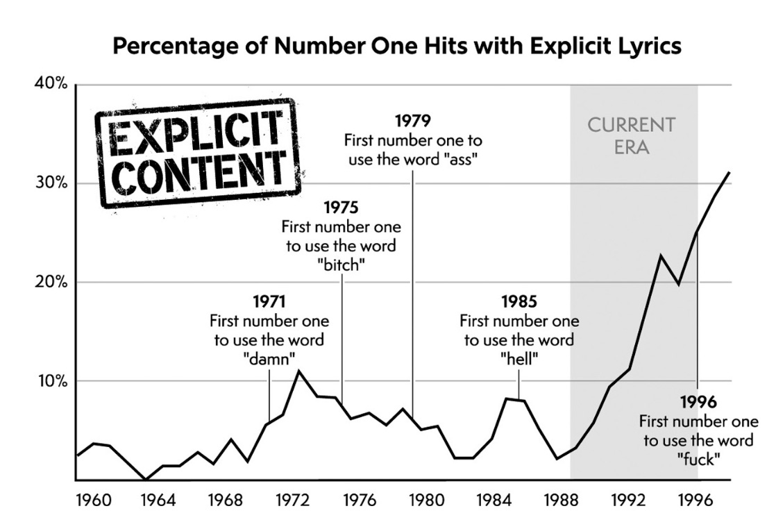
Work with annotations
There are many very good examples of applying annotations and backgrounds for highlighting. It's a simple yet very effective way of adding storytelling to your chart
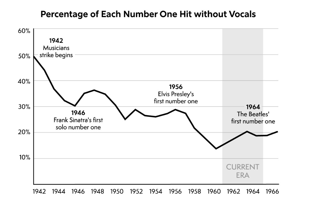
Key Advice for Chart Annotations:
Focus on insight, not description/ Use annotations to explain why data points matter and their real-world significance, not just what's visible in the chart.
Design for clarity and flow. Position annotations strategically, use consistent styling, and create visual hierarchy to guide readers through your data story without cluttering the chart.
Connect data to story. Bridge gaps in understanding by highlighting surprising patterns, counterintuitive findings, and connecting data points to business decisions or real-world implications.
Ensure accessibility and readability. Test color contrast, maintain legible typography at different sizes, and use background shapes or callouts to make annotations stand out against busy chart backgrounds.
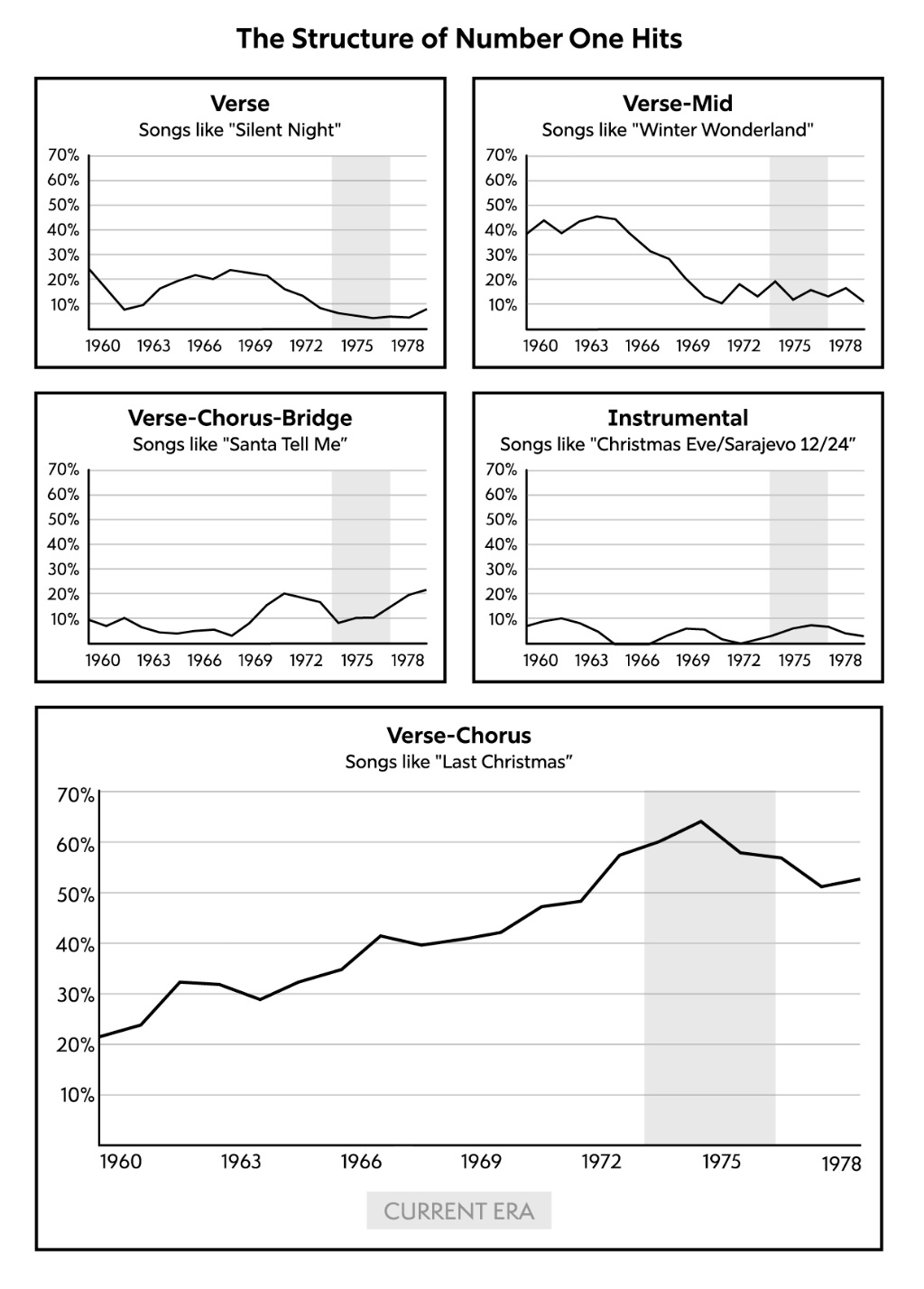
Design for Black and White
As dataviz professionals, we rely a lot on colors. However, sometimes it's not a choice and we have to switch all our color-coded channels to shapes. In the book, Chris showed a good way of doing that using different line patterns. Small advice from my side: try to label lines directly on the right side of the chart instead of using the legend. It'll help with readability of the chart.
Key Advice for Black and White Design:
Use varied line patterns and shapes/ Replace color distinctions with dashed, dotted, solid lines of different weights, or distinct marker shapes (circles, squares, triangles) to differentiate data series.
Direct labeling over legends. Place labels directly next to data elements (especially at line endpoints) rather than relying on legends, which reduces cognitive load and improves readability.
Leverage texture and fill patterns. Use different hatching, cross-hatching, or dot patterns for bar charts and area charts to create clear visual distinctions without color.
Emphasize hierarchy through contrast. Use varying line weights, font sizes, and spacing to create visual hierarchy and draw attention to the most important elements in your chart.
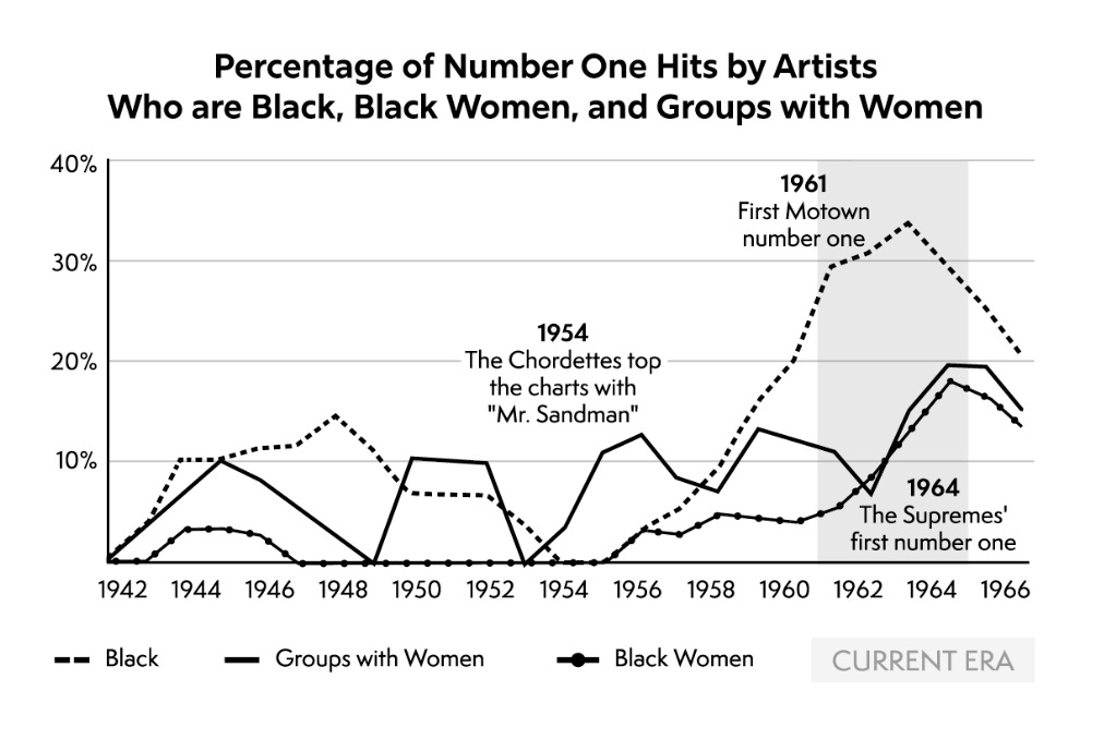
Small Multiples Approach
I love small multiples. It's a very efficient way to provide comparison. In this chart we can compare different categories without getting a spaghetti chart. It's clear and easy to read.
Key Advice for Small Multiples Design:
Maintain consistent scales and axes/ Use identical axis ranges across all panels to ensure fair comparison and avoid misleading interpretations between categories.
Keep individual charts simple. Each panel should focus on one clear message or trend; avoid overcomplicating individual multiples with too many data series or annotations.
Optimize spacing and layout. Balance white space between panels to create clear separation while maintaining visual cohesion across the entire visualization.
Guide the reader's journey. Arrange multiples logically (chronologically, by size, or by category importance) and consider adding a summary panel or highlighting key findings to help viewers navigate the comparison effectively.
Give a Chance to Radar Charts
I'm not a fan of such spider charts, to be honest. However, they can be efficient for comparing characteristics in sports and, as we can see, music! This gives a short profile overview that's easy to read and understand. Would love to look at this one for several songs.
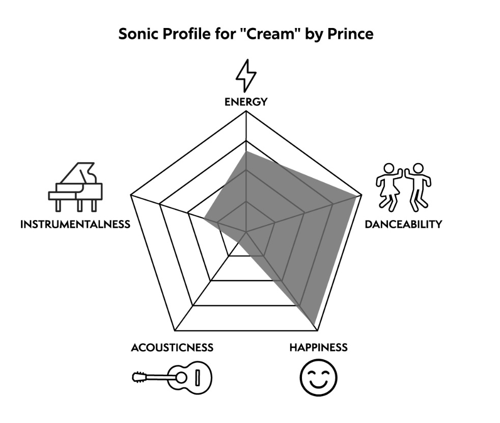
Key Advice for Radar Chart Design:
Limit the number of variables. Keep to 5-7 axes maximum to avoid visual clutter and maintain readability.
Use consistent scaling and meaningful baselines. Ensure all axes use the same scale (0-100 or 1-10) and start from zero to prevent distorted comparisons between different profiles.
Consider overlaying for direct comparison. When comparing 2-3 entities, use transparent fills or different line styles to overlay multiple radar charts, making differences immediately visible.
Add a Little Bit of Junk
Junk charts are usually a taboo in dataviz. But they can be good and add a bit of context to the chart! It's important they don't lie with the way they're constructed and do not compete with data. Found this column chart pretty interesting.
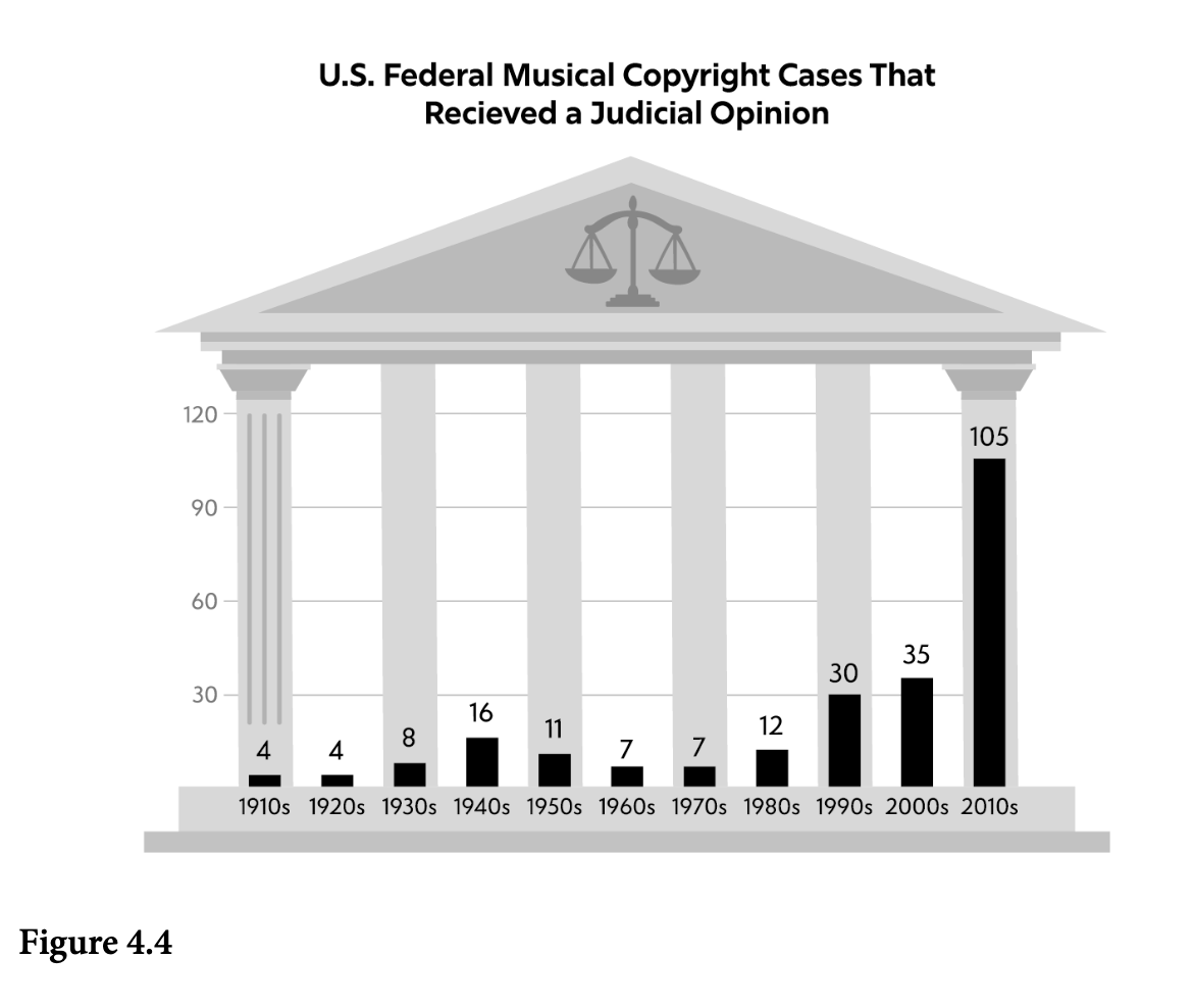
Key Advice for Using Chart "Junk" Effectively:
Ensure decorative elements support the story. Visual embellishments should enhance understanding of the data context, not distract from the core message or misrepresent the underlying values.
Maintain data integrity above all. Decorative elements must never distort proportions, scales, or relationships in the data; the visual metaphors should align with actual data values.
Use sparingly for specific audiences. Reserve decorative charts for presentations, marketing materials, or public-facing content where engagement is prioritized over pure analytical precision.
If you're still reading, I just found this one very interesting, so here it is! Don’t forget to pre-order the book :)
Chris was also a co-author of a couple of The Pudding projects. I highly recommended checking them out.
 | A guest post by
|