
🚀 Tips for dashboard developers
💜 This weeks news: R Tables Contest Winners, Hidden Tableau functions and 20 visualizations of one dataset

Tip of the week
Best practices for dashboards development

This week, I spent a couple of hours reverse engineering my own dashboard because I was too lazy to document it the first time (and it was a while ago). Documentation is not always the best way, and it’s much easier to use these best practices:
Use consistent and clear naming
Add information about what's inside to the calculation's name. Ensure this naming is consistent across all calculations: “Sales (2)” → “Sales Last Year”
If you use a parameter inside the calculation, add something like “Metric w param” to denote parameterized metric choices. Agree internally of the most popular names for calculations and parameters (MoM/YoY; Split by; etc)Split complex calculations
If your calculation feels too long, consider splitting it into several smaller ones, especially if you are reusing parts of the calculation elsewhere.Use tabs inside to divide big parts of calculation.
Group fields into folders
Number folders and calculations
If the calculation logic is long and complex, consider numbering them.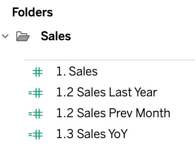
Add comments to your calculations
Use // for short and /* */ for long comments.Add chart type and used metric/dimension to the worksheet names
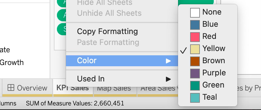
Use color for tabs navigation
Color your sheets with the same color your dashboard tab is colored

Useful for Data Visualization and BI
Designing for Complexity: 5 Key Considerations in High-Fidelity Prototyping
Power BI dashboard timelapse from Figma to real dashboard
[Tableau] Behind the Curtain: Tableau Hidden Functions by Yovel Deutel
I use RANDOM() all the time for jittering, so definitely check this out!

Data and Analytics
[SQL] Faizan's SQL Portfolio with challenges, instructions and SQL tips
[R] Introducing Positron: A New, Yet Familiar IDE For R And Python
Regrets and Regression: Standardization and Normalization
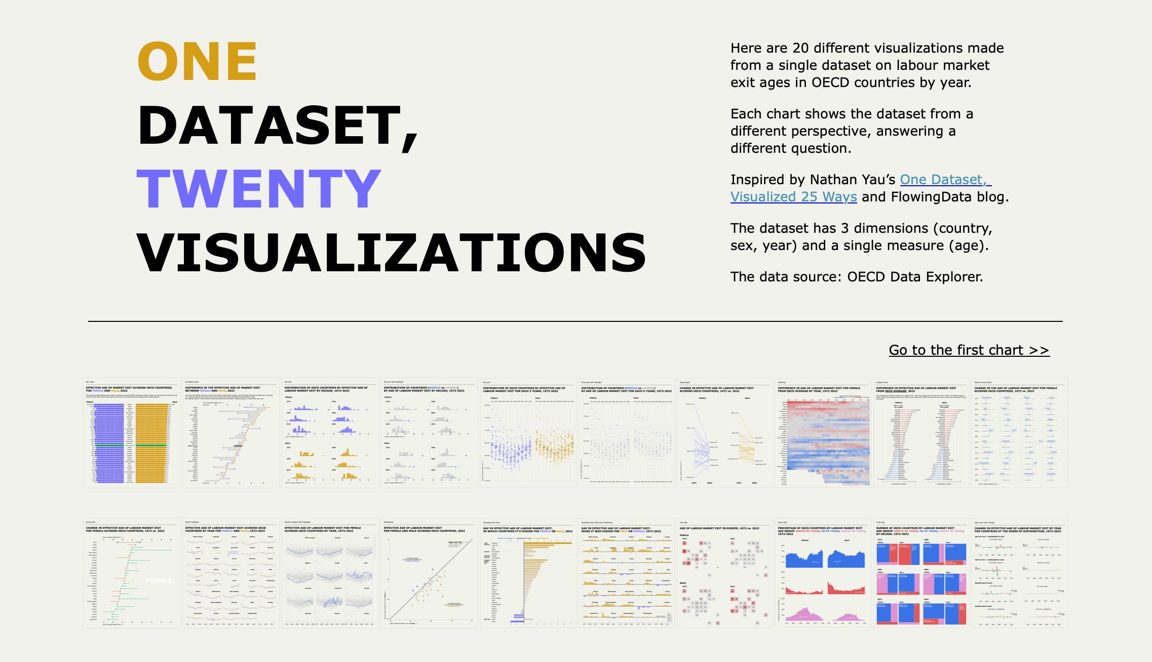
Data Visualization Picks


So useful! Thank you! 🤗