
Same Data, Different Questions
Transforming Time Series Data for Better Insights

Time series data — data that is collected over time — often contains valuable trends, patterns, and anomalies. But raw data alone isn't always enough to answer key business questions. By applying different data transformations, we can extract meaningful insights and communicate them effectively.
Let’s explore some common data questions, the transformations needed to answer them, and the best visualization techniques to use.
Example Dataset: Daily Orders
Imagine we have a dataset with the number of orders per day for an e-commerce store:
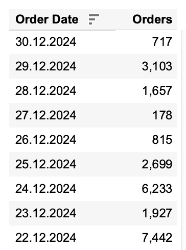
By analyzing this dataset, we can answer various business questions by applying different transformations and using the right visualization techniques.
1️⃣ How do orders change over time? (Absolute Trend Analysis)
Let’s start with the basics — seeing the big picture: How do our orders evolve over time? You can use the raw order count per day or aggregate it into weekly or monthly totals. The best chart here is a line chart because it allows trends analysis.
📌 When and Why to Use It?
To track long-term performance without focusing on short-term fluctuations.
Useful for strategic planning and growth analysis.
Helps identify seasonal patterns (e.g., do sales peak every December?).

2️⃣ What is the underlying trend? (Using Moving Averages to Reduce Noise)
If you are working with daily data, it can be useful to smooth fluctuations to reveal the true pattern. You can calculate a 7-day or 30-day moving average to reduce short-term noise. The best chart here is a line chart because it allows trends analysis.
📌When and Why to Use It?
When daily data is too volatile, making trends unclear.
To identify underlying growth trends without getting distracted by daily ups and downs.
Useful for tracking macro-trends, especially in businesses with seasonal or irregular demand.

💡 How to choose the right smoothing window?
Choosing the right smoothing window (7, 14, or 30 days) depends on your data patterns and analysis goals:
Daily fluctuations are too noisy → Use 7-day. If your orders fluctuate significantly from day to day but follow a weekly cycle, a 7-day average provides a clearer trend without losing too much detail.
Balance between detail and clarity → Use 14-day. If you want a clearer trend without over-smoothing, especially for businesses with bi-weekly cycles or frequent promotions.
Focus on long-term trends → Use 30-day. If your data has significant seasonality, such as monthly patterns, a 30-day average helps smooth out the noise while still capturing meaningful trends.
3️⃣ How much did orders change compared to the previous period?
To measure growth or decline over time you can calculate percent difference from the previous day, week, or month or year. The best chart here is a bar chart because it allows for easy comparison between periods.
📌 When and Why to Use It?
To understand performance shifts over time.
Helps answer: Are we growing faster or slower than before?
Useful for identifying sudden shifts, such as drops in demand or spikes after promotions.

4️⃣ Are there anomalies in the order trend?
To better detect unusual spikes or drops in sales, you can calculate the average daily orders and compare each day's deviation, or use standard deviation to detect outliers. The best charts for this are dot plots (like box plots or jitter) or line charts with threshold bands.
📌 When and Why to Use It?
To detect unexpected events affecting orders.
Helps with fraud detection or identifying system failures.
Useful for spotting holiday sales effects or unexpected market shifts.


5️⃣ How fast are we growing?
All kinds of “to Date” calculations help track cumulative growth over time and understand if we are growing faster than last year. In that case we compute a running sum of orders and compare cumulative totals against previous period. The best chart for this is a line chart.
📌 When and Why to Use It?
To see long-term progress and compare periods (e.g., this month vs. last month).
Useful for subscription businesses or e-commerce growth tracking.
Helps forecast demand by identifying growth acceleration or slowdowns.

By applying these transformations, we can extract deeper insights from time series data. The key is to choose the right question, apply the right transformation, and visualize it effectively.
Each of these transformations plays a crucial role in not just tracking trends but also in identifying patterns that can drive business decisions. Great breakdown Anastasiya.