
One Perspective That Separates Good BI Developers from Great Ones
And once you adopt it, your dashboards (and career) will look very different

Most BI professionals fall into the same trap early in their careers. We get excited about building comprehensive dashboards that showcase every available metric, complete with flexible filters and multiple visualization types. We treat dashboards as containers for data — a way to display numbers, charts, and KPIs. Mission accomplished.
I was just like that and I'm going to be honest — sometimes I still want to fall into this trap badly, because it's way easier to build dashboards that way and also more exciting. But this kind of dashboard is rarely used after launch. So here's what I've learned after years of designing dashboards that actually get used: the best dashboards aren't built to display data. They're built to drive decisions.
This fundamental mindset shift — from data builder to decision enabler — changes everything about how you approach dashboard design. It affects your priorities, your communication with stakeholders, and ultimately, the business impact of your work.
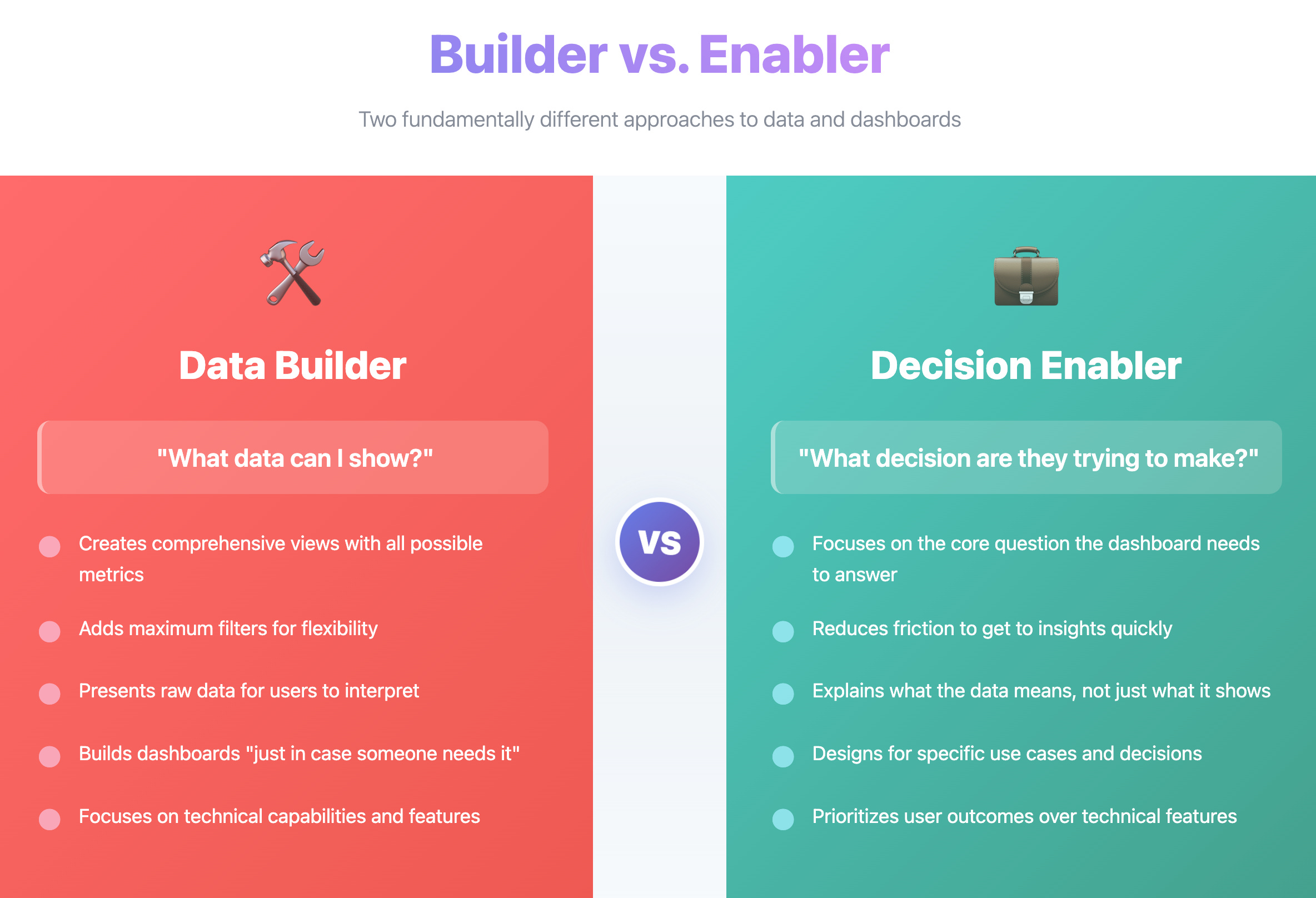
The Builder vs. Enabler Mindset
When you think like a data builder, you ask: "What data can I show?" When you think like a decision enabler, you ask: "What decision are they trying to make?"
The difference shows up in every aspect of your work:
Data builders create comprehensive views with all possible metrics, add filters for maximum flexibility, and present raw data for users to interpret.
Decision enablers focus on the core question the dashboard needs to answer, reduce friction to get to insights quickly, and explain what the data means rather than just what it shows.
If you've been designing dashboards that include every conceivable KPI "just in case someone needs it," you're operating in builder mode. That approach isn't wrong, but it's incomplete.
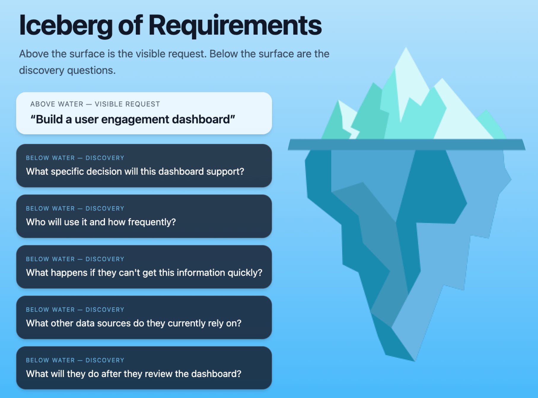
Start with the Decision, Not the Data Model
Before opening your BI tool, spend time understanding the business context. Every analytics request started as a business problem, but often by the time it reaches you, some translation has already happened. Your manager or stakeholder has done initial scoping based on their understanding of the ask.
Probe deeper into the original motivation. Ask questions like:
What specific decision will this dashboard support?
Who will use it and how frequently?
What happens if they can't get this information quickly?
What other data sources do they currently rely on for this decision?
What will they do after they review the dashboard?
Understanding these fundamentals helps you prioritize the work, identify key stakeholders, and often propose more efficient solutions to the original question.
Consider this example: A product manager requests a "user engagement dashboard" with daily active users, session duration, feature adoption rates, and geographic breakdowns. Instead of building a comprehensive view with all these metrics, dig into the underlying need. You might discover they're trying to decide which markets to prioritize for a new feature rollout. With this context, you can design a focused view that directly supports that decision — perhaps highlighting engagement quality metrics by region with clear thresholds for launch readiness.
Sometimes, understanding the decision reveals that a dashboard isn't the right solution at all. A sales manager once asked me for a "high-value customer churn dashboard" with retention rates, usage trends, and revenue per customer metrics. After digging deeper, I learned they needed to know which specific customers to call this week to prevent churn. The solution wasn't a dashboard – it was an automated weekly email subscription with a prioritized list of at-risk accounts and their contact information. Much more actionable than staring at charts.

Transform Numbers into Insights
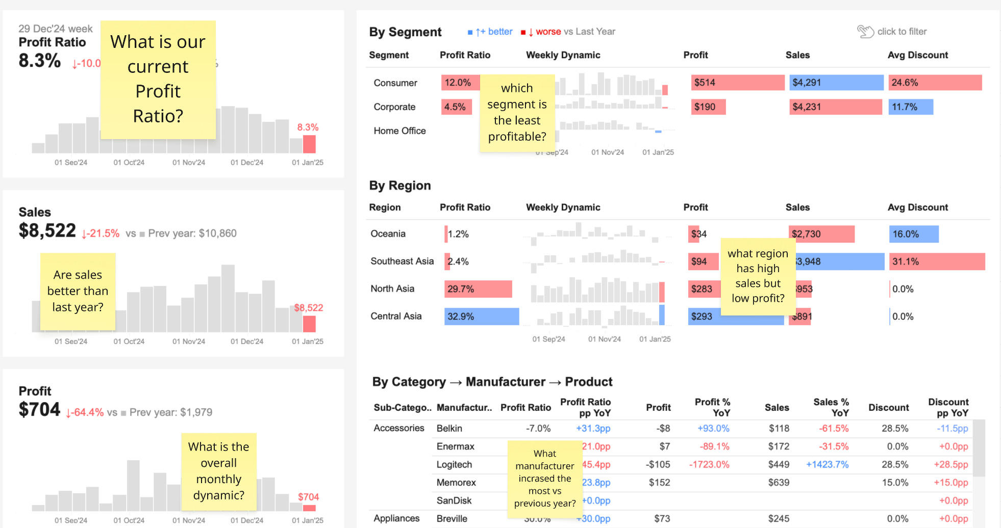
Raw data tells you what happened. Insights tell you what it means and what to do about it.
Add context to your visualizations through annotations, trend indicators, and threshold markers. Show comparisons that matter — current period vs. previous period, actual vs. target, or performance vs. benchmarks. Include brief explanations of significant changes or anomalies.
The goal is to move beyond presenting numbers to providing interpretation. Your dashboard should communicate not just "sales increased 15%" but "sales increased 15%, driven primarily by the northeast region, putting us 8% ahead of our quarterly target."
This transformation from data presentation to insight communication is what elevates you from a dashboard builder to a trusted partner in the decision-making process.
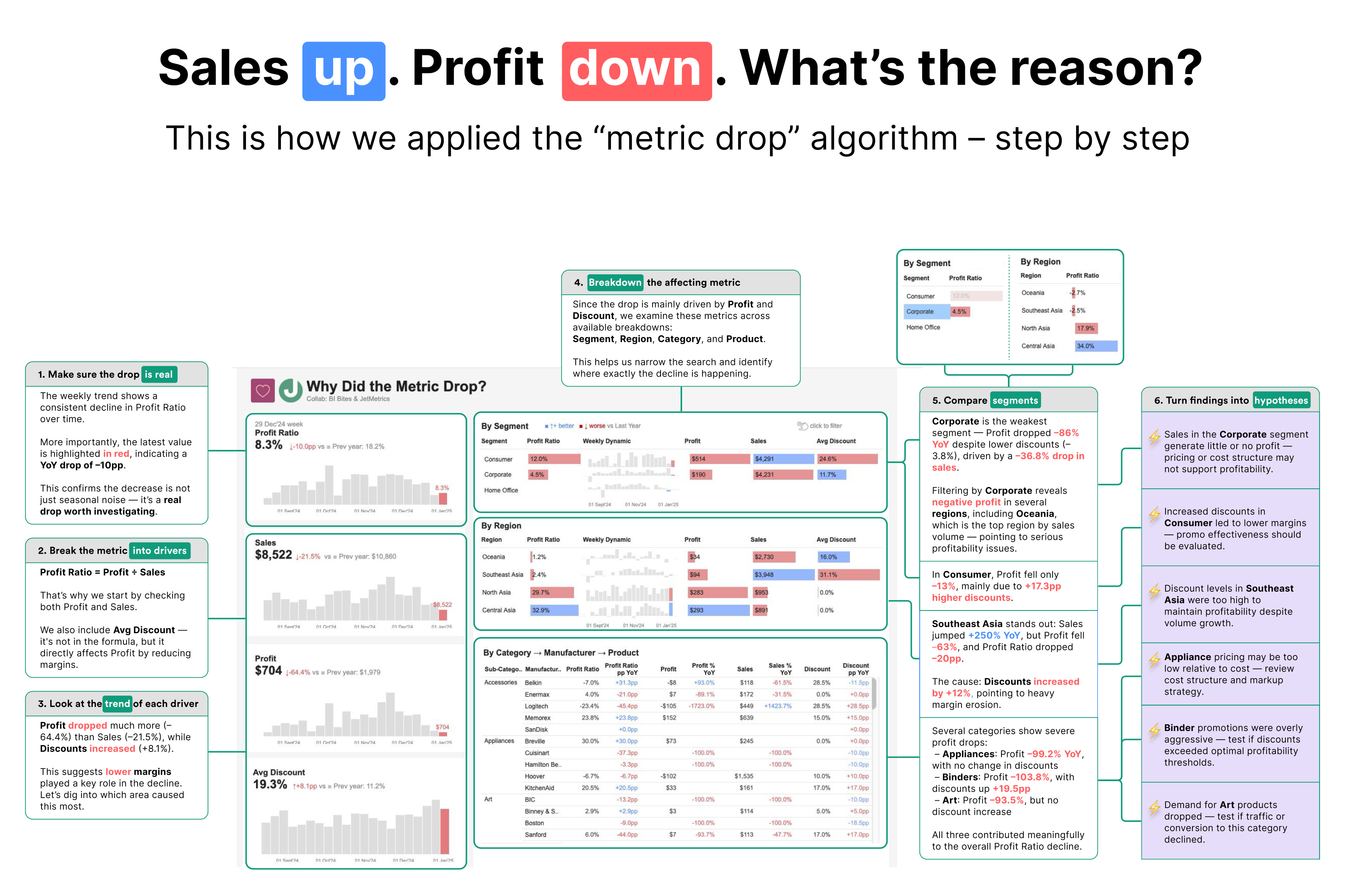
Read more about designing such dashboards on the post: Why Did the Metric Drop?
The Discipline of Exclusion
Enabling decisions requires knowing what to leave out. Not every metric needs to be included. Not every requested filter should be added. Not every stakeholder group needs to be served by the same dashboard.
This discipline is challenging because it requires saying no to seemingly reasonable requests. When someone asks to "just add one more chart" or "include that metric too," evaluate whether it serves the core decision the dashboard was designed to support.
Successful dashboards often show fewer metrics but provide deeper insights into the ones that matter most for specific decisions.

Practical Implementation Steps
To shift from builder to enabler mentality:
Gather requirements with surgical precision
Before touching any design tool, spend quality time understanding the business context. Document the specific questions your dashboard must answer and the decisions it will enable. Write these down clearly — if you can't articulate the purpose in simple language, your users won't understand it either.
For example, instead of accepting a vague request for "marketing performance dashboard," dig deeper to uncover questions like: "Which campaigns should we increase budget for next month?" and "Are we on track to hit our lead generation targets?". The resulting dashboard becomes focused on campaign ROI comparisons and target tracking rather than a generic collection of marketing metrics.
Map every element to your core questions
During design, audit each chart, filter, and metric against your documented questions. Every element should directly support at least one core question — if it doesn't, remove it. This discipline keeps your dashboard focused and actionable.
Then consider how you can facilitate the business decisions beyond just displaying data. Add cross-links to related dashboards, direct links to CRM systems for account details, or integrate action buttons that trigger workflows. For instance, if your dashboard identifies underperforming territories, include a direct link to the territory management system where managers can reassign accounts or schedule coaching sessions.
Communicate insights, not just information
Transform how you present your work to stakeholders. Instead of showing data, explain what the data means for their decisions. Frame your communications around business outcomes rather than technical deliverables.
Replace "here's the sales dashboard with revenue by region" with "here's what our regional performance tells us about where to focus Q4 efforts — the Northeast is 23% ahead of target while the West Coast is lagging, suggesting we should reallocate marketing spend." This positions you as a strategic partner who provides actionable intelligence, not just charts.
Apply storytelling techniques, such as the following:

Use data to optimize your dashboards
Treat your dashboards like any other product — measure what works and what doesn't. Track which parts people actually use and which they ignore.
Check which dashboards get opened, which charts get clicked, and where users spend their time. Ask users which parts help with their decisions and which parts they skip. Sometimes a chart gets ignored not because it's useless, but because it's confusing or hard to interpret. Use this combined feedback to refine your designs.
Moving Forward
This mindset shift has tangible effects beyond better-looking dashboards. When you design for decisions rather than data display, you typically see:
Higher adoption rates because users can quickly find what they need
More actionable insights because context is built into the presentation
Reduced back-and-forth with stakeholders because questions are anticipated and answered
Greater trust in your recommendations because you demonstrate understanding of business needs
The transition from data builder to decision enabler isn't just about dashboard design — it's about how you think about your role as a BI professional. Instead of being the person who pulls data, you become the person who provides the insights that drive business decisions.
This shift requires understanding business context, prioritizing user needs over technical possibilities, and focusing on communication as much as visualization. It means asking better questions at the start of every project and being willing to say no to requests that don't serve the core purpose.
The most successful BI professionals I've worked with share this common trait: they understand that their job isn't to show all the data — it's to show the right data in the right way to enable the right decisions.