How We Perceive Uncertainty?
🌧 what to remember when working with uncertain data and how visualization can help
I’ve recently finished reading “The Grammar of Graphics” by Leland Wilkinson. It was a personal challenge for me and one of the hardest books I’ve ever read on data visualization due to its technical details. However, it was full of insights. One concept I want to share is how we perceive uncertainty.
Believe it or not, we face uncertainty more often than we expect. Daily decisions, like managing finances, choosing healthcare options, or planning for unpredictable events (e.g., weather changes or job stability), are rife with uncertainty. This arises from incomplete information, ambiguous outcomes, or risks – whether it’s investing money, deciding to see a doctor based on symptoms, or picking the best travel route given traffic predictions.
We are not randomly suboptimal in our decisions.
We are systematically suboptimal.
“The Grammar of Graphics”, Leland Wilkinson
Human decision-making in uncertain situations is systematically prone to biases, not random errors. Understanding biases – like overestimating rare events (e.g., fearing flying more than driving) or relying on personal experience instead of data – helps navigate uncertainty more effectively and make better-informed choices.
In his book, Leland Wilkinson summarizes these biases, drawing from research by Kahneman, Slovic, Tversky, and others. Their work highlights critical aspects of decision-making under uncertainty, making these mentions particularly valuable. If you’re interested in this topic, I highly recommend reading “Thinking, Fast and Slow” by Daniel Kahneman.
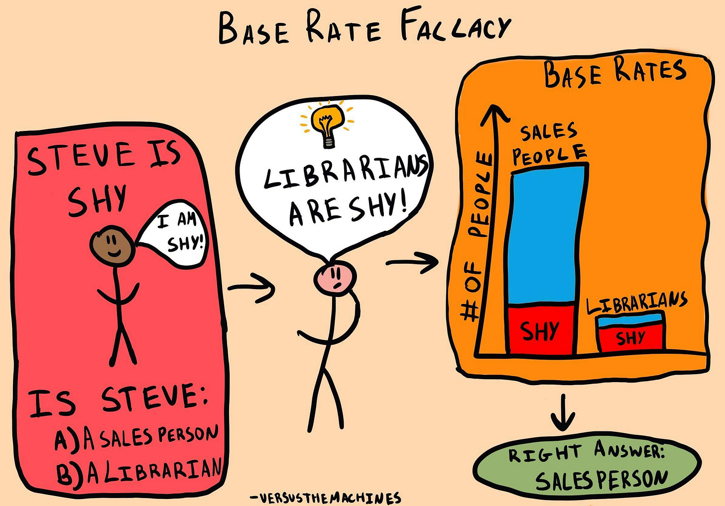
1. Misuse of Priors
People incorrectly interpret probabilities based on how "representative" an outcome feels instead of its actual likelihood.
First, people tend to assess probability from the representativeness of an outcome rather than from its frequency.
Second, humans often judge relative probability of outcomes by assessing similarity rather than frequency.
Third, when given worthless evidence in a Bayesian framework, people tend to ignore prior probabilities and use the worthless evidence.
Fourth, people often judge the frequency of a class on the basis of avail- ability of typical instances.
“The Grammar of Graphics”, Leland Wilkinson
For example, we might overestimate the danger of flying after hearing about a rare plane crash on the news, ignoring data showing air travel is statistically safer than driving.
Also after a highly publicized plane crash, fear might temporarily reduce demand for air travel, causing airlines to lower ticket prices to attract customers. This phenomenon is not limited to aviation. Events tied to rare but emotionally charged risks often lead to behavioral shifts, affecting supply, demand, and pricing in various industries.

In analytics, a misuse of priors could occur when an analyst predicts customer churn based on recent negative feedback, ignoring the larger base rate of customer satisfaction. If they assume that a single incident of poor service means widespread dissatisfaction, they might overestimate churn risk, leading to inefficient interventions or resource allocation.
2. Misuse of Likelihoods
People confuse conditional probabilities, such as mixing up the probability of "A given B" with "B given A."
People often ignore priors, but at least as often, they ignore or discount evidence. Edwards (1968) has denoted the systematic underestimation of the im- pact of evidence conservatism. People often hold on to prior beliefs in the face of conflicting evidence.
“The Grammar of Graphics”, Leland Wilkinson
For example, a doctor can assume that the probability of having a disease given a positive test result is the same as the likelihood of a positive test result for patients with the disease.
![An illustration of two stick figures. The figure on the left, under a sun, is smiling and saying, "Did you read my paper on confirmation bias?" The figure on the right responds, "Yes, but it only proved what I already knew..." Between them is a blackboard with the Bayesian probability formula: P(A|B) = [P(B|A)P(A)] / P(B). An illustration of two stick figures. The figure on the left, under a sun, is smiling and saying, "Did you read my paper on confirmation bias?" The figure on the right responds, "Yes, but it only proved what I already knew..." Between them is a blackboard with the Bayesian probability formula: P(A|B) = [P(B|A)P(A)] / P(B).](https://substackcdn.com/image/fetch/$s_!GvMN!,w_1456,c_limit,f_auto,q_auto:good,fl_progressive:steep/https%3A%2F%2Fsubstack-post-media.s3.amazonaws.com%2Fpublic%2Fimages%2F9f202fcc-fc0d-41da-a9da-835ff180e445_1024x715.jpeg)
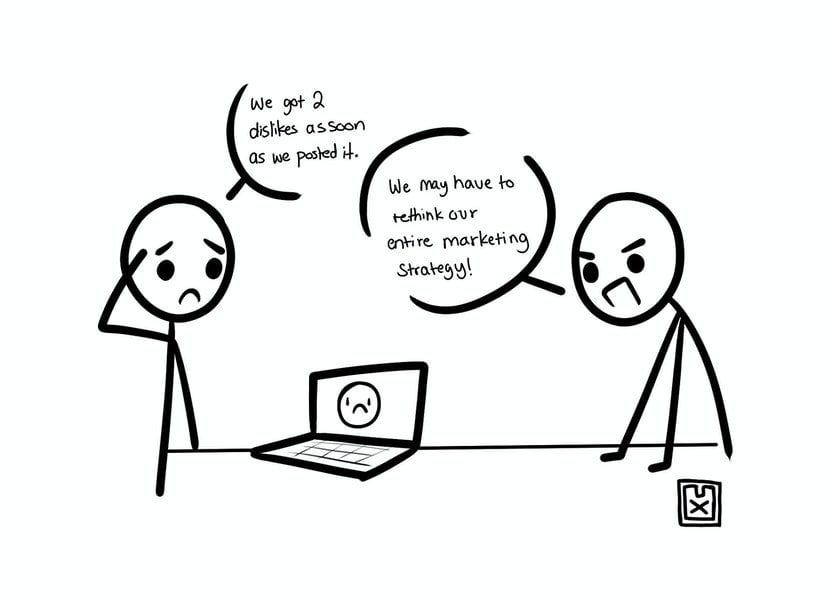
If an A/B test shows a promising early result (e.g., a 10% conversion increase in the first few days), there is a risk of assuming that the change will hold true long-term. This might lead to decisions based on insufficient data.
3. Insensitivity to Sample Size
People trust small samples as much as large ones, leading to overconfidence in unreliable conclusions. It is also called “Law of Small Numbers” – people assume that small samples are representative of the larger population, which can lead to overconfidence in conclusions.
4. Nonlinearity
People misjudge frequencies, often overestimating rare events and underestimating common ones.
We cannot assume that subjective probability is proportional to observed frequency, even in the most controlled and objective circumstances.
“The Grammar of Graphics”, Leland Wilkinson
Nonlinearity is also connected to subjective probability. Subjective probability refers to personal judgment or belief about the likelihood of an event, which may not always align with objective data. People often perceive probabilities nonlinearly – meaning that their judgment about the likelihood of an event can change disproportionately in response to different factors.
5. Implications for Graphics
To help us avoid irrational choices, we need visual aids, similar to how displays are designed to counteract visual illusions.
Decision-makers need statistical tools to formalize the scenarios they encounter and they need graphical aids to keep them from making irrational decisions.
“The Grammar of Graphics”, Leland Wilkinson
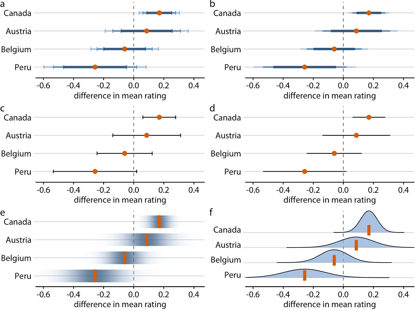
For instance, mosaic plots can illustrate Bayesian concepts. It’s also important to visually represent errors, not just with error bars but through more effective graphical representations, to guide better decision-making.
In Data Visualization
When working with data involving uncertainty, it's essential to present the full story, avoiding cherry-picked "success story" narratives. Always display base rates, sample sizes, and distributions to ensure a complete picture. Confidence intervals or error bars are crucial to convey uncertainty and prevent premature conclusions, especially when dealing with small samples.
If you're working with aggregates like averages, always show the sample size and the distribution from which the average was calculated. Analysts may overlook the importance of sample size when comparing two metrics. For example, concluding that a small improvement in conversion rate is meaningful based on a small sample when the confidence interval is wide.
Visualize confidence intervals or error bars on charts to show the uncertainty of results and highlight whether the sample size is large enough for reliable conclusions.
Don’t forget to show the historical trends of the data and visualize data distributions where possible. This helps provide context, making it easier for viewers to understand the overall pattern and variability of the data.
Hope you’ve enjoyed this article! Please leave a comment or like if you enjoy this type of content, so I can write about things you truly care about. And yes, your opinion really matters to me! 🍀


Always love reading your articles and blog posts! Definitely inspires me to keep reading and learning!