
How to Visualize Plan vs Actual
Design choices that make deviations visible at a glance

When you put plan and actual values on the same chart, the goal is simple: let the viewer see the gap immediately. The design choices you make — how to draw the plan, which color to use for deviations, how to encode the comparison — will determine whether that gap is obvious in two seconds or hidden in visual noise.
Make Plan and Actual Instantly Distinguishable
The first rule is that plan and actual should never look the same. If a viewer has to check the legend to know which bar is which, the chart is doing too little work.
The clearest way to separate them is through visual form, not just color. Use different shapes or line styles: wide bars for actuals and narrow background bars for plan, a border outline instead of a filled bar, a marker line like in a bullet chart, or a dashed line for plan against a solid line for actuals. Each of these tells the eye “these two things are different kinds of information” before any reading happens.
Whatever encoding you choose, keep it consistent across every chart in the report. If plan is a dashed line on page one, it should be a dashed line on every other page too. Mixing styles without a reason creates confusion.
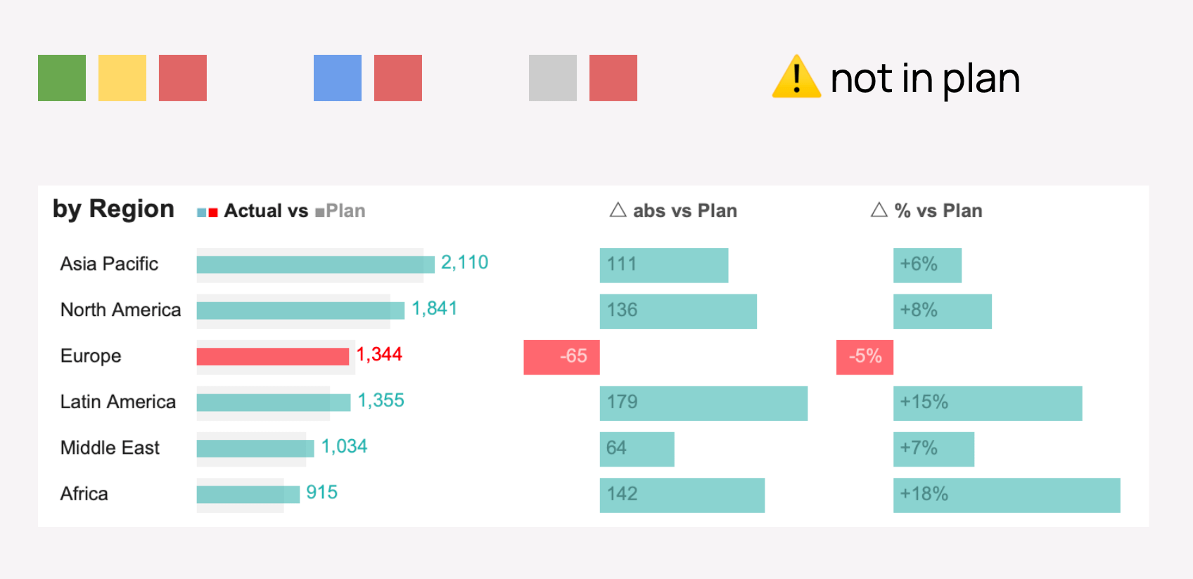
Use Color to Show What Went Wrong, Not Just What Happened
Color is most powerful when it’s reserved for exceptions. If every bar is colored, nothing stands out.
The approach that works well: keep on-track performance in a neutral color — grey or muted blue — and use a strong accent color only where actuals missed the plan. That way, a reader scanning the chart immediately spots the red or orange bars without reading a single number.
Show both absolute and relative variance. A -5% deviation looks small, but if it’s on a large revenue line, the absolute gap might be $65M — which is a different story. Showing both gives the business context it needs to act.
When something falls outside the plan entirely and wasn’t budgeted for, a simple warning marker (like a ⚠ icon) next to the label is enough to flag it without overloading the chart.
Choosing Between Bars and Lines
The choice between a bar chart and a line chart comes down to what question you’re answering.
Bar charts work best for comparing plan vs actual within a single time period or across categories. The eye compares heights or lengths naturally, making it easy to see which month or which region missed. They’re the right call when the message is “how did we do against the target?”
Line charts work best when the focus is on longer-term trends — how performance is moving over months or years, and whether the trajectory is converging toward or diverging from the plan. A line shows momentum in a way bars don’t.
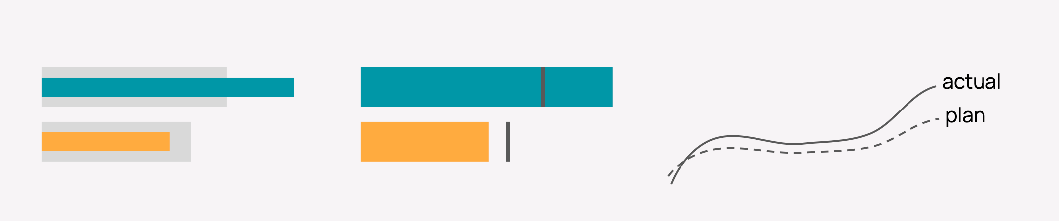
Bar Chart Approaches
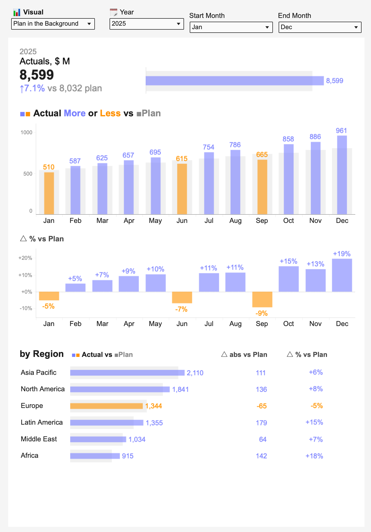
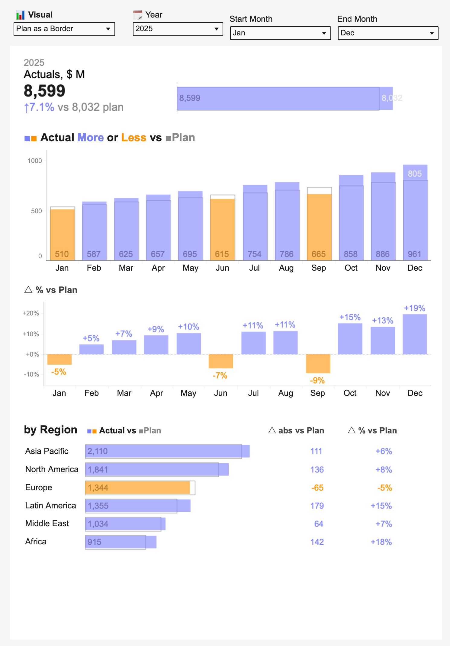
All three bar approaches below use the same data: monthly actuals for 2025 across 12 months, with a summary at the top and a regional breakdown at the bottom. The color logic is the same throughout — blue for months where actuals exceeded plan, orange for months where they fell short.
Plan in the Background
The plan bar sits behind the actual bar as a wider, lighter shape. The actual bar appears on top of it. When the actual exceeds the plan, the blue bar extends past the grey background. When it falls short, the orange bar is visibly shorter.
This approach is intuitive because the “target zone” is always visible — you can see at a glance whether the actual reached it or not. The background plan bar provides context without competing for attention.
Plan as a Border
Instead of a background fill, the plan is shown as a thin outline around the bar position. The actual bar fills in solid color inside or beyond that boundary.
This keeps the chart cleaner — there’s no overlapping fill to manage — and works especially well when actual values are close to the plan, since the border and the bar edge sit right next to each other and the gap is easy to read.
Plan as Gantt (Bullet-Style Marker)
The plan is represented as a short horizontal line — a marker — drawn across the bar at the plan value. This is similar to a bullet chart. The actual bar grows toward (or past) that marker.
This is the most minimal approach. The plan takes up almost no space visually, so the chart feels uncluttered. It’s a good choice when you have many bars and want to keep things readable at a glance without the visual weight of background bars or outlines.
Line Chart Approaches
Line charts come into their own when you’re looking at a longer period — multiple quarters or two years, for example — and want to see how the trend is developing against the plan.
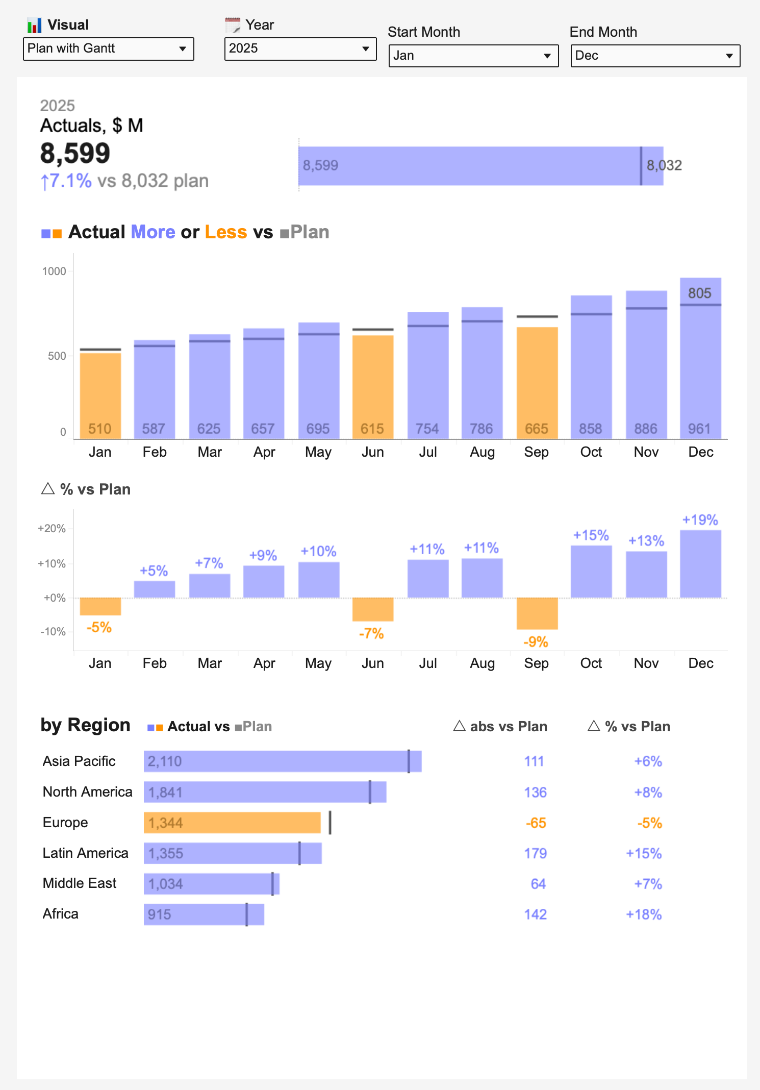
Plan as a Dashed Line
The actual performance is shown as a solid colored line; the plan runs alongside it as a dashed grey line. The two lines share the same axis and the gap between them is the story.
This is the simplest and most widely understood line-based approach. The dashed line clearly signals “this is a target, not a measurement.” When the solid line climbs above the dashed one, performance is ahead of plan; when it dips below, it’s behind.
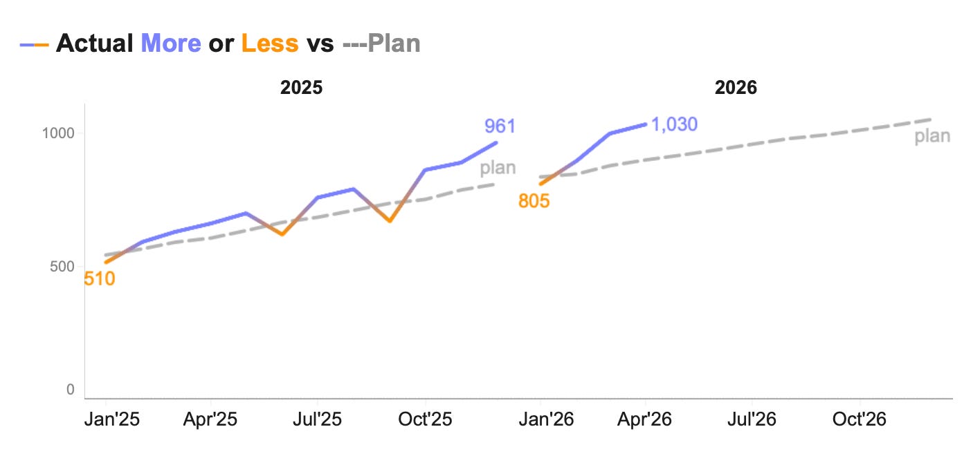
Plan as a Shaded Area
The plan is filled as a grey area across the full chart. The actual line runs over the top of this area.
This gives a strong sense of the “planned range” as a zone rather than a single value. It works well when the plan itself changes over time and you want to show the shape of what was expected, not just a static number.
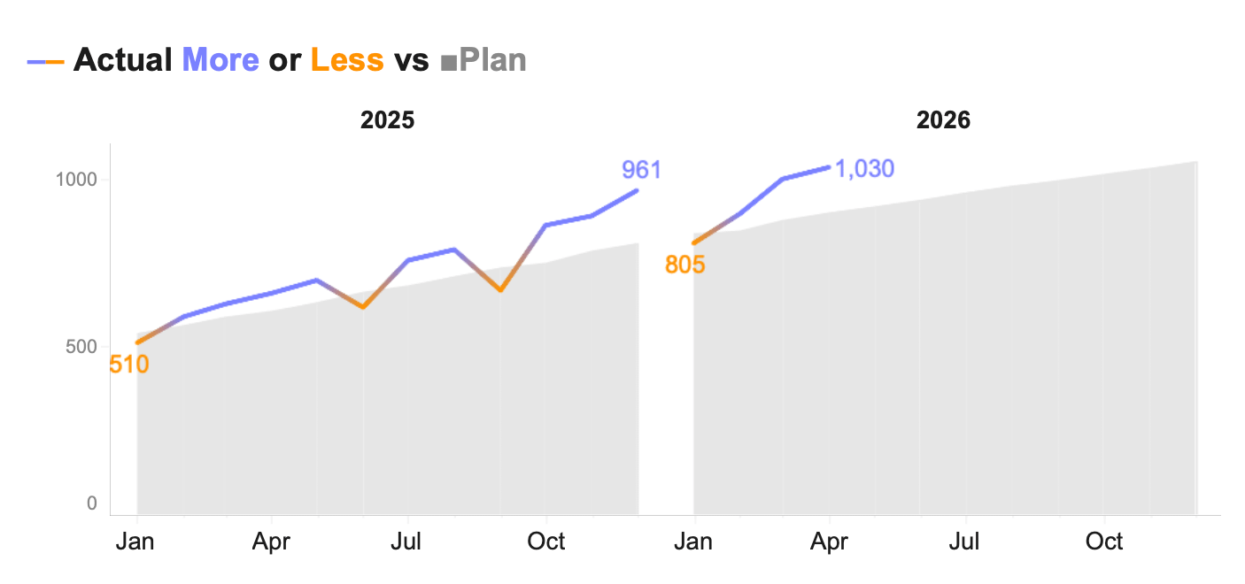
Shaded Area Between the Lines
Both the plan and actual are drawn as lines, and the space between them is filled with a colored band. The band represents the variance directly — it grows when the gap widens and shrinks when they converge.
This is particularly effective for showing whether performance is improving or worsening over time. The viewer doesn’t need to mentally calculate the distance between two lines; the filled area does that work.
No single approach is right for every situation. The question to ask is: what does the viewer need to understand first? If it's the size of the gap in a given month, use bars. If it's whether the trajectory is improving, use lines.
All the visuals in this article were built in Tableau. You can download the workbook for free and explore each approach yourself.