
Financial Dashboarding
🚀 What Great Financial Reporting Looks Like in Tableau and PowerBI

Here’s the thing about finding good financial dashboard examples: most companies keep their actual financial data under lock and key. So unlike marketing or sales dashboards, you can’t just browse through a gallery and find dozens of real-world examples to learn from.
But over the years, I’ve been quietly bookmarking the gems I’ve come across – dashboards that are well-designed, thoughtfully structured, and actually useful.
So I decided to share my collection with you: examples in Tableau, Power BI, and Excel, plus a couple of resources on the IBCS standard if you want to go deeper.
Tableau
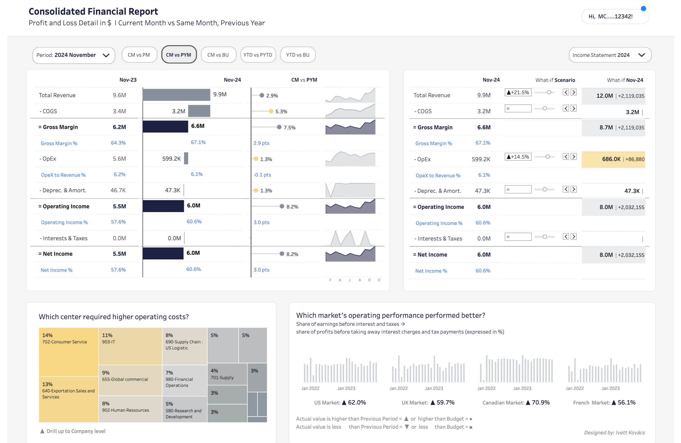
Consolidated Financial Report by IvettAlexa
A comprehensive P&L dashboard with month-over-month and year-over-year comparisons, trend sparklines, and built-in scenario planning. When I first showed this to our FP&A team, they immediately asked for a similar one. Notice the hierarchical income statement structure with sparklines for instant trend context, and the what-if scenario analysis on the right that lets you model changes in real-time.
Scenario Analysis - IBCS® by IvettAlexa
A scenario planning dashboard comparing Actual vs. Pessimistic vs. Optimistic forecasts for a full income statement. Another gem by Ivetta – a perfect implementation of the IBCS standard in Tableau. Notice the consistent use of color coding, the clean column structure for scenario comparisons, and how variance deltas are shown both in absolute values and as bars.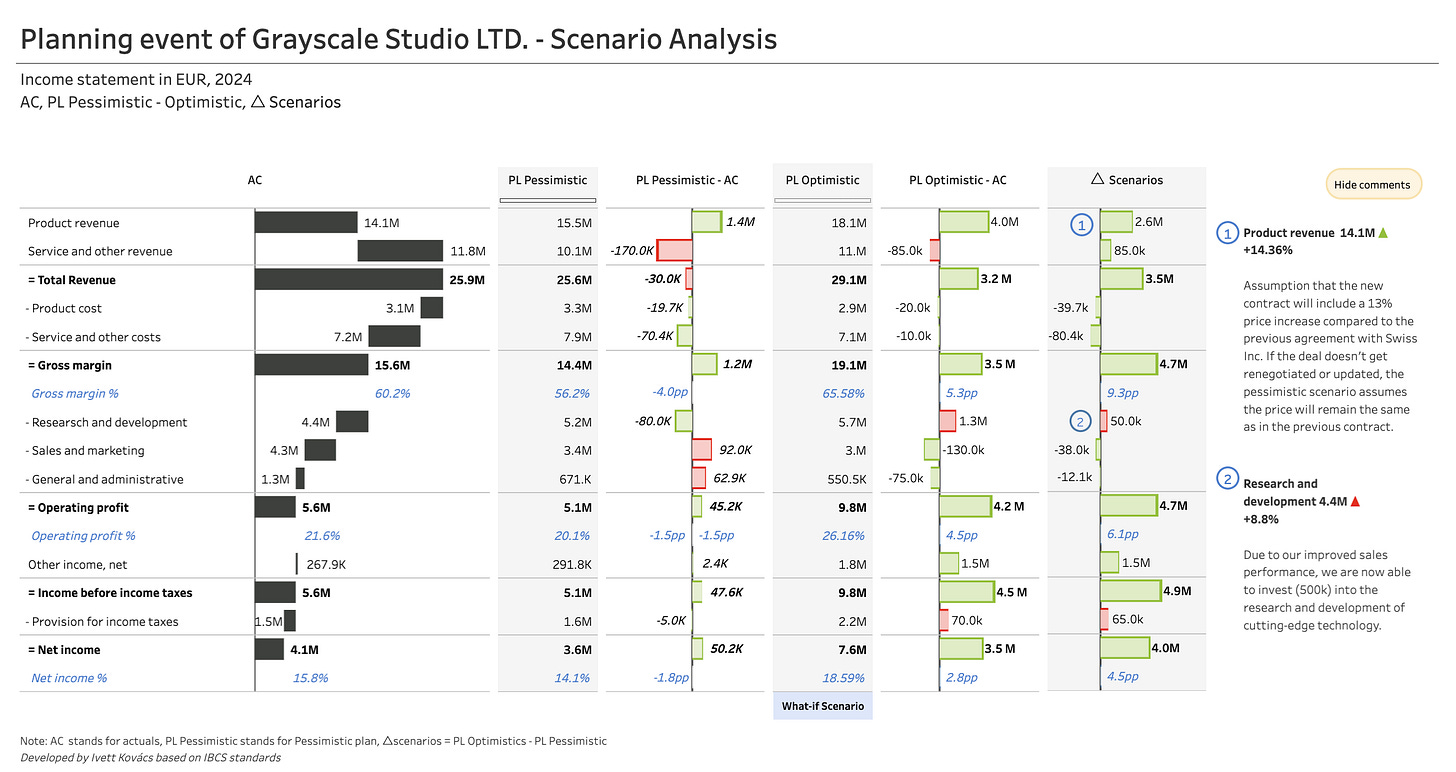
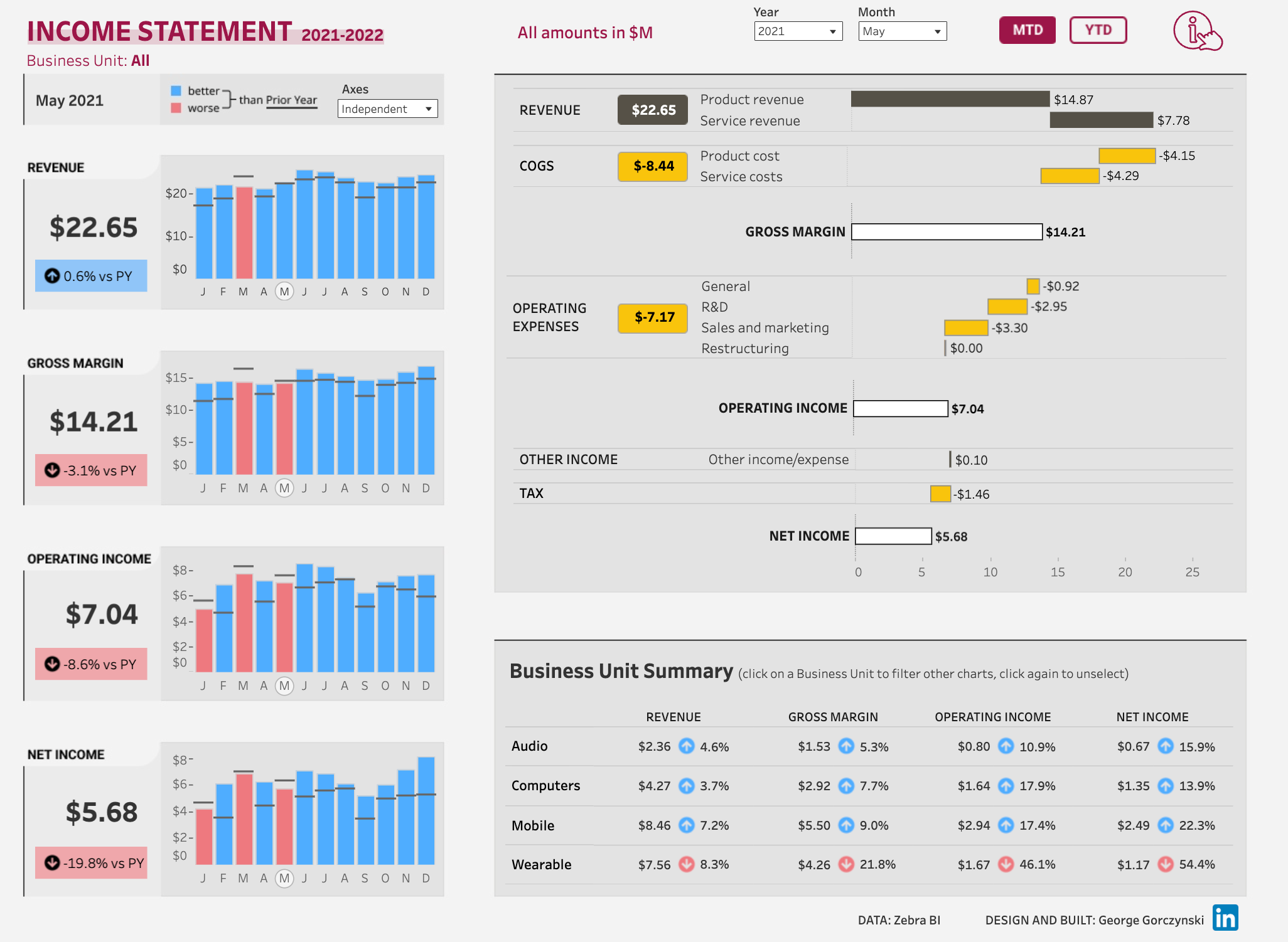
Income Statement by George Gorczynski
A straightforward P&L dashboard showing monthly trends for key metrics (Revenue, Gross Margin, Operating Income, Net Income) with year-over-year comparisons and a detailed waterfall breakdown on the right. Perfect combo of overview on the left with details on the right.

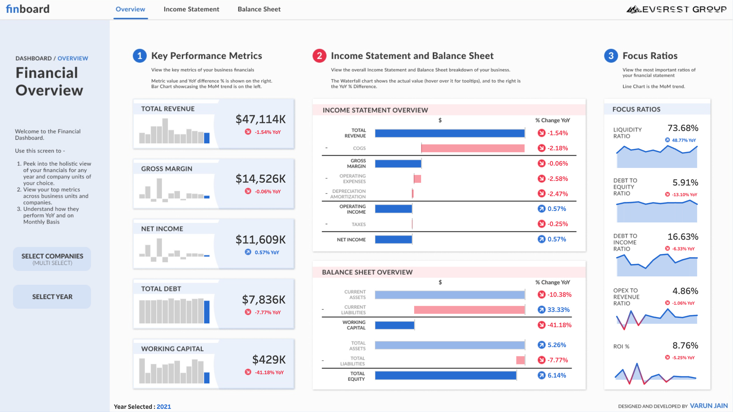
Financial Dashboard | #RWFD by Varun Jain
A comprehensive financial overview combining key performance metrics, income statement and balance sheet waterfalls, and focus ratios. This dashboard does an excellent job organizing complex financial data into three digestible sections.
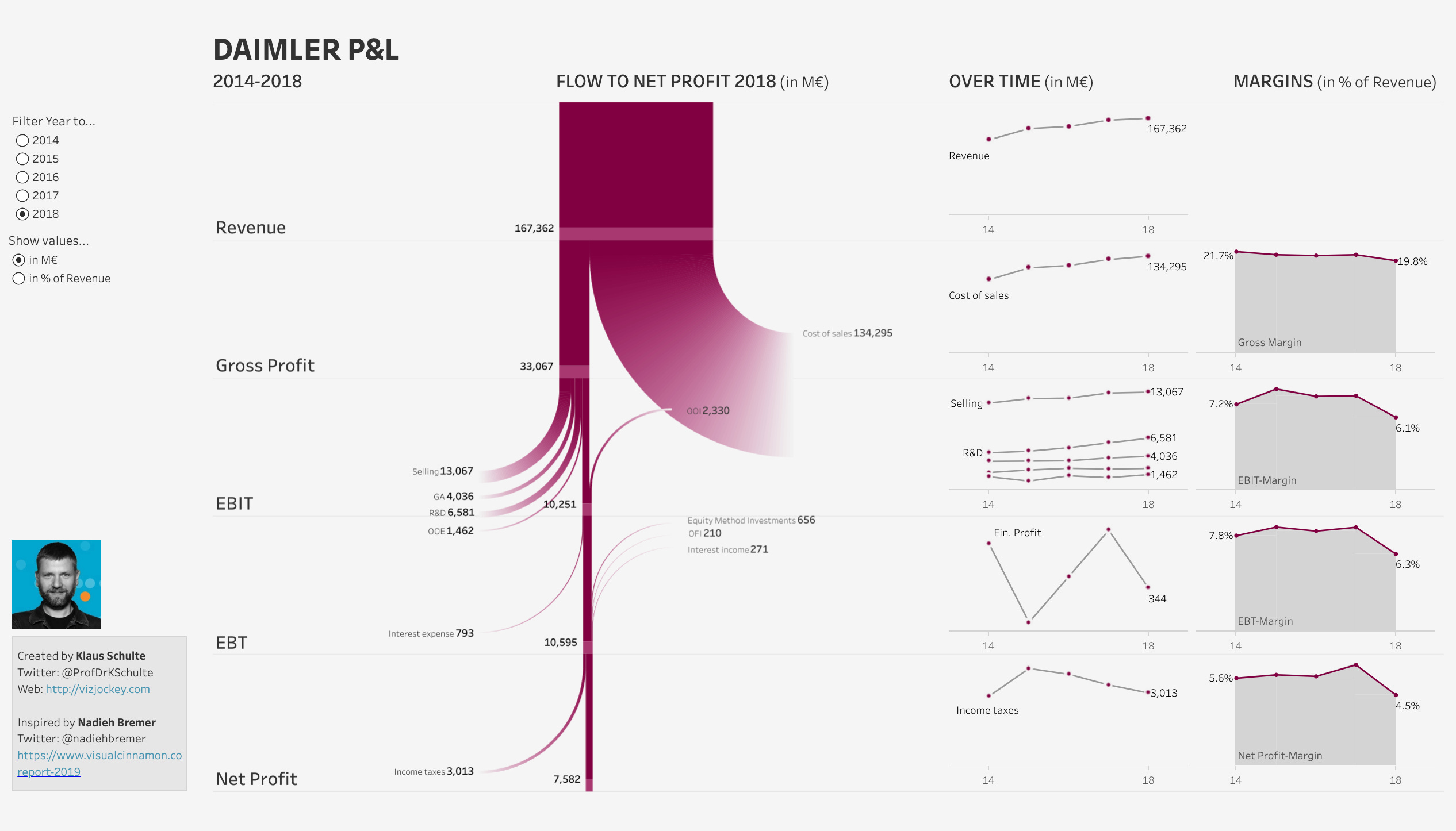
Flow to Net Profit - Daimler P&L 2014-2018 by Klaus Schulte
A P&L flow visualization using a Sankey-style diagram showing the journey from Revenue to Net Profit, with trend lines and margin analysis on the right side. The Sankey flow in the center is unconventional but effective — it shows exactly how revenue cascades down through costs to net profit, with each expense category clearly labeled and proportional to its size.
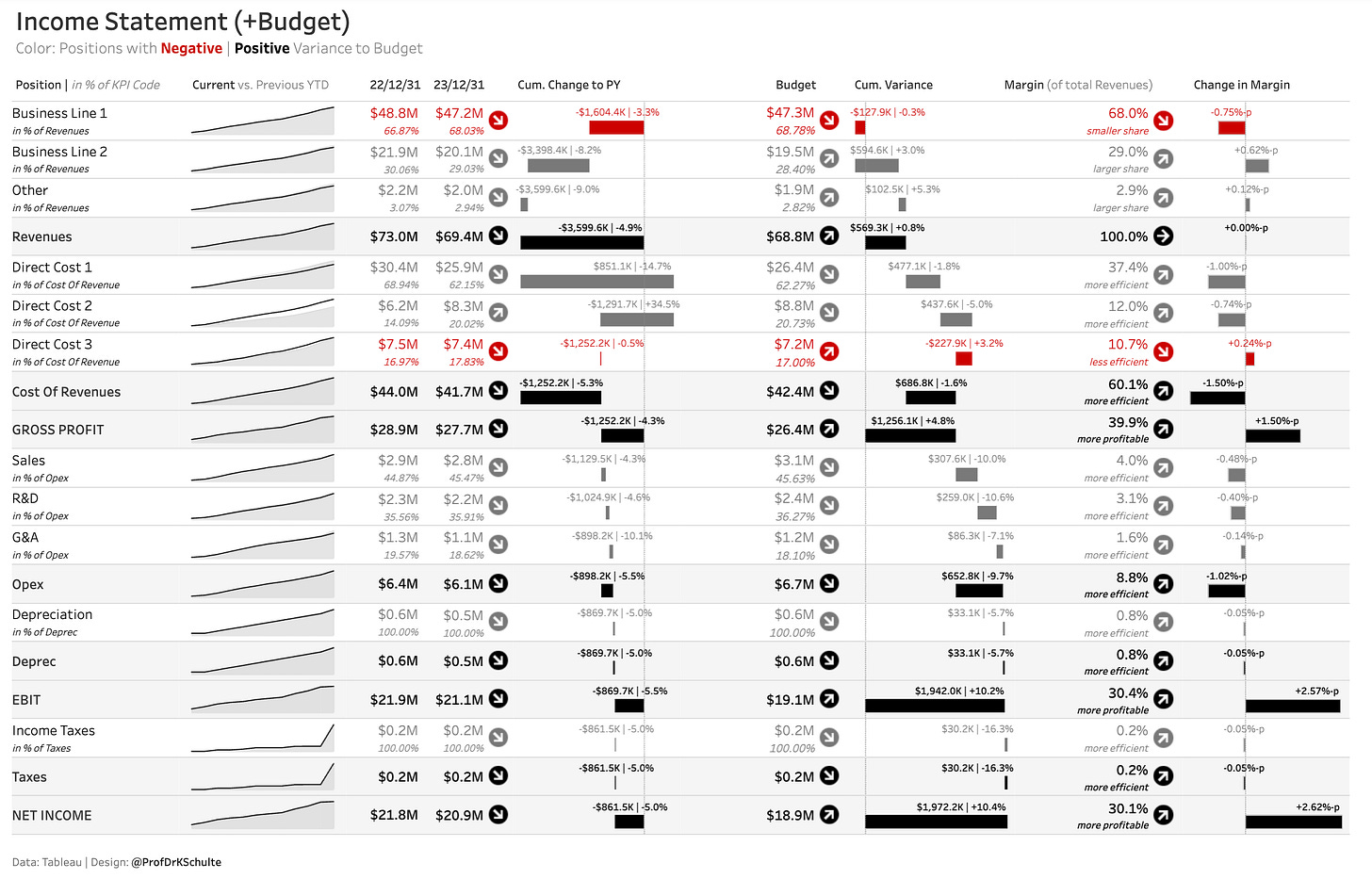
Income Statement (+Budget) by Klaus Schulte
This is a data-dense dashboard done right. Notice how it packs multiple comparison dimensions (Current vs PY, Budget vs Actual, Margins, Margin Changes) without feeling cluttered. The color coding instantly highlights negative variances in red and positive in gray/black, while the sparklines on the left give quick trend context.
💡 Bonus for Tableu users: Zen Mastering Financial Data — #Ireland TUG 3/3/2021 by Klaus Schulte
Power BI
Power BI Profit and Loss Template version 3.0.1 by Accounting Insights
A full P&L statement with detailed line items, variance analysis, and visual breakdowns showing variance by group and costs as a percentage of total sales. Includes flexible filtering by fiscal year, month, and analysis period.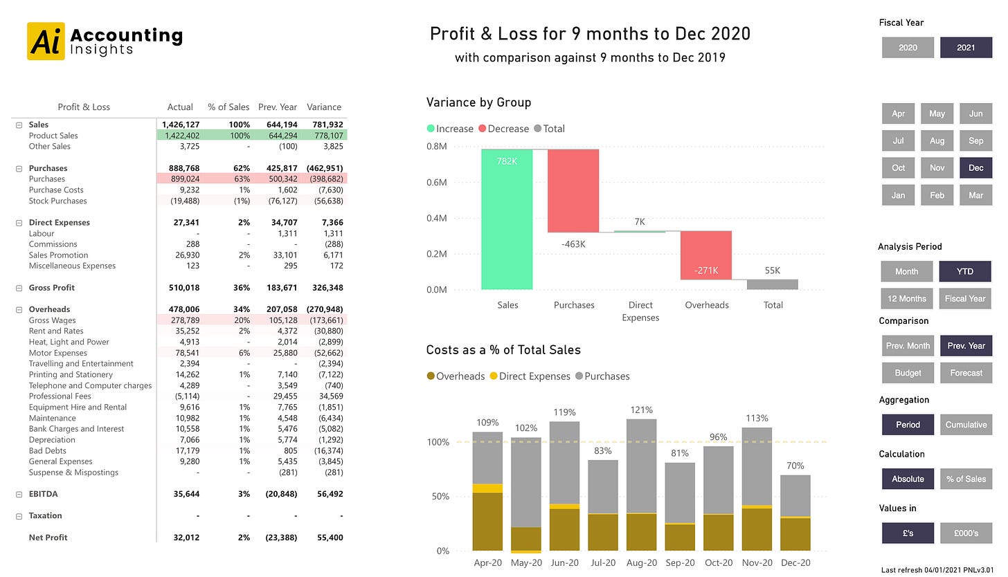
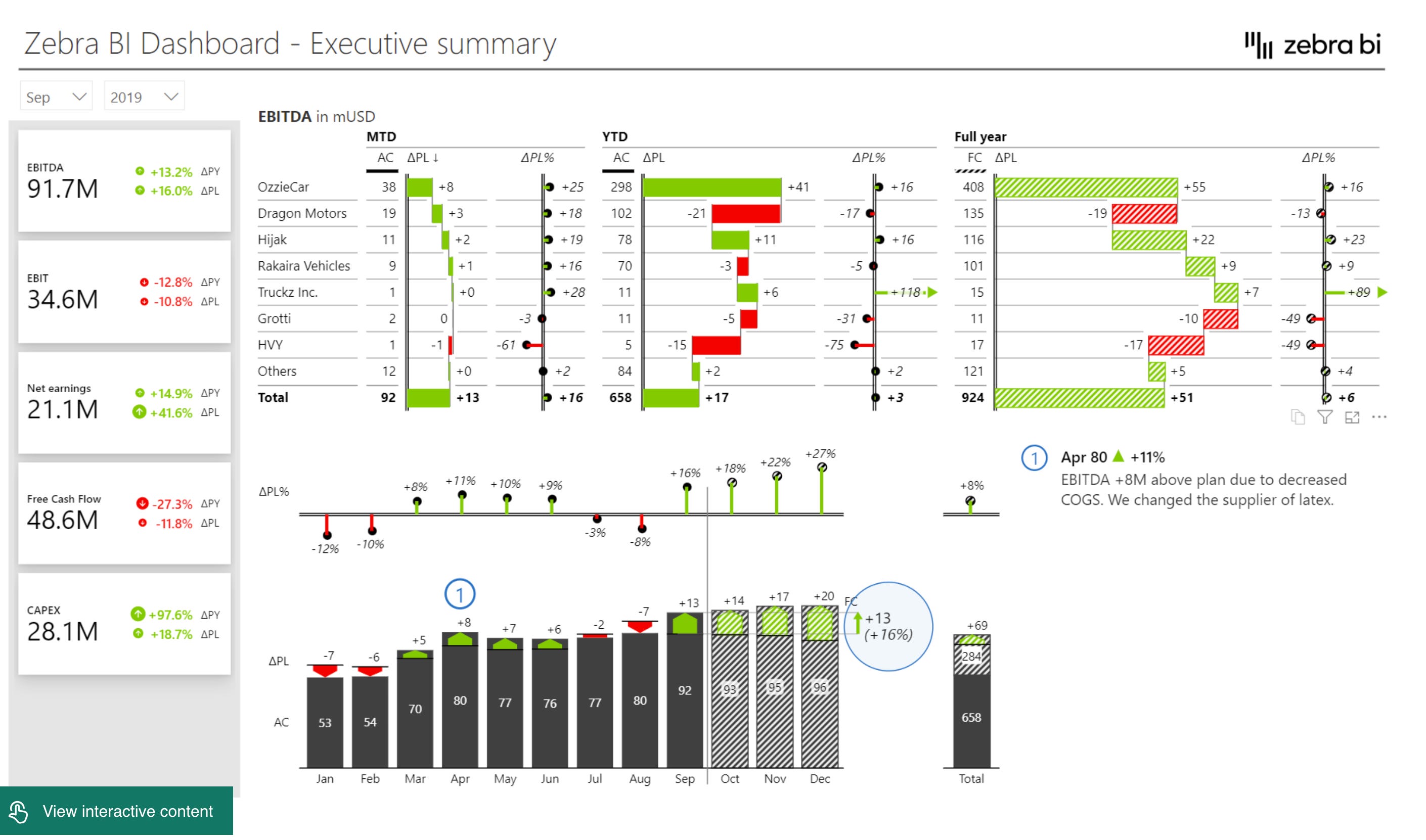
Consolidated Financials Power BI Dashboard by Zebra BI
An executive summary dashboard following IBCS standards, showing EBITDA breakdown by business unit across MTD, YTD, and Full Year periods. Includes variance analysis with both absolute and percentage changes, plus a waterfall chart showing monthly progression. This is IBCS done elegantly.
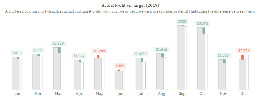
Alternative Approach to Visualize Surplus and Deficit by Iwa Sanjaya
Not a full dashboard, but a very good technique to visualize surplus and deficit, which are essential for financial dashboards.

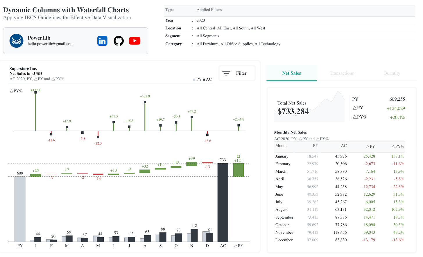
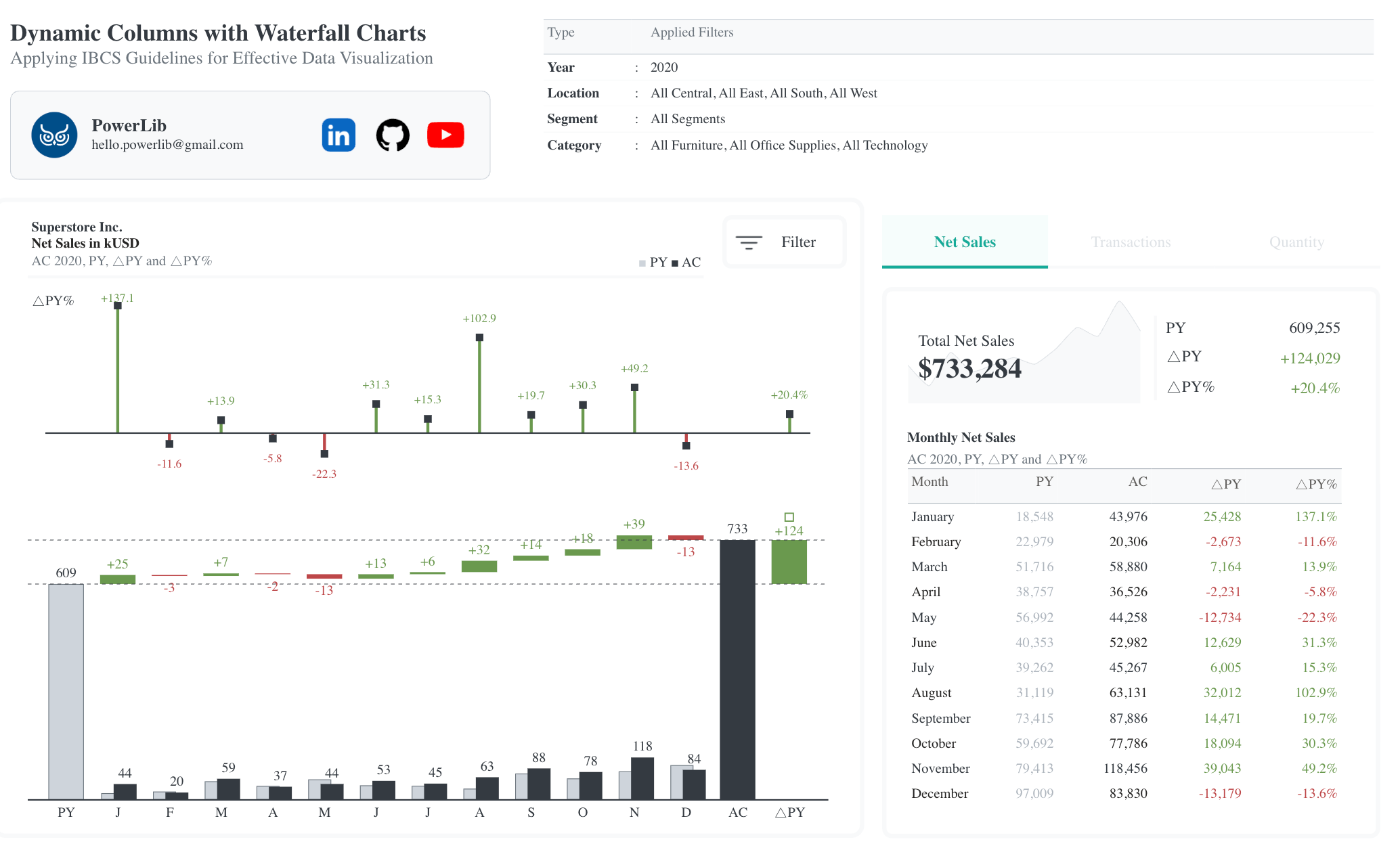
Dynamic IBCS-Standard Columns with Waterfall Charts by Iwa Sanjaya

IBCS Standard
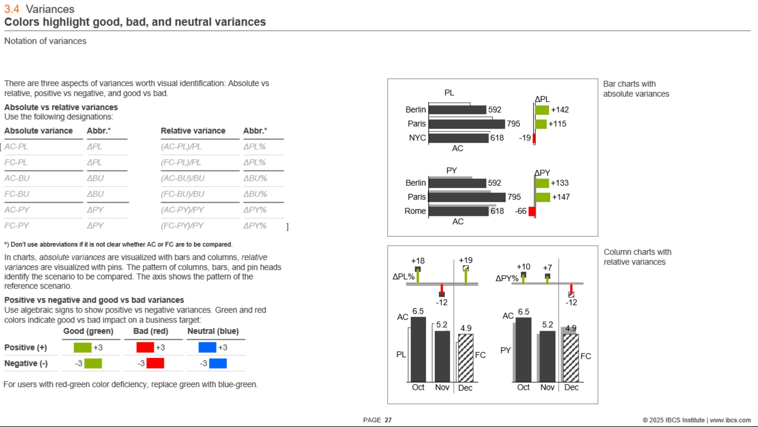
I’ve mentioned the IBCS standard a couple of times already, so if you’re not familiar with it, here are some details: IBCS (International Business Communication Standards) is a set of practical guidelines for designing clear, consistent financial reports and dashboards. It provides specific rules for things like color usage (green for favorable, red for unfavorable, gray for structure), chart types, layout structure, and how to show variances and comparisons. The goal is to make financial data easier to read and interpret by standardizing the way your financial data is shown. It’s widely adopted in tools like Tableau, Power BI, and Excel.
Some charts in my opinion can look a bit overwhelming, but they’re also adapted for printing, so that’s part of the reason. I’d definitely recommend checking out the table designs there – they’re particularly well thought out.
Hope this collection helps you get inspired and maybe reimagine your own financial dashboards too. Got a financial dashboard you love? Add a comment below – I’d love to see what’s inspiring you and feature it in the next collection.
What I find very bizarre with the financial standards is that red/green colour is usually inaccessible by people with certain types of colour blindness.