
Dashboard Color Makeover: When Less Really Is More
🎨 transforming a dashboard by using color to distinguish and highlight – not decorate

Color in dashboards typically serves two main purposes: to distinguish between different categories or metrics, or to highlight and alert users to something important. In this short makeover of a Marketo accelerator dashboard, I’ll show you how color can work effectively in both cases.
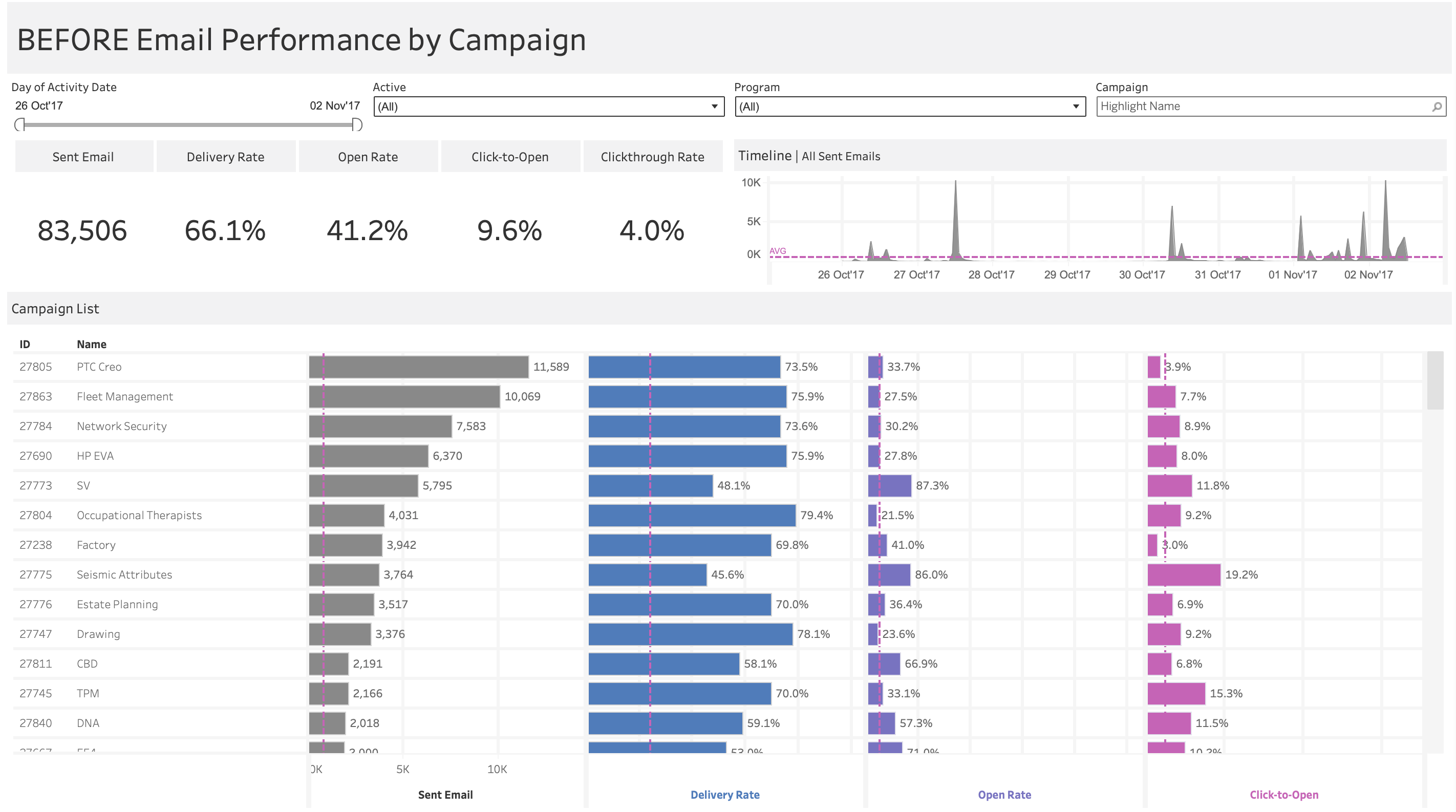
Dashboard 1: The Original
The original dashboard makes a good attempt at using color to distinguish metrics – each of the four metrics has its own color (gray, blue, purple, pink). There’s even a nice touch where the axis labels match the bar colors, helping reinforce the connection.
However, there are critical flaws: why is the average reference line pink? It stands out as the most vibrant element on the entire dashboard, yet it’s just showing the average – not an alert, not an insight, just a benchmark. This creates visual confusion and draws attention to the wrong place. The reference line should fade into the background, not compete with the data. Making matters worse, this pink is the same color as Click-to-Open, which raises questions: are they connected somehow? Is the reference line specific to that metric?
More importantly, the color coding doesn’t actually help navigation or understanding. There’s only one chart where the same colors are reused – Sent Email. Beyond that, the different colors for each metric don’t serve a purpose. All the bars could’ve been left gray without losing any insight.
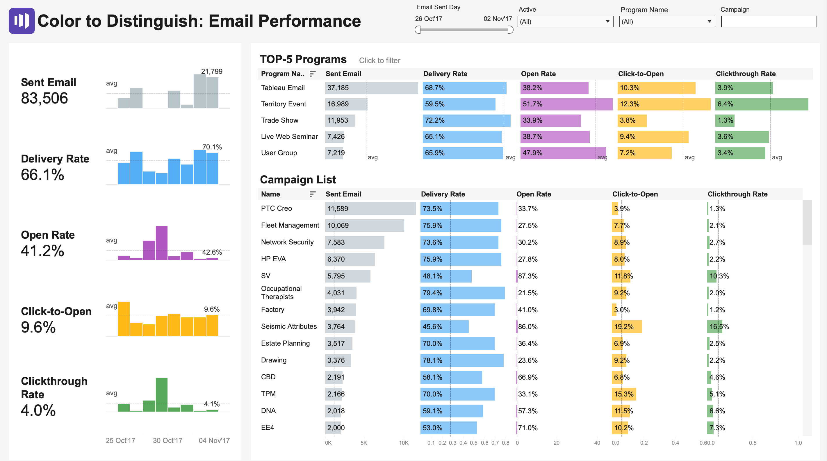
Dashboard 2: Color to Distinguish
In this version, I apply color consistently: one color per metric throughout the entire dashboard. Delivery Rate is always blue, Open Rate is always purple, Click-to-Open is always orange, and Clickthrough Rate is always green. This creates instant recognition—once you learn the color scheme, you can quickly scan and compare performance across programs and campaigns. I also tried to make colors associative, but this can be argued from a perception perspective.
I’ve also added sparklines to each metric because I firmly believe that a number without context is just a number, and sparklines are a great way to provide that needed context. However, this approach still has limitations: with every bar fully saturated in color, nothing truly stands out. The colors distinguish categories but don’t communicate performance – they don’t tell us if these rates are good, bad, or average.
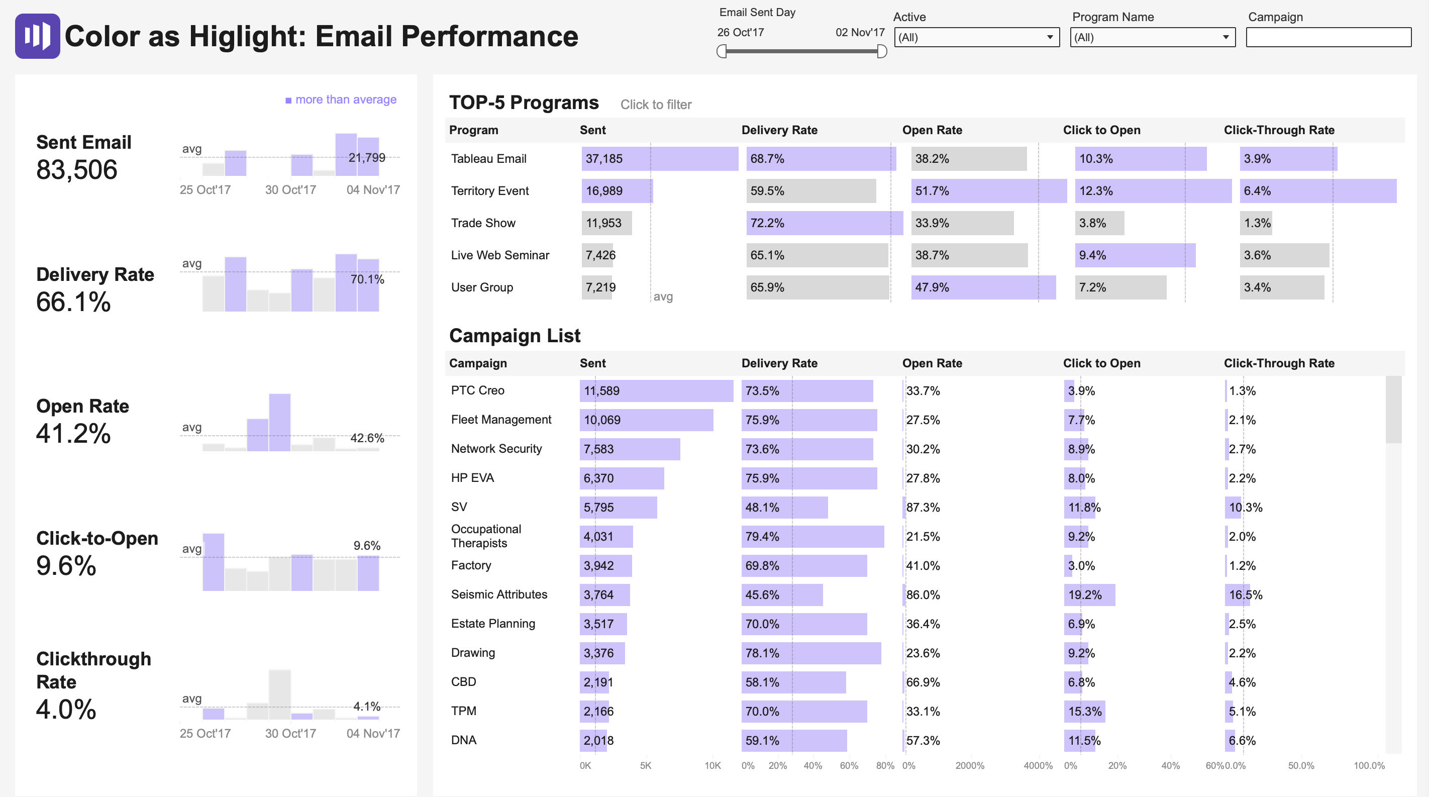
Dashboard 3: Color to Highlight
This version uses color sparingly to draw attention to what matters. Most bars are muted gray, establishing “normal,” while purple highlights values above the average. Your eye immediately goes to the purple – within seconds, you can identify which campaigns and metrics need attention.
However, consider using different thresholds like median instead of average, or the 90th percentile. Sometimes it’s not values above the average that should be highlighted, but rather below – depending on whether we’re focusing on problems or successes.
Look at your current dashboards. Are you using color to decorate or to communicate? Try this exercise:
Convert everything to grayscale
Add back only the color that serves a specific purpose—either to distinguish categories or to highlight deviations
Ask: “Does this color help my audience make a decision faster?”
Remember: In data visualization, color is not decoration – it’s a tool. Use it wisely.