
5 Rules for Dashboard Filter Placement
and if you should add them at all

Welcome to the first issue of BI Bites in 2026! As we kick off the new year, I wanted to start with something that might seem simple but has an outsized impact on dashboard usability: filter placement.
I know, filters don’t sound like the most exciting topic. But here’s the thing: I’ve seen brilliantly designed dashboards become frustrating to use because filters were placed as an afterthought. Conversely, I’ve seen relatively simple dashboards feel incredibly intuitive purely because filters were positioned thoughtfully.
So let’s talk about filters. Specifically, let’s explore a strategic framework for deciding where your filters should live and whether you need visible filters at all.
Start with the Foundation Question
Before placing a single filter on your dashboard, ask yourself: Do users actually need filters to use this dashboard at all?
This isn’t about being minimalist for its own sake – it’s about understanding your users’ workflow. Filter placement depends on three key factors:
How often filters are used – Daily? Weekly? Only for specific edge cases?
Whether the dashboard works without them – Can users gain meaningful insights with default values, or is the dashboard essentially unusable until filters are adjusted?
Whether filters affect one chart or the whole dashboard – This fundamentally changes where they should live
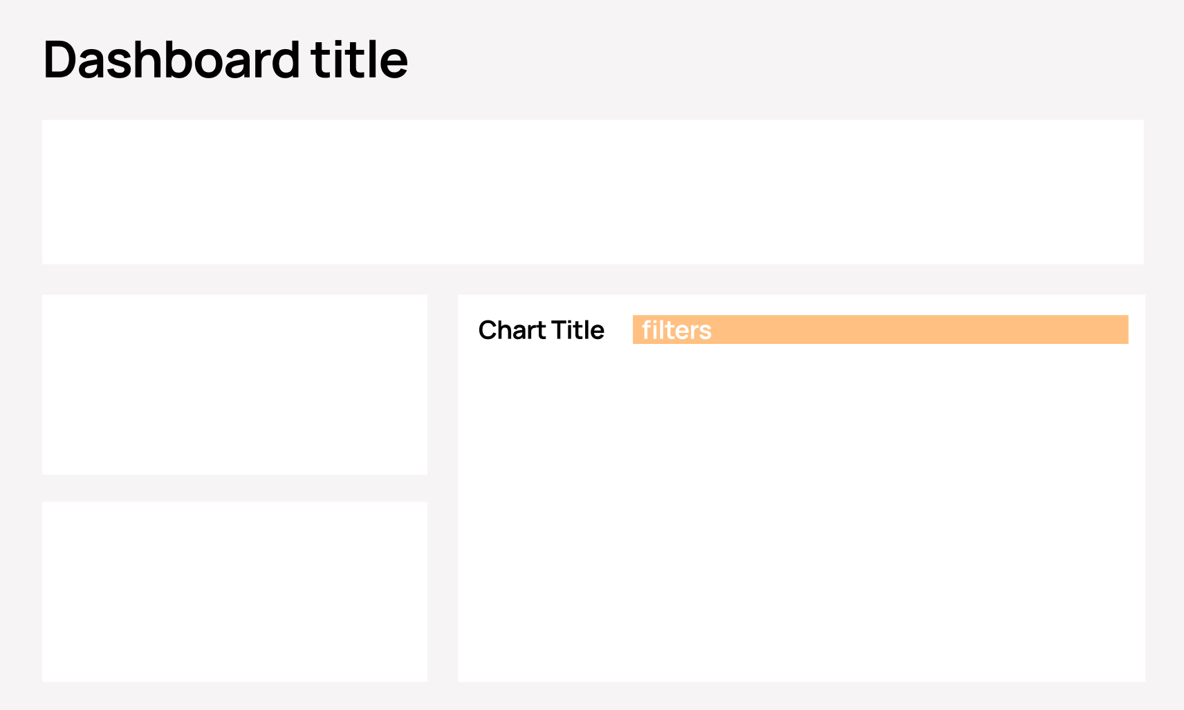
1. Header Block Filters
When to use: You have up to 5 filters that affect the entire dashboard
Examples:
Date range selectors (Q1 2024, Last 30 Days, YTD)
Regional filters (North America, EMEA, APAC)
Channel (Online, Retail, Partner)
Why this works: Header filters signal their importance through placement. Users instinctively understand that changing these will recalculate everything below. The dashboard should still provide value with default selections (like “All Regions” or “Current Quarter”), but users can narrow their focus as needed.
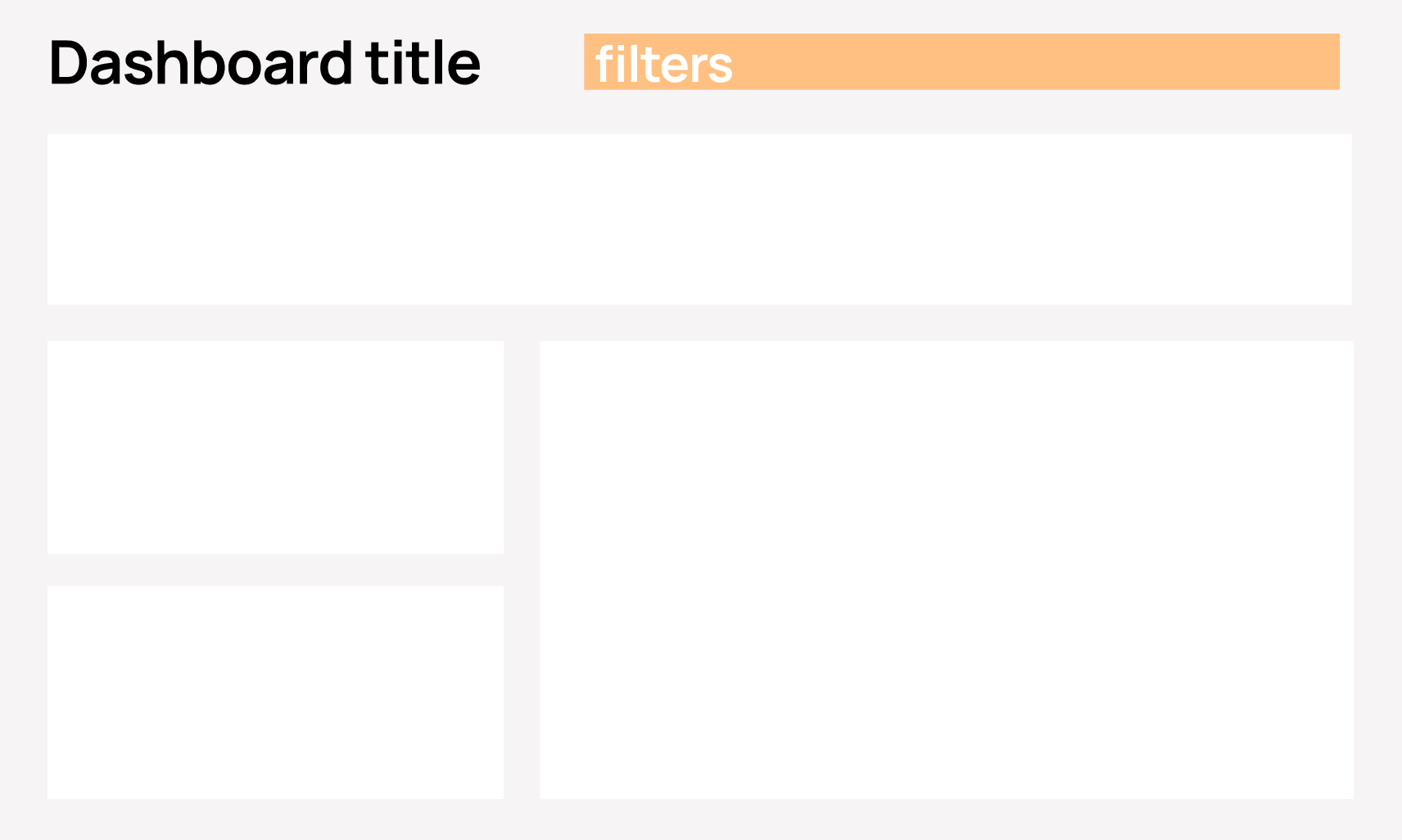
Visual placement: Typically positioned directly in the dashboard header
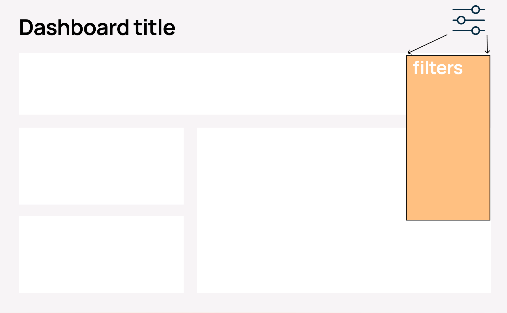
A note on left-side placement: I know many people like to put optional filters on the left side of dashboards – it’s become almost a default pattern in many BI tools. However, I strongly suggest avoiding this for non-mandatory filters. Here’s why: the left side of your dashboard is just too important. It’s where users’ eyes naturally land first (especially in left-to-right reading cultures). When you place optional filters there, you’re essentially telling users “this control panel is the most important thing on this page,” when it’s actually your data and insights that deserve that attention.
There's another complication with left-side panels: they're often used for navigation in multi-page dashboards or reporting suites. Navigation requires a completely different design approach. When you mix navigation and filters in the same left panel, you create cognitive confusion. Users have to mentally separate "where do I go?" from "how do I filter?" in the same visual space. Even worse, as users navigate between pages, they may expect filters to persist (or not) and different tools handle this differently, leading to frustration.
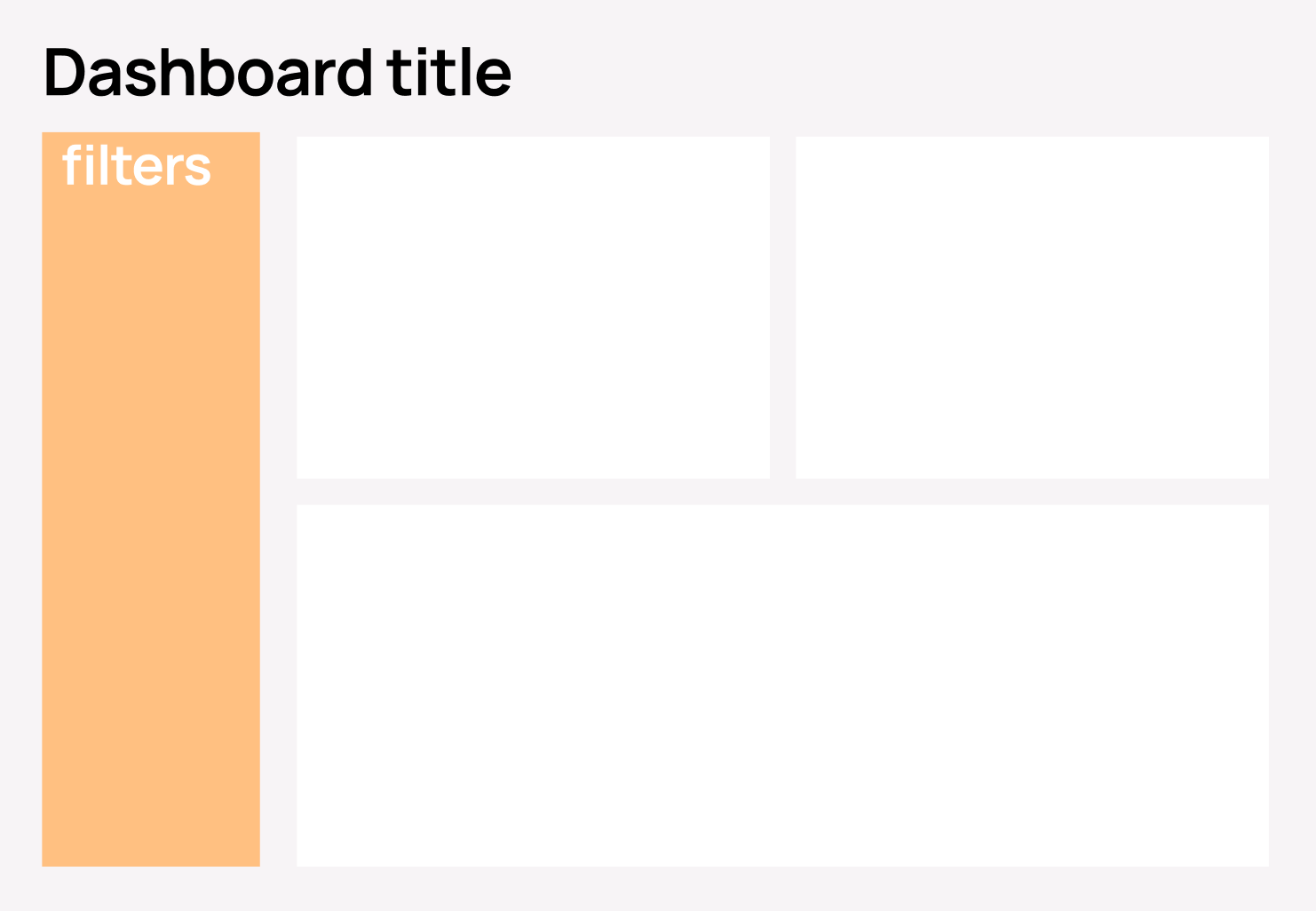
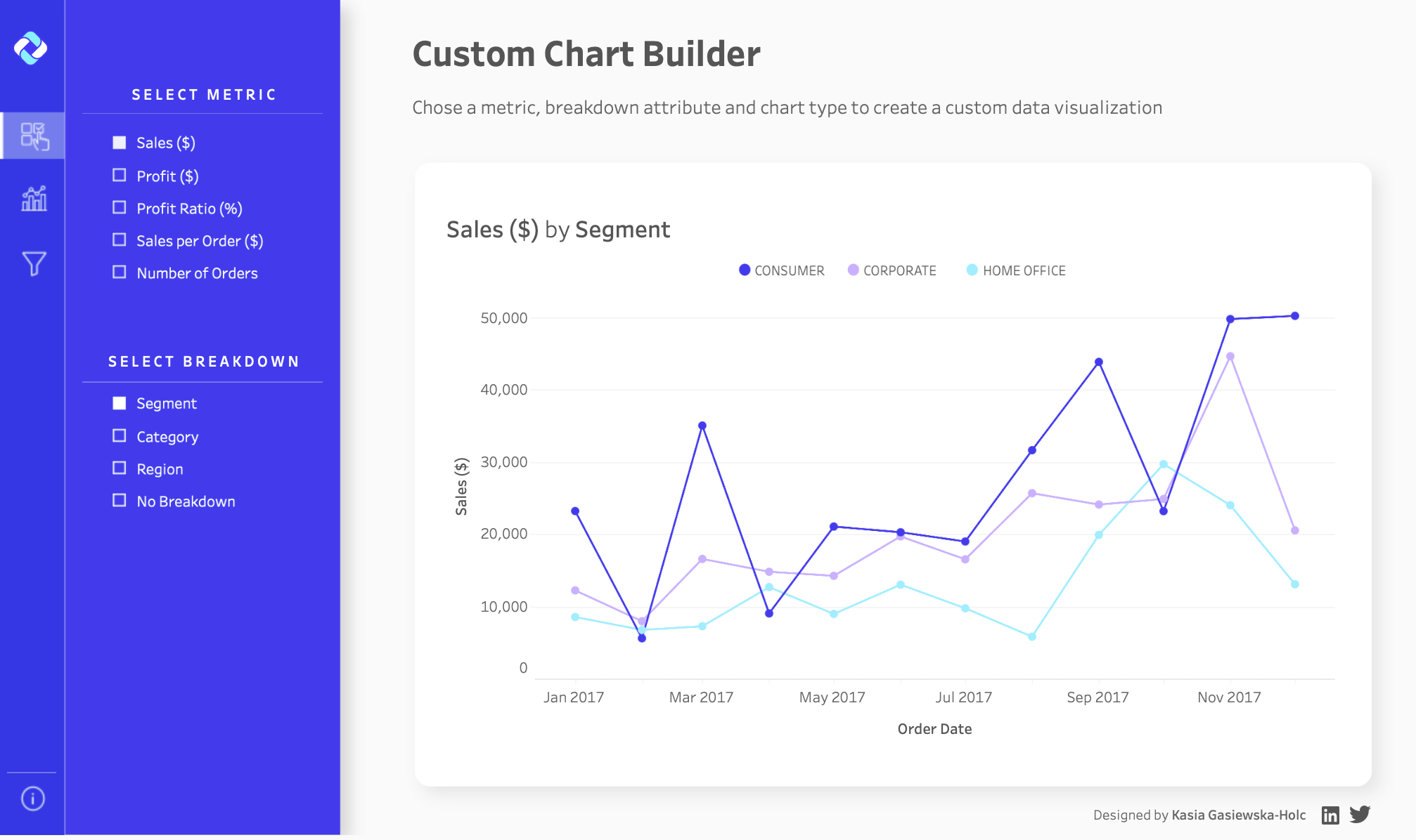
2. Important but Optional Filters
When to use: You have 5+ filters that strongly influence insights, but the dashboard still makes sense without changing them
Examples:
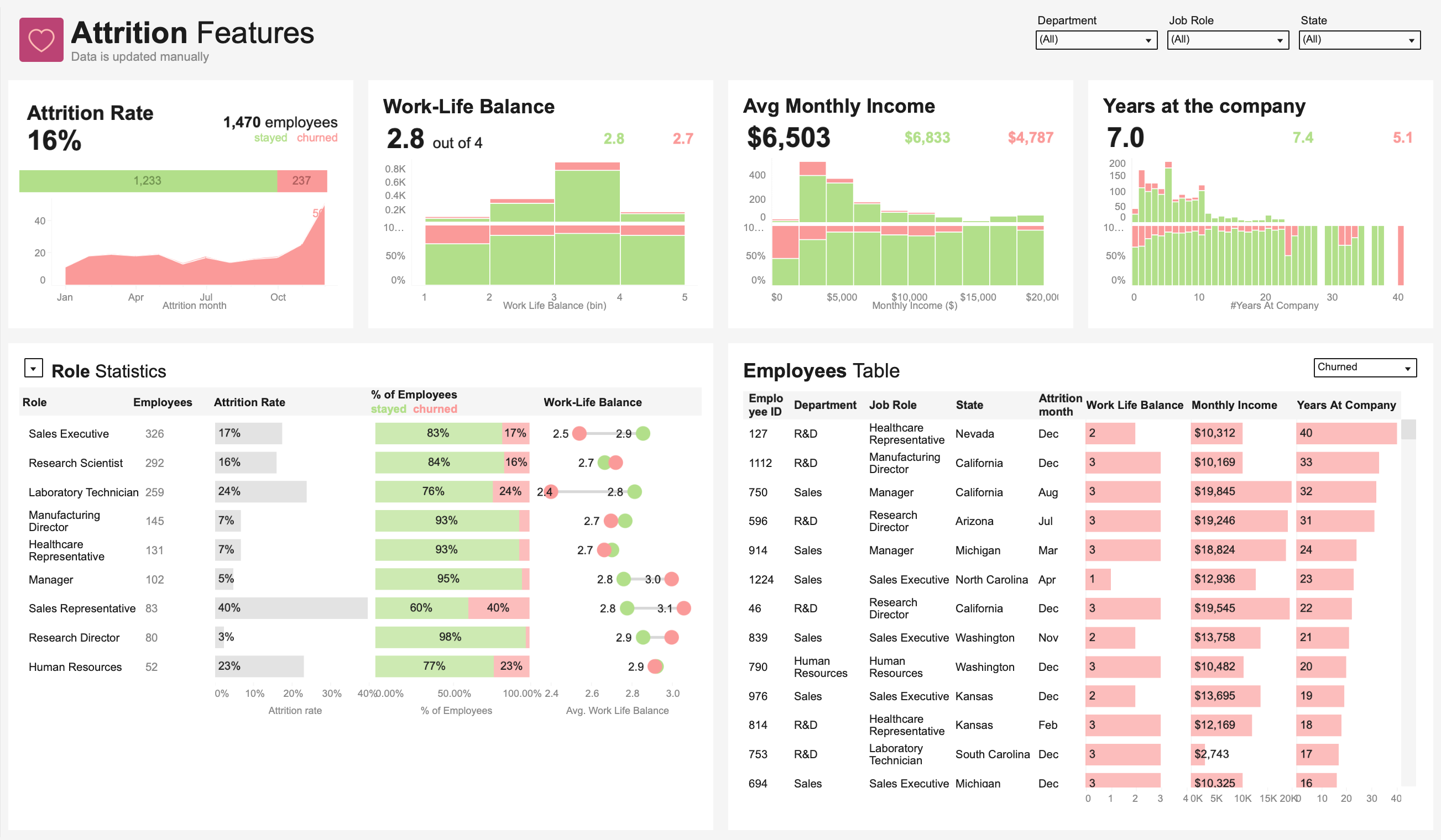
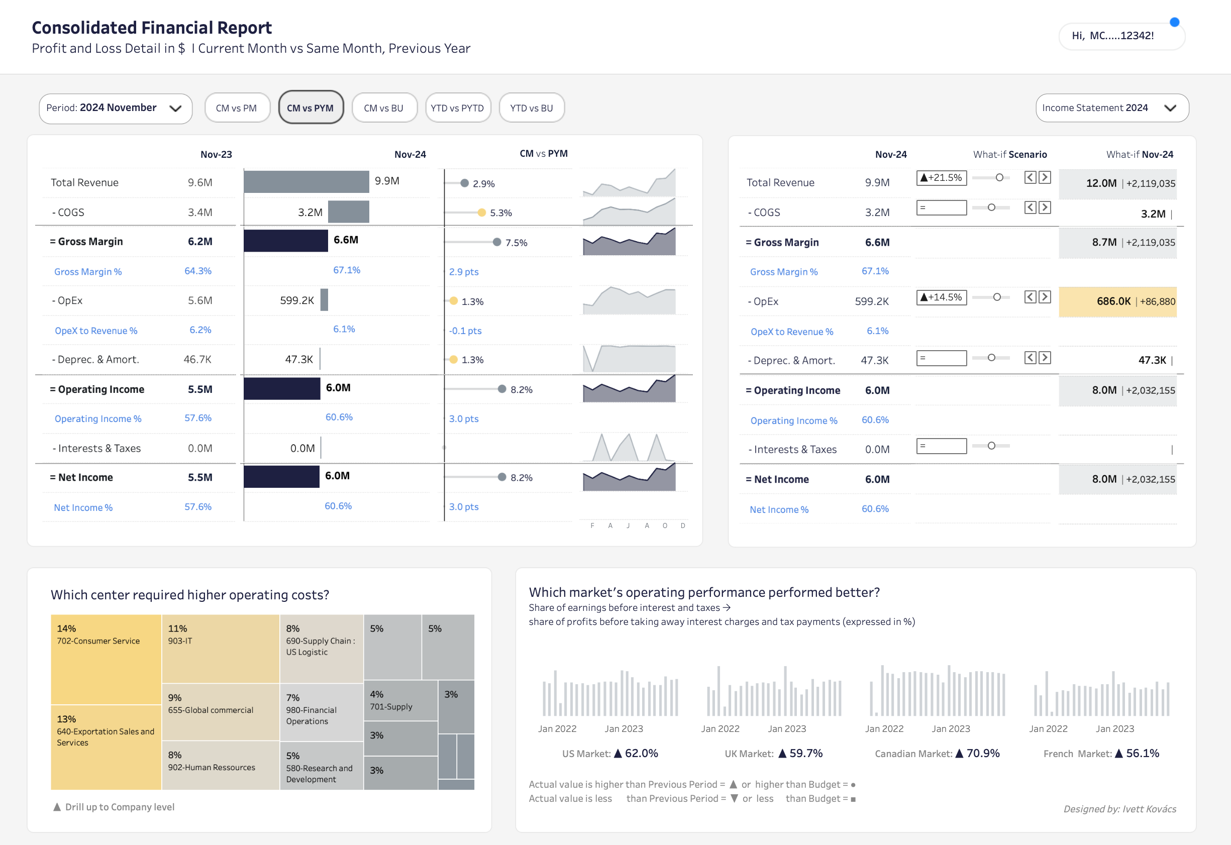
Sales performance dashboard with filters for: sales rep, product line, deal size, sales stage, contract type, customer industry, and lead source
Marketing dashboard with filters for: campaign type, audience segment, creative variant, channel mix, spend threshold, attribution model
Why this works: These filters are discoverable but don’t block the user’s path to insights. A regional sales manager might primarily filter by their region, while an executive views everything. The dashboard accommodates both use cases without forcing interaction.
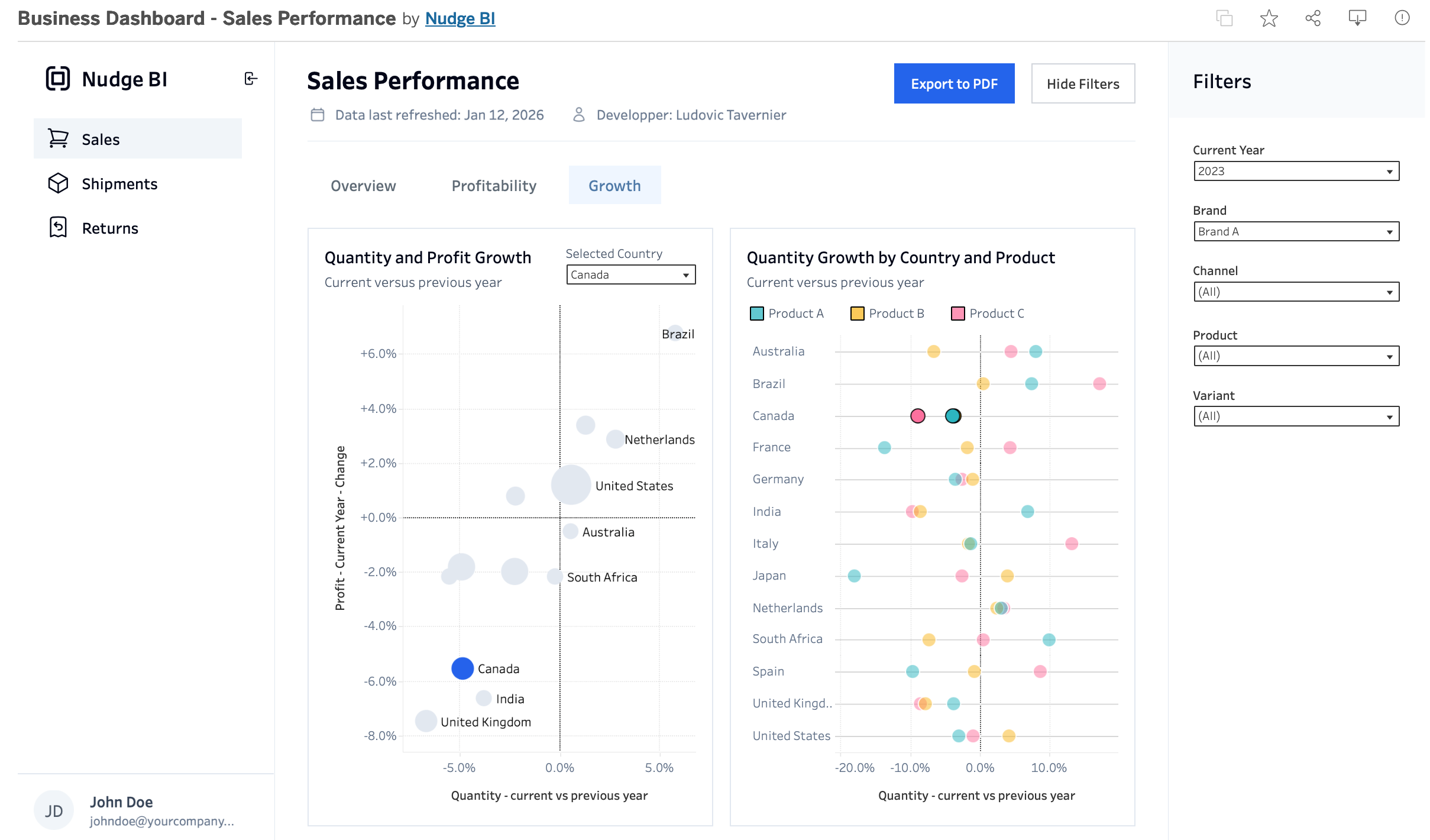
Visual placement: Either as a horizontal bar under the header (if space permits) or as a right-side panel that users can scan vertically. Right panels work particularly well for longer filter lists, as they don’t consume valuable vertical space from your visualizations.
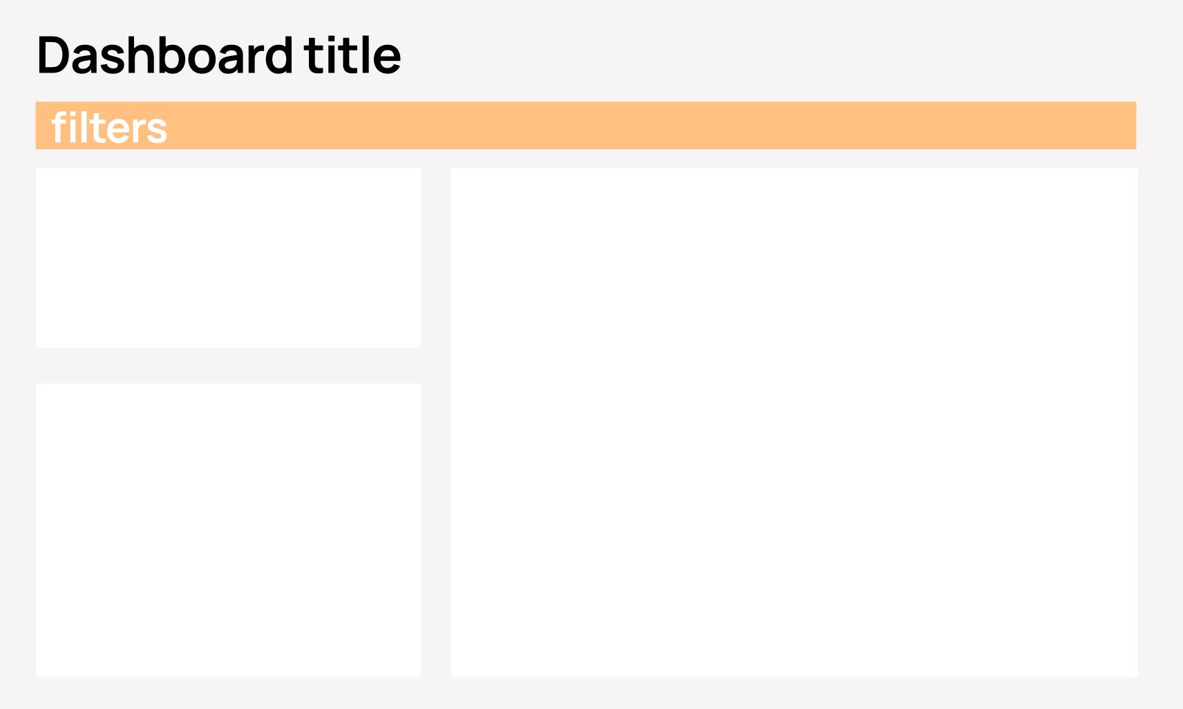
3. Mandatory Filters
When to use: Users must adjust filters first — the dashboard is unusable with default values
Examples:
Customer-specific dashboards where users must select their account
Project tracking where a project must be selected to see any data
Inventory lookups where a SKU or location must be specified
Why this works: The left-side placement creates a natural reading flow: configure → view results. By making filters impossible to miss, you prevent users from drawing incorrect conclusions from default data. The prominent vertical space communicates “start here.”
Design consideration: Include helpful messaging like “Please select filters to view data” or default the dashboard to a blank state that prompts filter selection.
4. Rarely Used or Advanced Filters
When to use: Filters are needed occasionally, or the filter list is long and complex
Examples:
Advanced data quality filters (exclude returns, include partial shipments, adjust for seasonality)
Technical parameters (confidence intervals, calculation methods, data source selection)
“Compare to” options (prior year, budget, forecast, industry benchmark)
Why this works: Hidden filters (often behind a “Filters” button or slide-out panel) keep your interface clean while preserving functionality. Most users won’t need them, but when they do, they’re accessible. This prevents overwhelming casual users while empowering advanced users.
Implementation tip: Include a small indicator showing when non-default filters are active (e.g., “3 filters applied”) so users don’t forget they’ve narrowed the data.
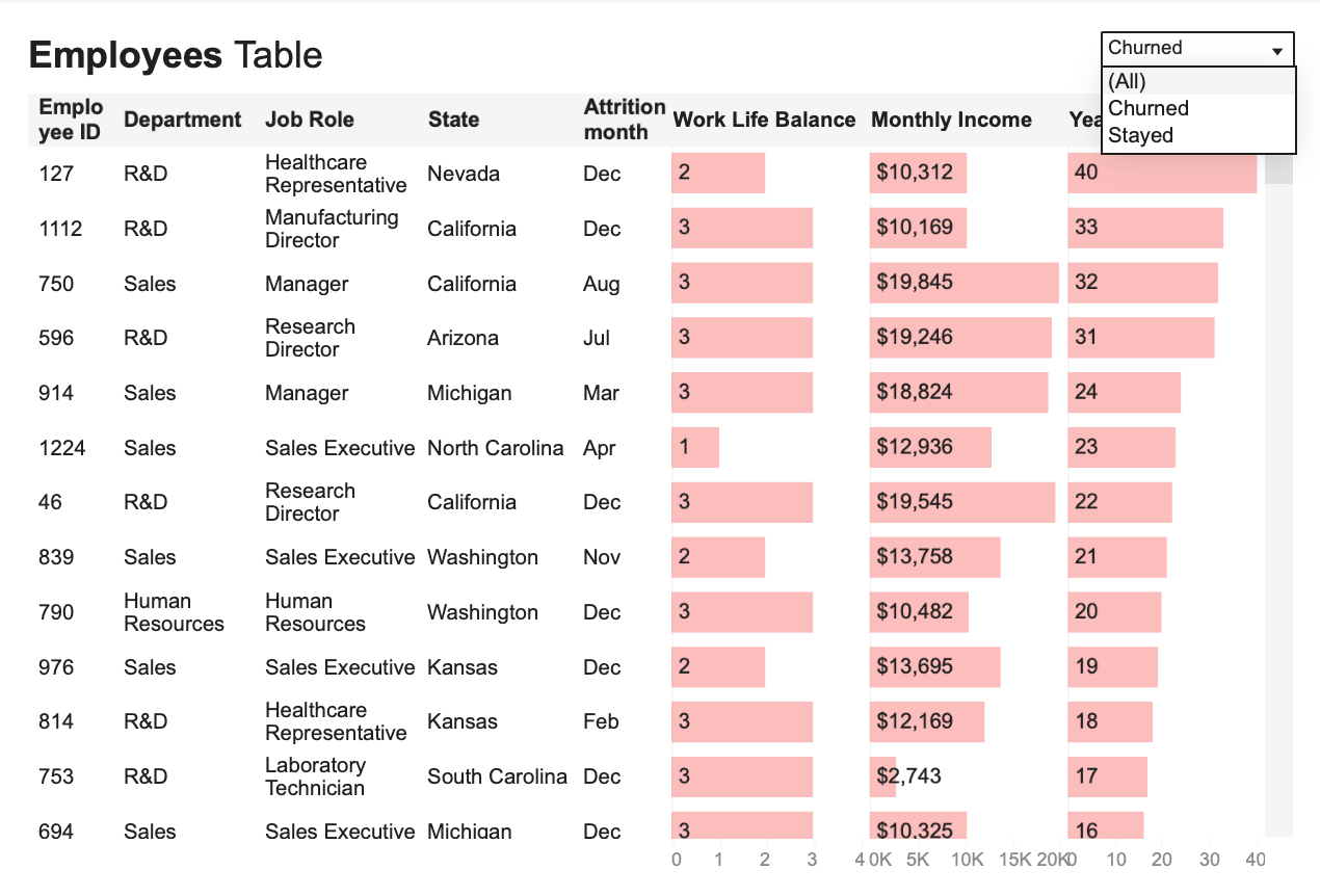
5. Filters for One Chart Only
When to use: The filter impacts only one specific visualization and shouldn’t affect the rest of the dashboard
Examples:
Time granularity for a trend chart (daily, weekly, monthly) while other charts stay at monthly
Top N selector for a ranking (Top 10, Top 25, All items)
Chart type toggle (bar chart vs. line chart vs. table view)
Metric selection within a single chart (revenue vs. units vs. margin)
Why this works: Placing filters directly next to or above the chart they affect creates clear visual association. Users immediately understand the scope of impact. Changing this filter doesn’t unexpectedly alter other visualizations, preventing confusion.
Visual example: A table might have a dropdown right in its title area.
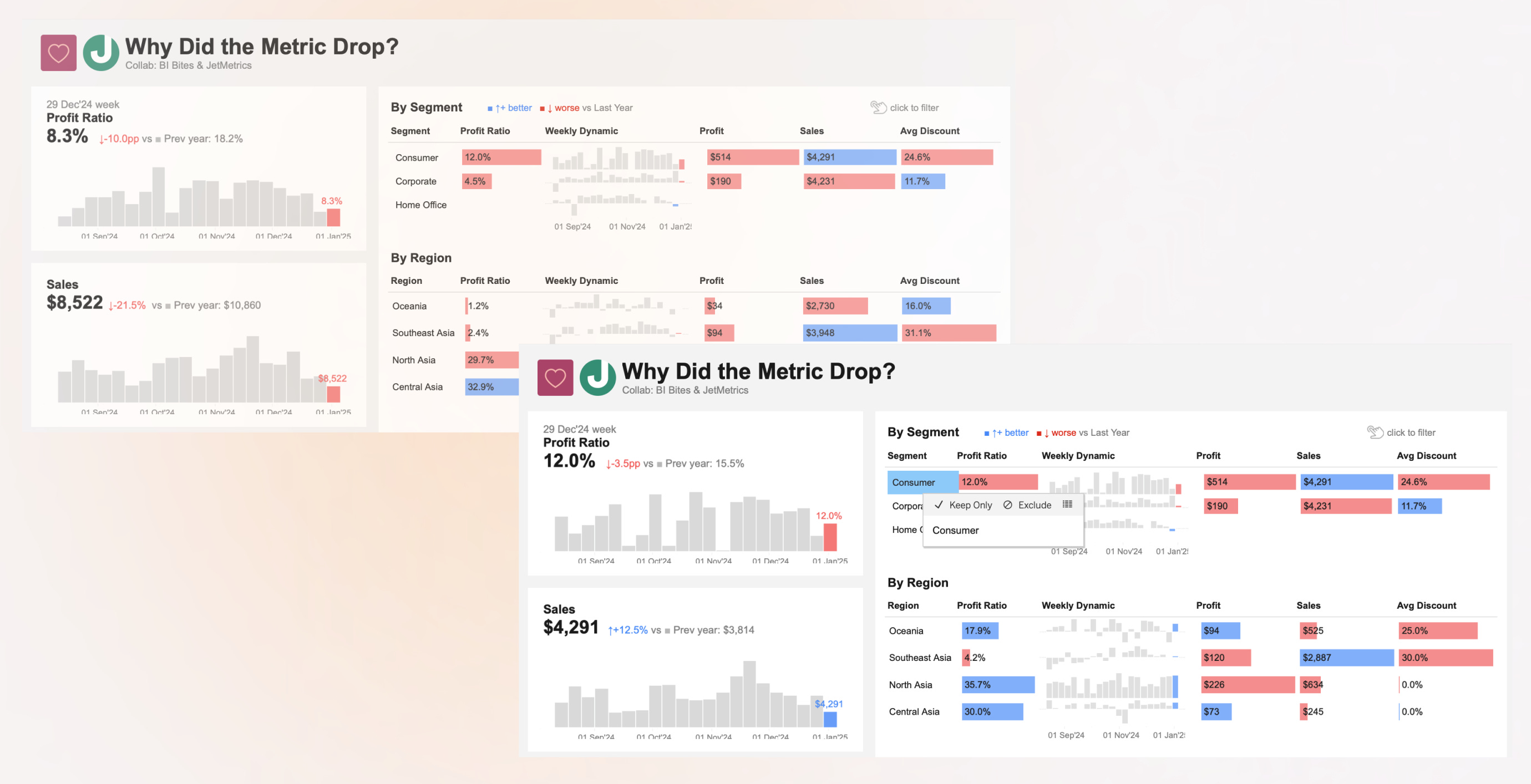
The Alternative Approach: No Visible Filters at All
Sometimes, the best filter is no filter. Instead, design dashboards where charts themselves become interactive filtersthrough cross-filtering or drill-through actions.
When to use:
Exploratory dashboards where users navigate by clicking what interests them
The user journey is naturally sequential (overview → drill-down → details)
You want to encourage discovery rather than specific queries
Examples:
Users click a region on a map to filter all other charts to that region
Clicking a product category in a bar chart updates a table below with specific items
Selecting a time period on a trend chart zooms other visualizations to that window
Why this works: The interaction feels natural and fluid. Users explore by engaging with the data itself rather than hunting for filter controls. The dashboard “responds” to curiosity. This approach works beautifully for executive dashboards and storytelling applications.
Example scenario: A “Why Did Metrics Drop?” dashboard where clicking on the week the metric dropped automatically updates all other charts to show comparisons for that specific week, breaking down by segment, region, product, and so on — all without a single traditional filter control.
Practical Implementation Checklist
When designing your next dashboard, work through these questions:
☐ Can my dashboard provide value with default filter settings, or must users interact first?
☐ Do my filters affect all visualizations, or just specific ones?
☐ How many filters am I including? (Fewer than 5 suggests header; more suggests panel or hidden)
☐ How often will users change these filters? (Frequently = prominent; rarely = hidden)
☐ Would interactive charts serve better than explicit filter controls?
☐ Have I tested this with actual users to see if they find the filters where they expect them?
Remember: the goal isn’t to follow rules rigidly, but to remove friction from your users’ analysis workflow. The right filter placement makes your dashboard feel intuitive, powerful, and effortless to use.